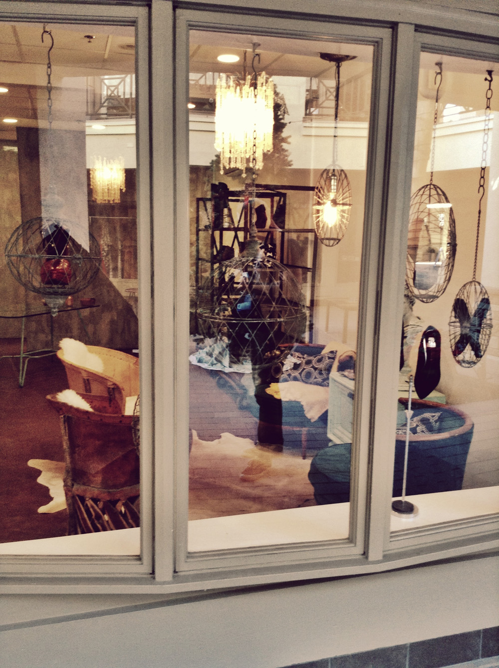
Was Rome built in a day? Heck no! That’s for crazy people. So when Andrea Van De Vort asked me to design her pop-up shoe shop in two weeks, I clearly said,….”Sure, I’ll do it!???”
Yep, I’m pretty much full of these fly by the seat of my pants, follow your heart moments only to find myself wishing I had slowed down to think; just a little more. I mean, I had just finished Lone Flag (a four week project) that I had been working on daily, for a straight month. We got it done, yes. AND it looked great but, we were stressed every day of that month and needed every day of that month to complete the project…with THREE people. There were moments when we didn’t think it would get done.
Rome might be an exaggeration but, it is not like I didn’t have a very recent relevant experience to tell me I needed more time and that this would be a very stressful two weeks when I took on this project. I am not saying that I wouldn’t have taken on this project if presented with it again. What I am saying is, next time, I will discuss the timeline more carefully and lay out what is truly realistic. I never want to set myself or my client up for failure of meeting their deadline. In this case, we met the deadline, but it nearly killed me.
A pop up shop is a risk. It is where a retailer is testing the market to see if the retail concept will go somewhere or thrive. Sometimes pop ups are intended to be temporary. Regardless, the risk should be minimized. In Andrea Van Der Vort’s case, she wants this store to work. She wants it to be successful and to bring a much needed designer shoe store to San Diego. She also however, wanted her initial spend on the pop-up shop to be low risk in case it doesn’t take off. If it is successful, she will be willing to pour more into the shop. It’s smart thinking.This just meant for me however, it was a limited budget, a limited timeline with a need for big creativity and catching design. Did I say that right? In other words, crap! Get your design on Smid!
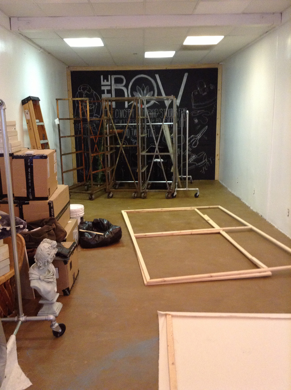
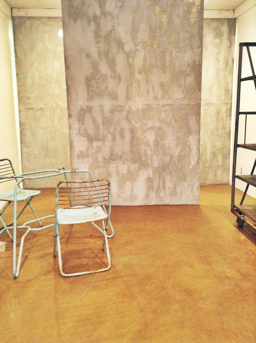
Here is a look at the space before I got my hands on it.
<img class="aligncenter size-large wp-image-729" alt="image" src="http://www.smidthat.com/wp-content/uploads/2013/12/image1.jpg?w=560" width="560" height="749" srcset="http://www.smidthat.com/wp-content/uploads/2013/12/image1.jpg 1936w, http://www.smidthat.com/wp-content/uploads/2013/12/image1-224×300 cheapest levitra pills.jpg 224w” sizes=”(max-width: 560px) 100vw, 560px” />
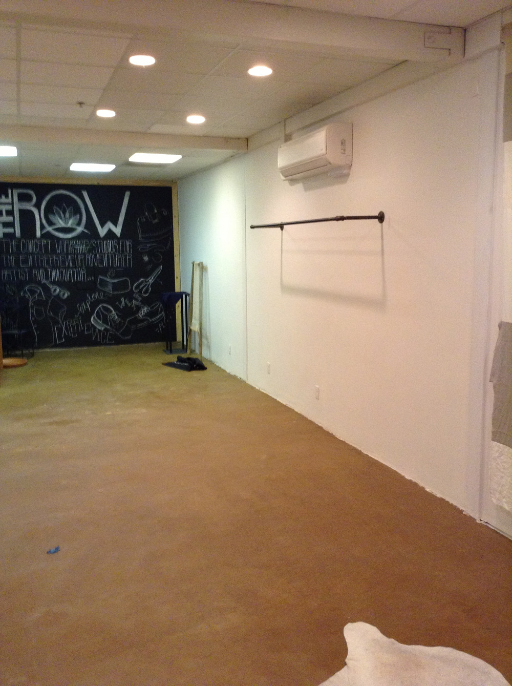
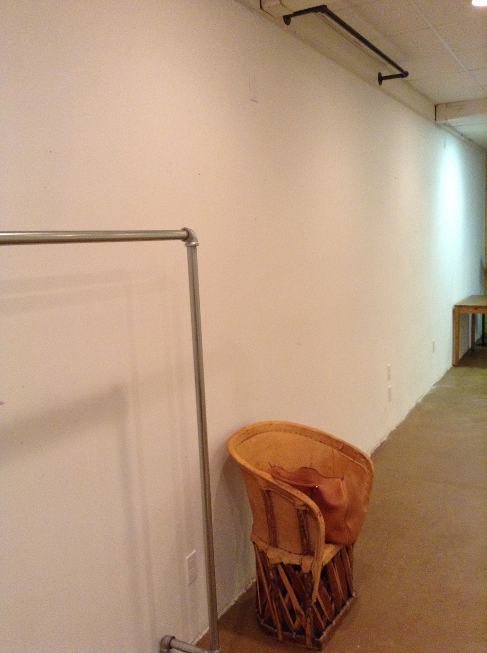
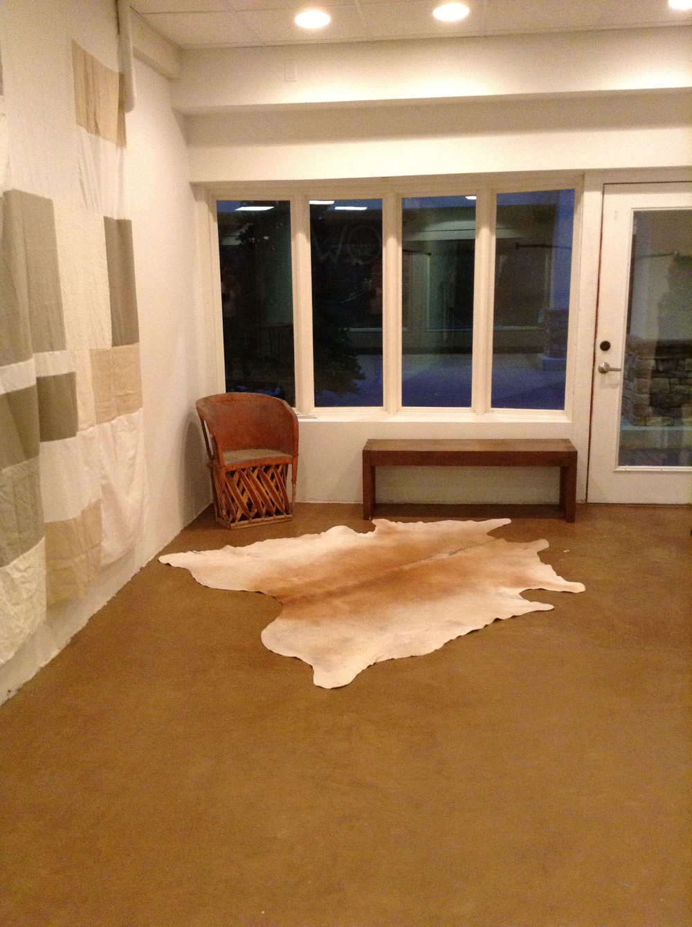
There were two of these chairs left behind as well as the hide. We wanted to make these pieces work in the design to help save on cost where possible.
Andrea had shared color palettes with me that she liked. They all seemed to fall in the creams, sea foams, blues, dusty pinks, very light and airy colors. Yet in some of the pictures and descriptions of things she liked, it seemed to show me that she loved some industrial and tough aspects of design as well. She also loves Moroccan blankets and would have loved one in the store. I am not sure if you own one of these? They are stunning and I want one of my own as well but, one of these would have killed our budget in 10 seconds flat. So I tried to pair the feel of a morrocan blanket, some of the color palette she wanted and the industrial toughness together for the space.
The space was small and very narrow. Andrea’s first request was to have storage space for the plethora of shoes she wanted to sell. Thankfully the storage area needed to be hidden but, the tricky part is there wasn’t a budget for doors or for walls. Curtains? Nahhhh! Everyone does that. I honestly don’t know why but it came to me as I was driving out to the country for an estate sale. I envisioned a runway, where the catwalk is blocked off from the behind the scenes madness. They put up these catwalks in a day and take them down. I tried to think of what could I do that was similar to this, scalable and yet eye catching not distracting. Canvas walls! A wall of art! I decided to make large canvas’ that would stretch from floor to ceiling. The vision was to have two toward the front and one toward the back. This way the sales person could walk right or left to reach the storage space that was tastefully blocked off.
The frames were custom built for the space. I was originally planning to do it but, my hubby helped me. In fact, he did most of the framework. Remember I said, “It nearly killed me.” Well I ended up in bed for six days with strep and a chest infection. I was running fever so high, I was unable to keep solids or liquids down for 2 days. With a two week timeline, there is no time for strep. We had to keep it moving somehow. He was my somehow!
After the intense planning for and executing the vision for Lone Flag, the two week pop up shop timeline nearly interrupted by strep throat and my husband the hero stepping in, the pop up shop is open at Flower Hill Mall in Del Mar, CA. I am so excited with how it turned out. I am thrilled I had the opportunity. I hope you can make it in to see it. Here’s a look at how it was done.
– Smid
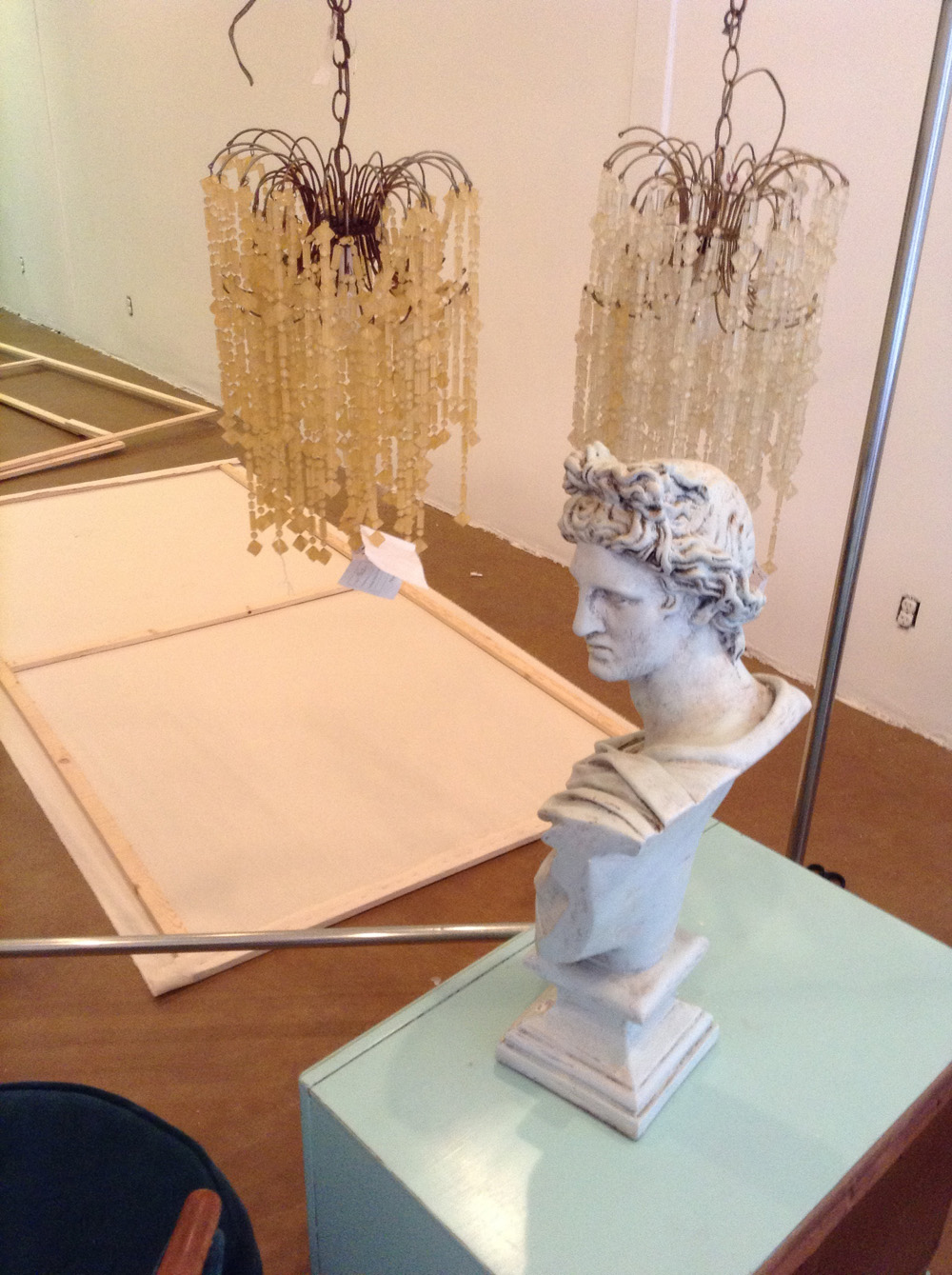
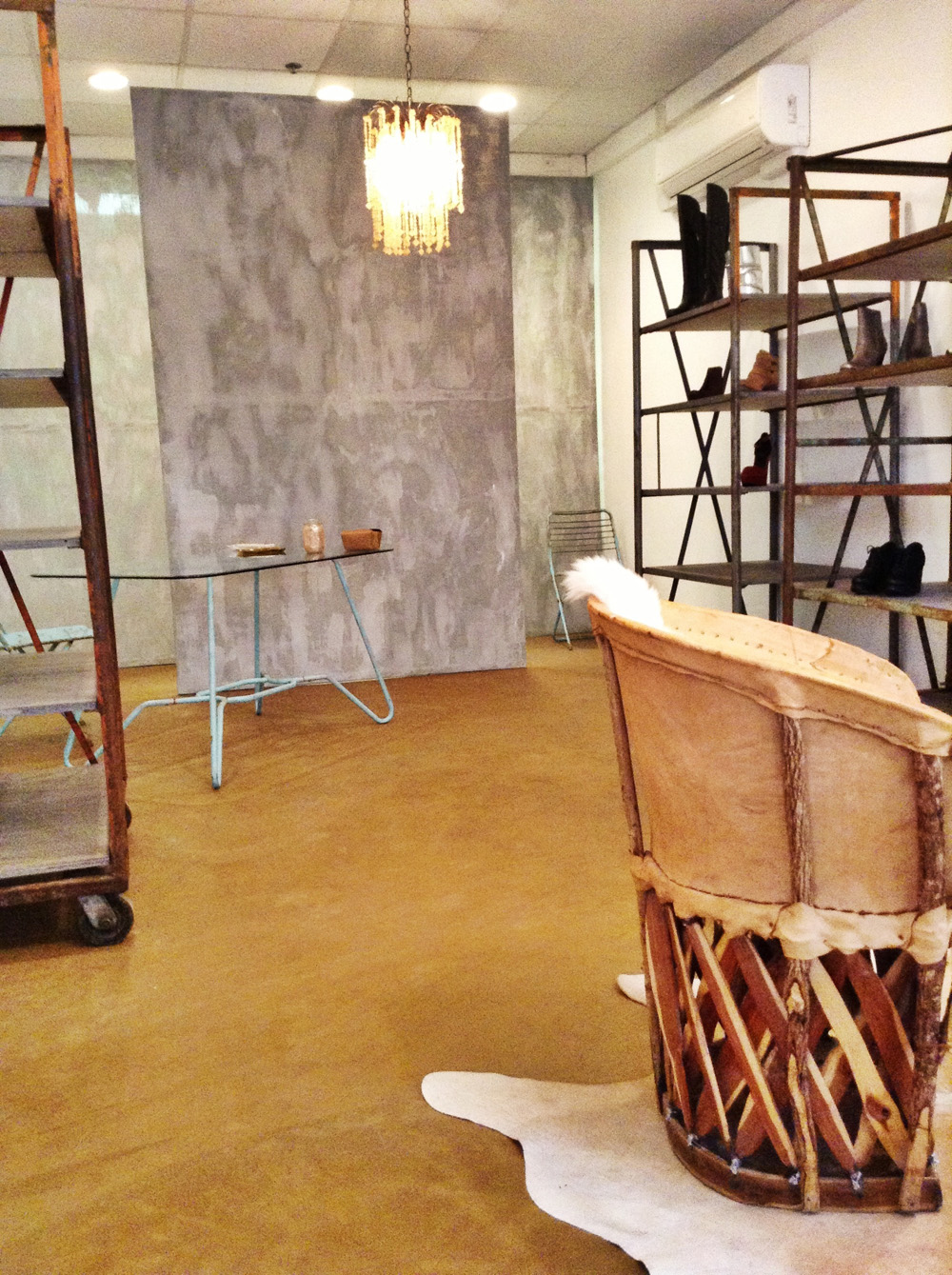
I bought very large rolls of canvas from Michaels Arts and Crafts and stretched the canvas over the frames. These chandeliers were an estate sale find. They are lucite and spidery. One of them must have been installed right by a window in it’s former life, because it appears to have sun damage. I personally thought it gave them more character and made them more interesting.
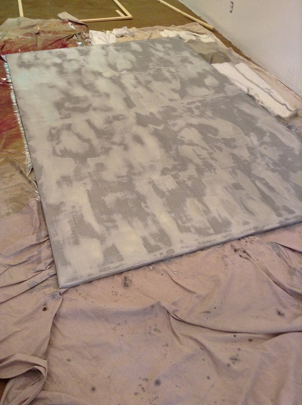
I used an oil based paint. I laugh because I am always on a search for the most eco-friendly products for our household and in my designs but honestly…how do you find the perfect silver metallic liquid paint for a canvas that doesn’t look like that awful sponge faux stuff or the too perfect looking puff paint that is making my lip curl right now while typing this. You can’t! No pain. No gain. Or in this case. No fume. No gain. This liquid paint is really interesting to work with. I wasn’t exactly sure how it would take to the canvas but I knew it would be interesting. I quite like the way it turned out. It has depth and texture to it.
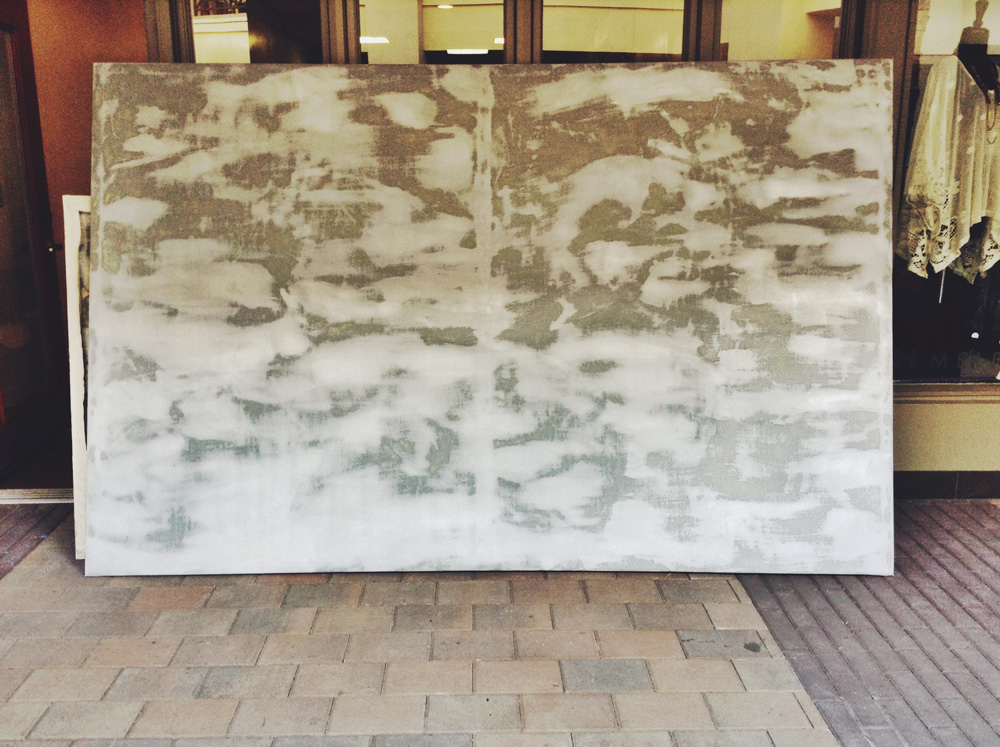
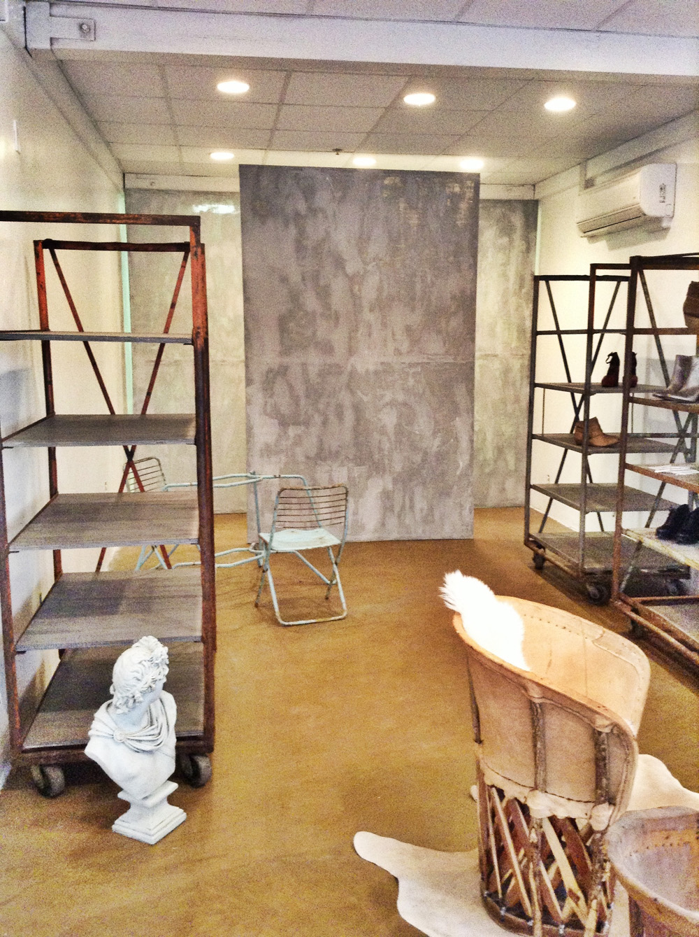
You’ll notice the reverse of what I said earlier. When the canvas pieces were being installed, Andrea started to panic that there would not be enough storage space. Then I had an internal fight with myself. The more rationale side won this time and I did not panic. I measured the canvas to fit floor to ceiling!! The back of the room had lower ceilings. When we decided to move the middle canvas up front, it gave Andrea more storage space but the canvas was no longer flush with the ceiling. We were able to secure it with silver wire and museum putty (on the ground). Flexibility and creativity thankfully made it work!
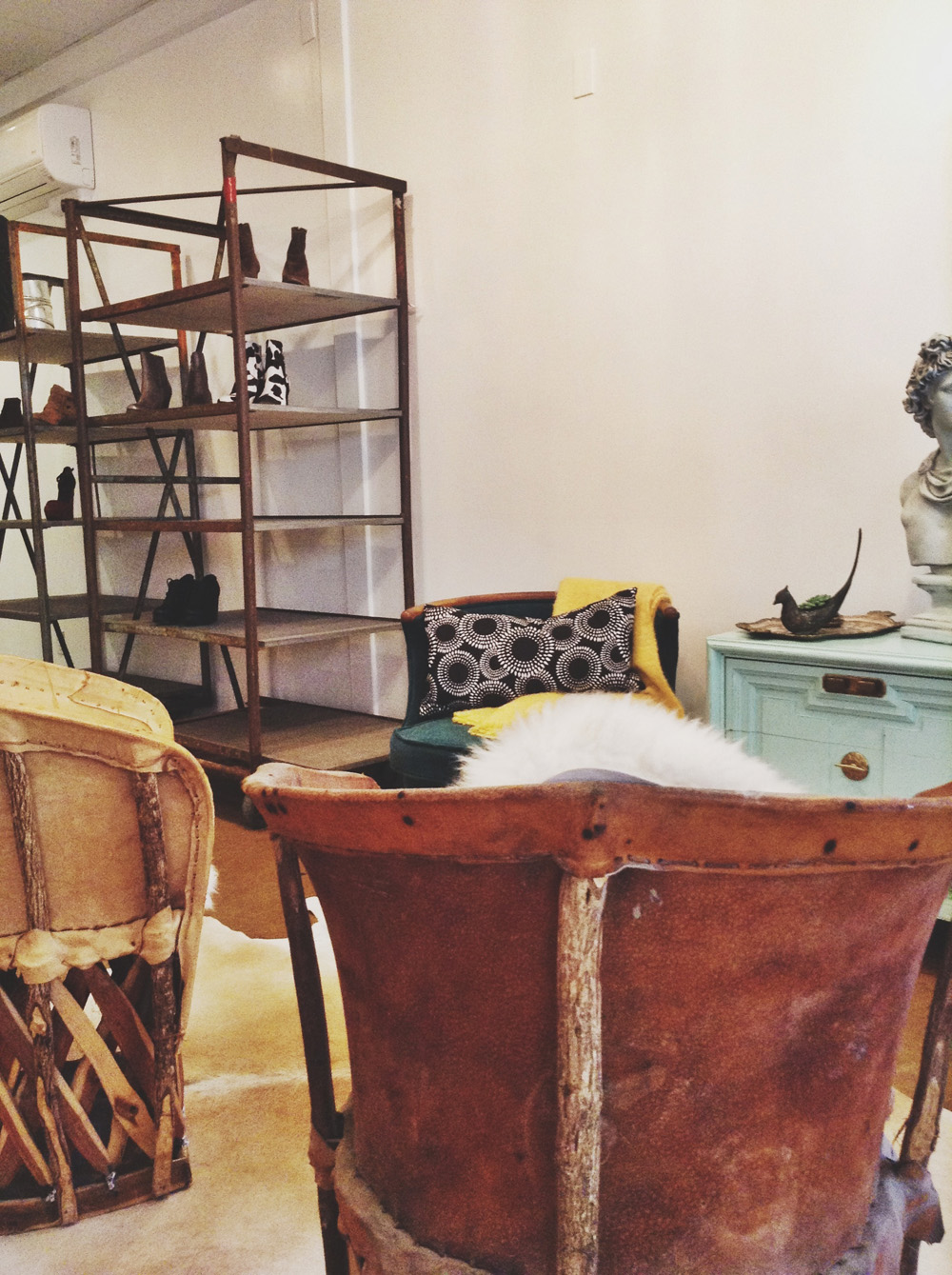
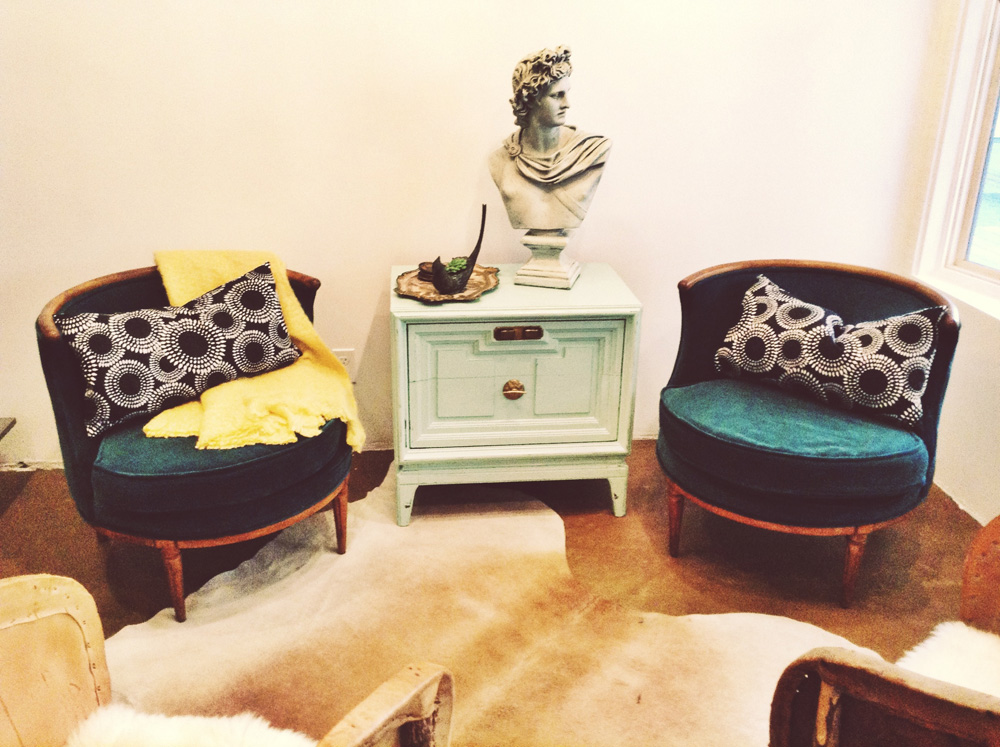
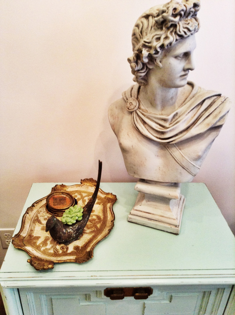
I really wanted to put red lips on this guy! They hesitated right before the opening. Darn! He’d look so good in red.
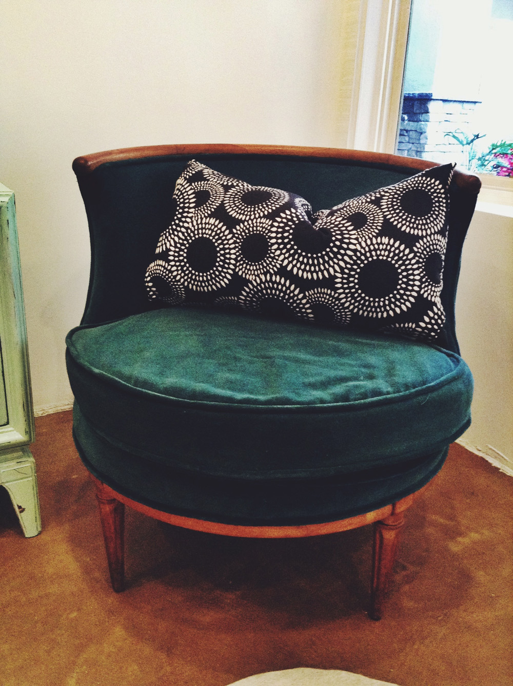
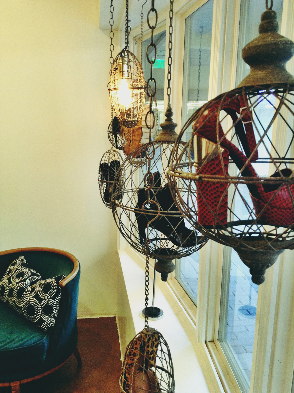
I found these steel baskets and I thought they would look so amazing for a window display. I put a light in one so that they would have good lighting there and the rest were hung at varying lengths and filled with shoes.


Sick sick SICK space!! Sorry to say but your strep was totally worth it. The chandies are killer and I do so want to see red lips on that chap. It would be the perfect amount of cheeky! The more I see of your work, the more I need to keep seeing. More SMID, please!
Su! Hey! lol Thanks! I am so glad you like it!