Tina and Brian are renewing their vows on July 24th. It is their five year anniversary. And from what I learned, they have a lot to celebrate.
They are probably one of the cutest couples I know. They are incredibly in tune to what each other is thinking and very respectful of each other’s wishes. I also find them extremely calming and peaceful in how they manage conflict, or at least the design decisions they were presented with while working with me. I am a very expressive and emotional person as you may have gathered by now. I get very excited and worked up about many things. Ok… most things. So I am completely impressed and was quite taken back with their patience for one another and their warmed hearts toward me as we designed the space together. I THINK they may actually be this way when they are alone and behind closed doors too. Amazing!
Tina asked me if I would redesign their master bedroom prior to their vow renewal. They have put a ton of work into their home to make it alive and playful but, their bedroom was the one place that felt unfinished in their mind and was not reflecting who they are as a couple and as individuals. They wanted the entire house to look spectacular for the event. Most importantly, they wanted to use their bedroom. They wanted it to feel comfortable, inviting, exciting, romantic and be happy with the way it looks. They struggled with what the room needed in order to make it all of those things. They were tired of trying to get it there and being unsuccessful.
I knew exactly what it needed when I walked in the room. I understood why they were so frustrated with it. It was too stale and a little uptight for them. It was a beautiful room for most but not enough for them. It just felt like it was cut short and not given as much love as the rest of the house. It didn’t feel or look lived in. Nor was it inviting. The rest of their home is incredibly playful. It is full of these fun Bear Brick collections and unique pieces that they have purchased together over time that represent who they are and carry significant sentimental value. Their bedroom didn’t have any of these things.
Tina shared that they had their master bedroom designed before. However, the designer had not captured their personality in the space. They have spent very little time in there because of it. I hated to hear that they had been avoiding this room, other than to sleep , and have also shut the door to their bedroom when having visitors. They were not proud of it. Tina and Brian have a very large bedroom, with a fire place and lots of light. There are walk in closets AND Tina even has a powder room!!! Are you kidding me? It is a great space. We had to get them using it! And what a great time to do this.
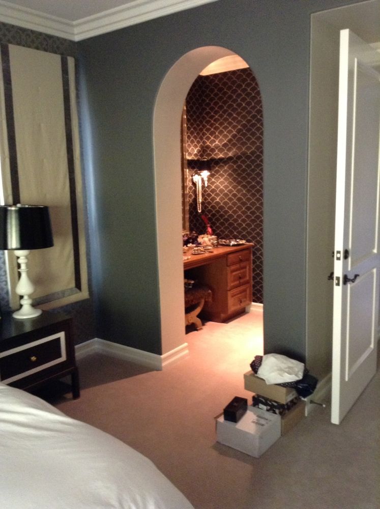
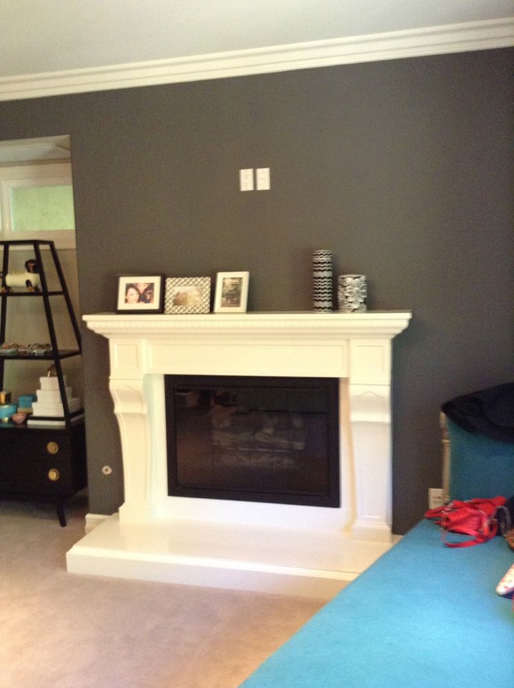
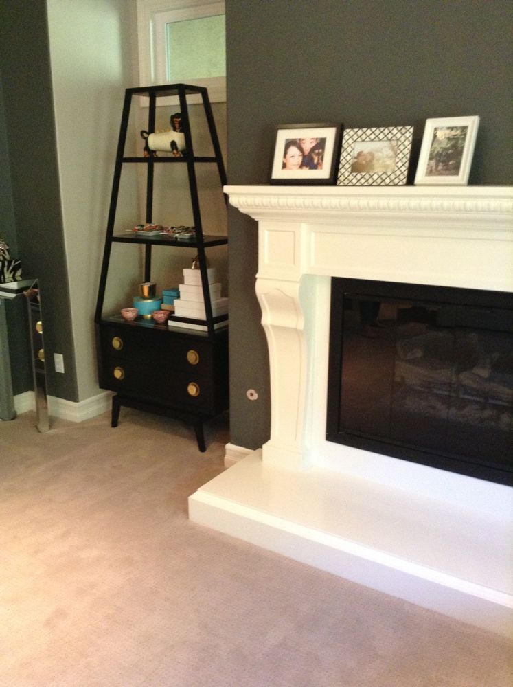
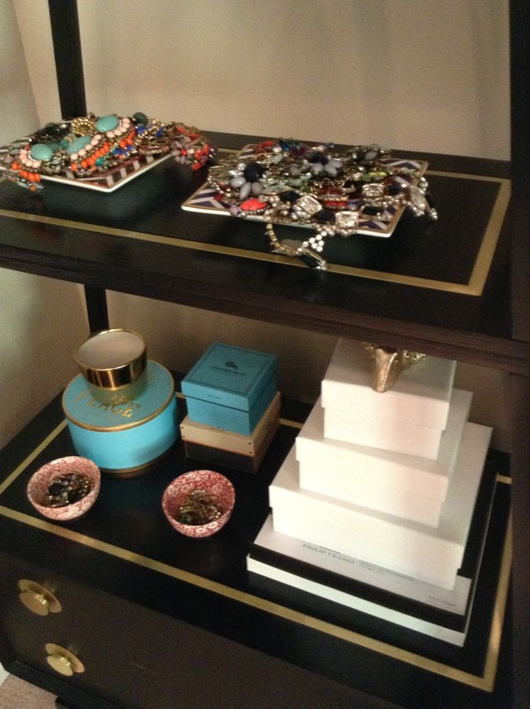
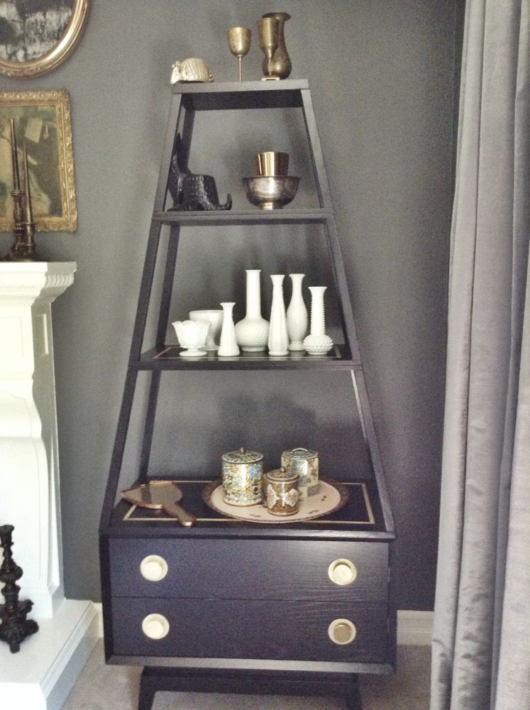
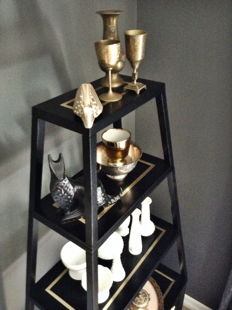
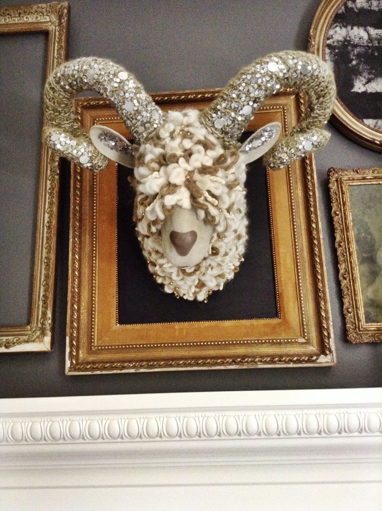
The challenge I faced with this re-design, they had already poured quite a bit of money into their bedroom. We had to be reasonable with what we invested in the space. We also needed to make things work in the room (that were already there) which were substantial investments or had sentimental value. Here were the things we agreed/needed to leave; the wall color, the wallpaper (which Tina was disappointed in since it was installed), the curtains, the custom made side tables, and the head board. They also had a very cool Jonathan Adler etagere which got lost in their room before. It was tucked in a little nook and the styling on the table was too flat to make it noticeable. Then there was this Ram’s head made of cashmere, suede, yarn and sequins. It was a piece the couple had purchased a while ago and it had been sitting in their closet for years. They really wanted to get it into the room somehow.
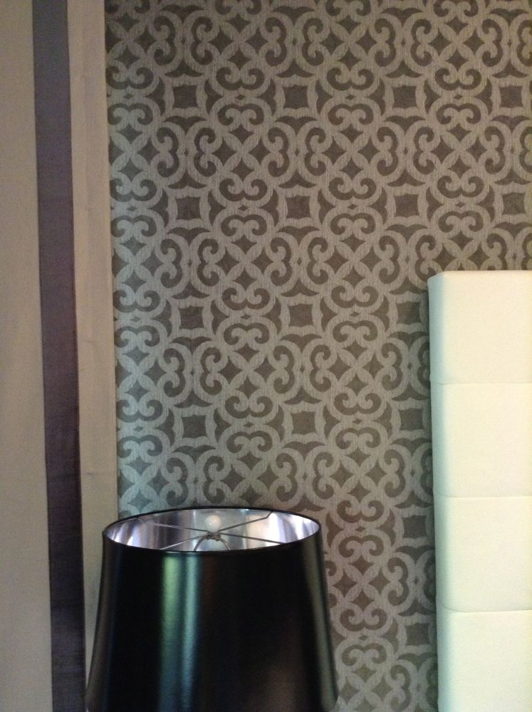
My goal was to bring life to the wallpaper, compliment the curtains and make the side tables look more sophisticated. The room needed more glam and yet needed to look tougher. I wanted it be fun and livable. It was important to compliment the theme in the rest of the home. And did I mention this? Tina loves glamorous, edgy designs. Brian loves mid-century. Right! We had to ‘master’ that bedroom.
Here is a look at what we did. I hope you enjoy it. Smidthat!
-Smid
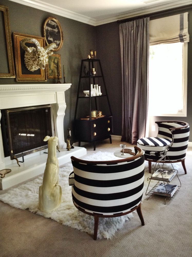
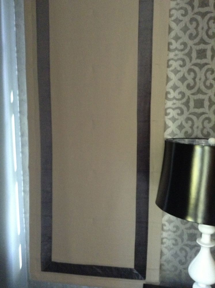
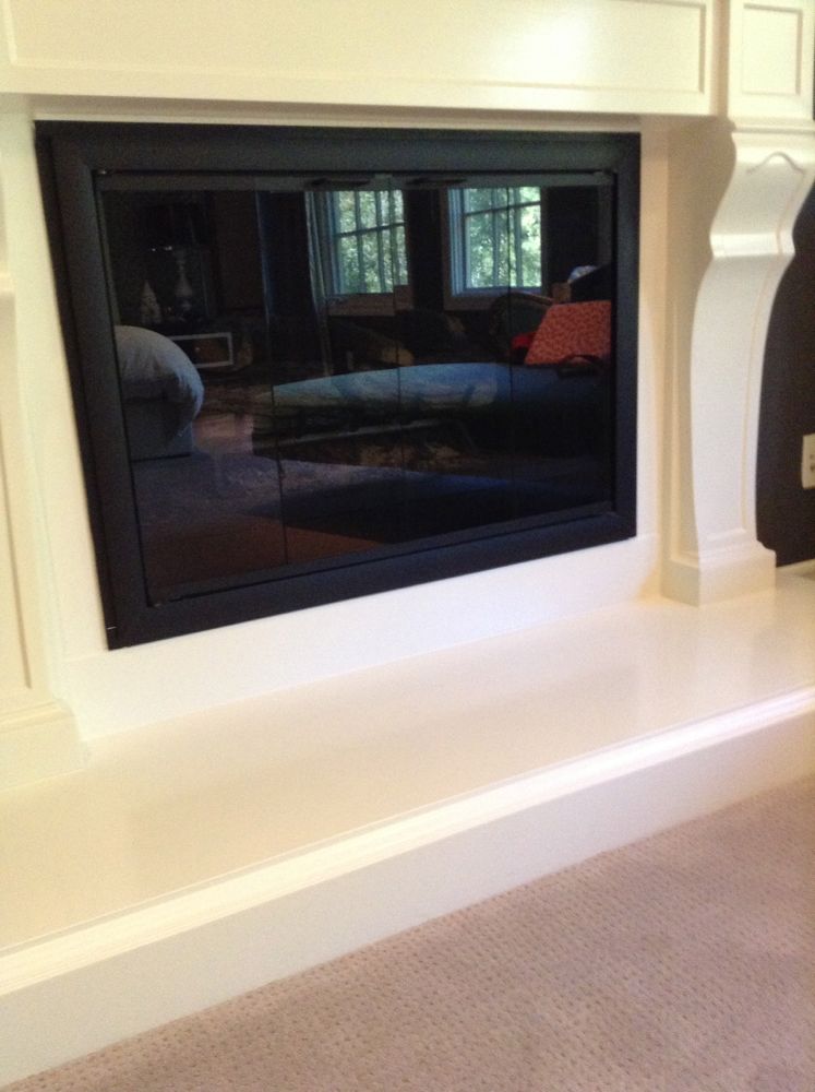
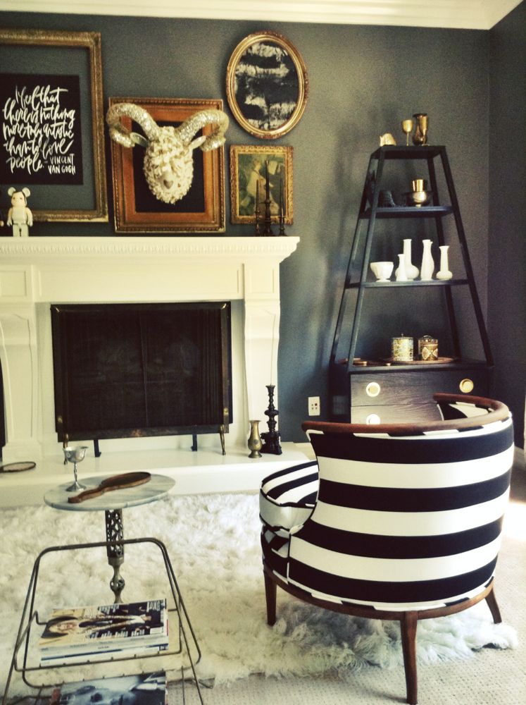
Etagere now NOT tucked away. Ram head now sitting tall and in it’s new home. I added a fireplace cover to soften the fireplace. The curtains now appear to be full of life and more glamorous.
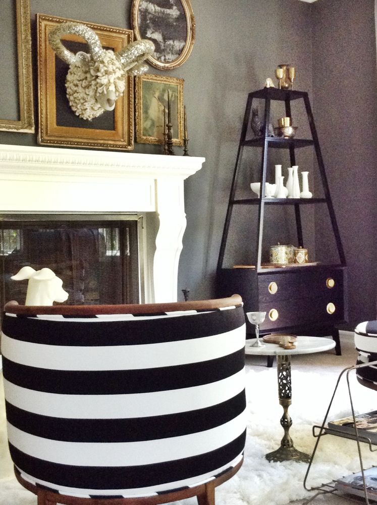
I styled the etagere by using more height and a bit of the color blocking technique.
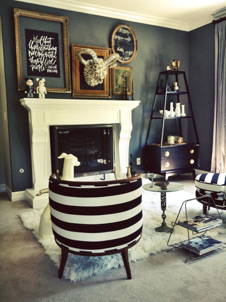
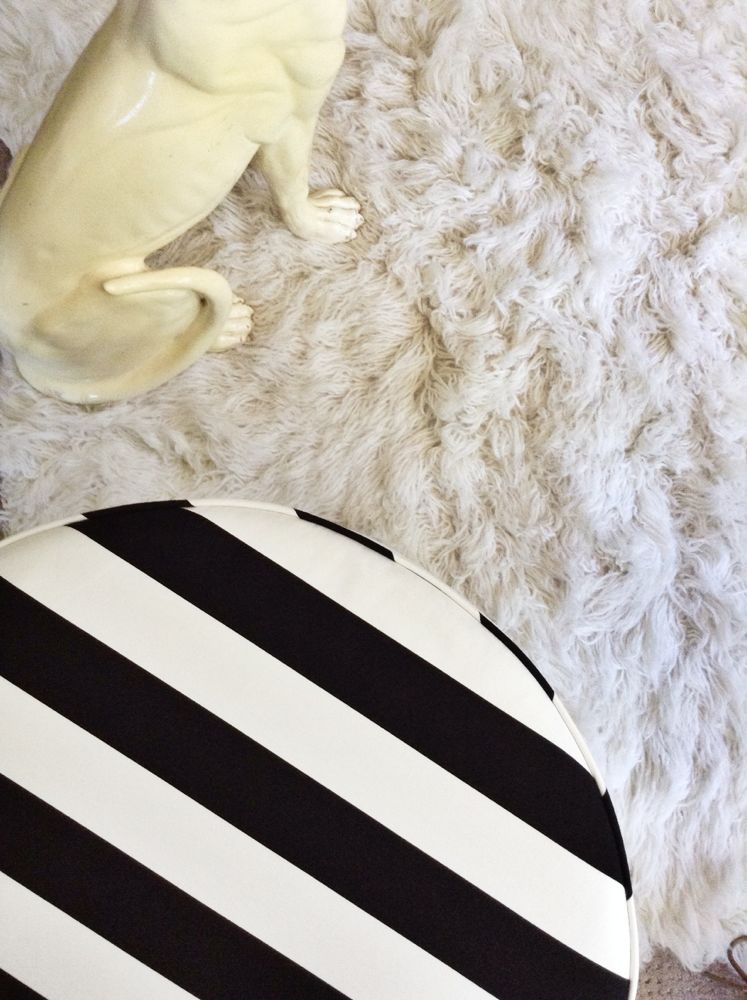
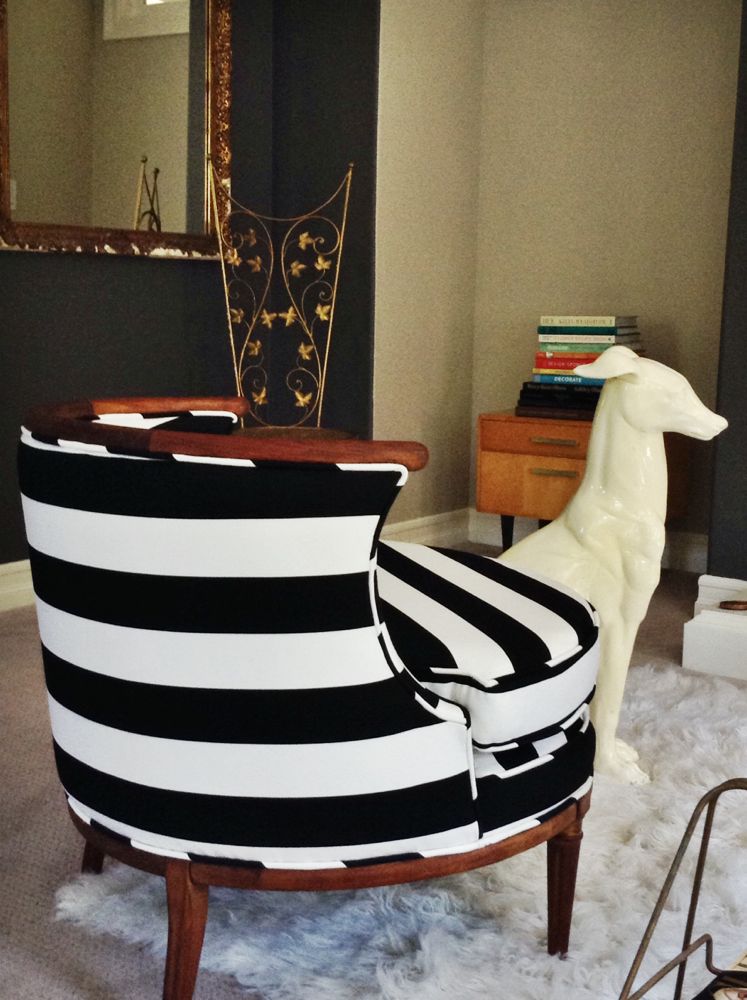
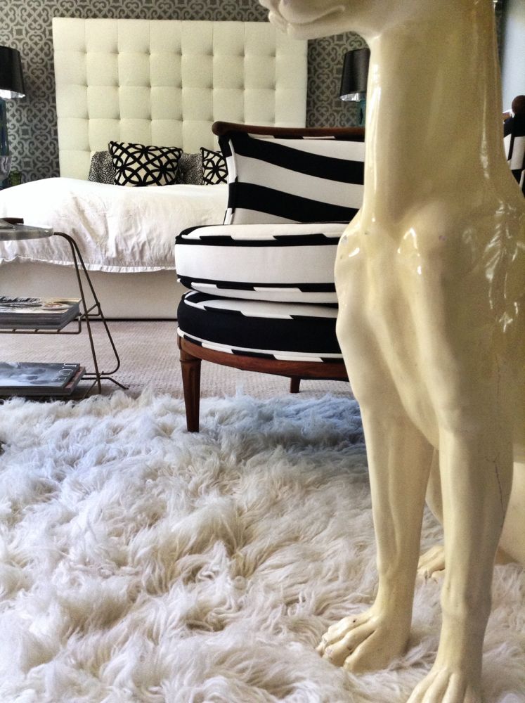
The chairs are very mid-century. We ‘glammed’ them up with a classic bold black and white stripe.
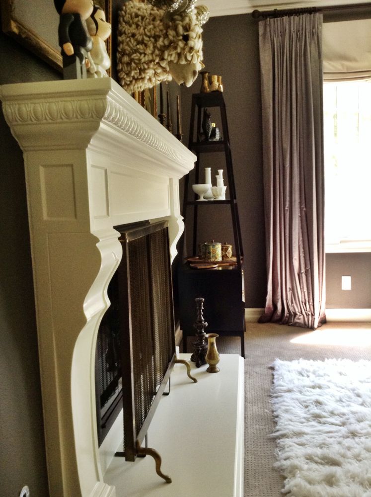
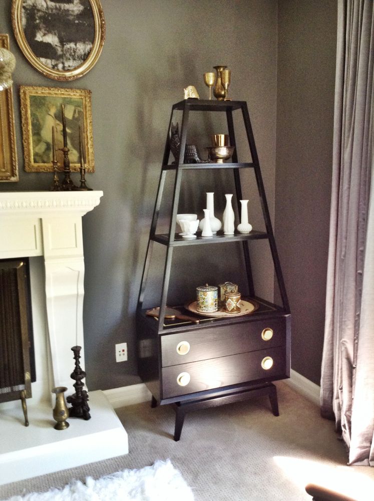
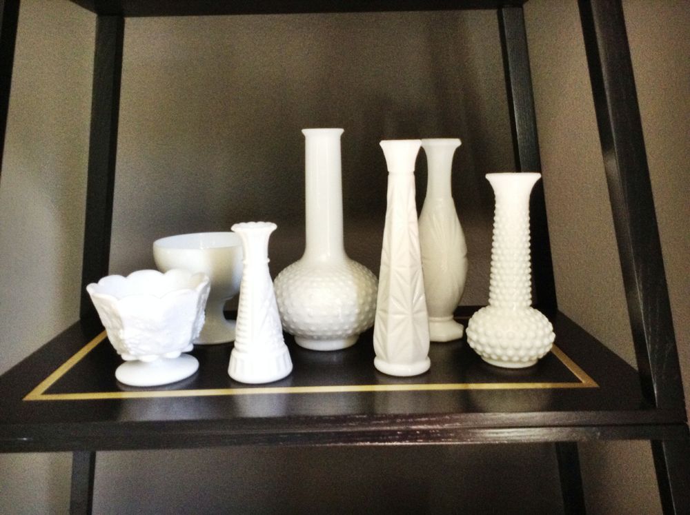
This is Tina’s milk glass collection that we finally got dusted off and out in their room.
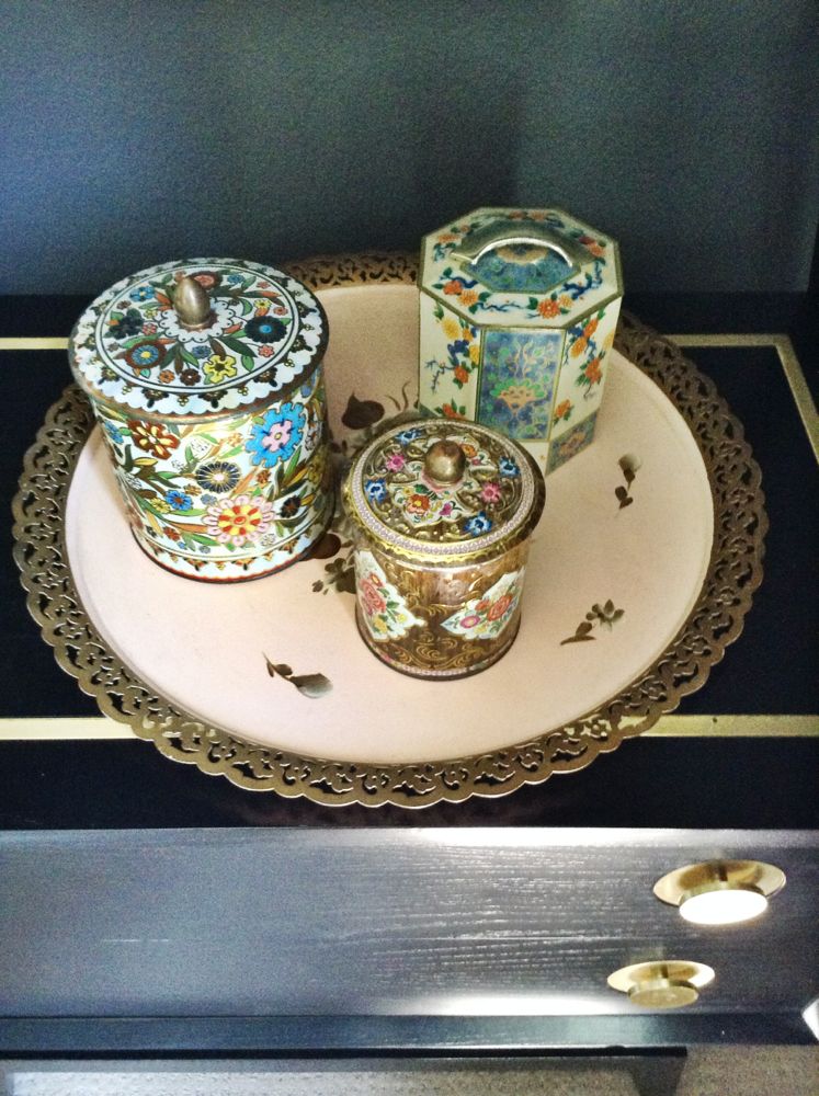
I found this floral trey at the flea market and it compliments these old flower tins from their first wedding.
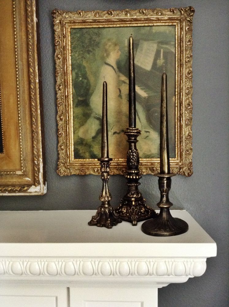
Tina had these beautiful full wax candles that complimented the frames on the new art wall. I love the detail in this space.
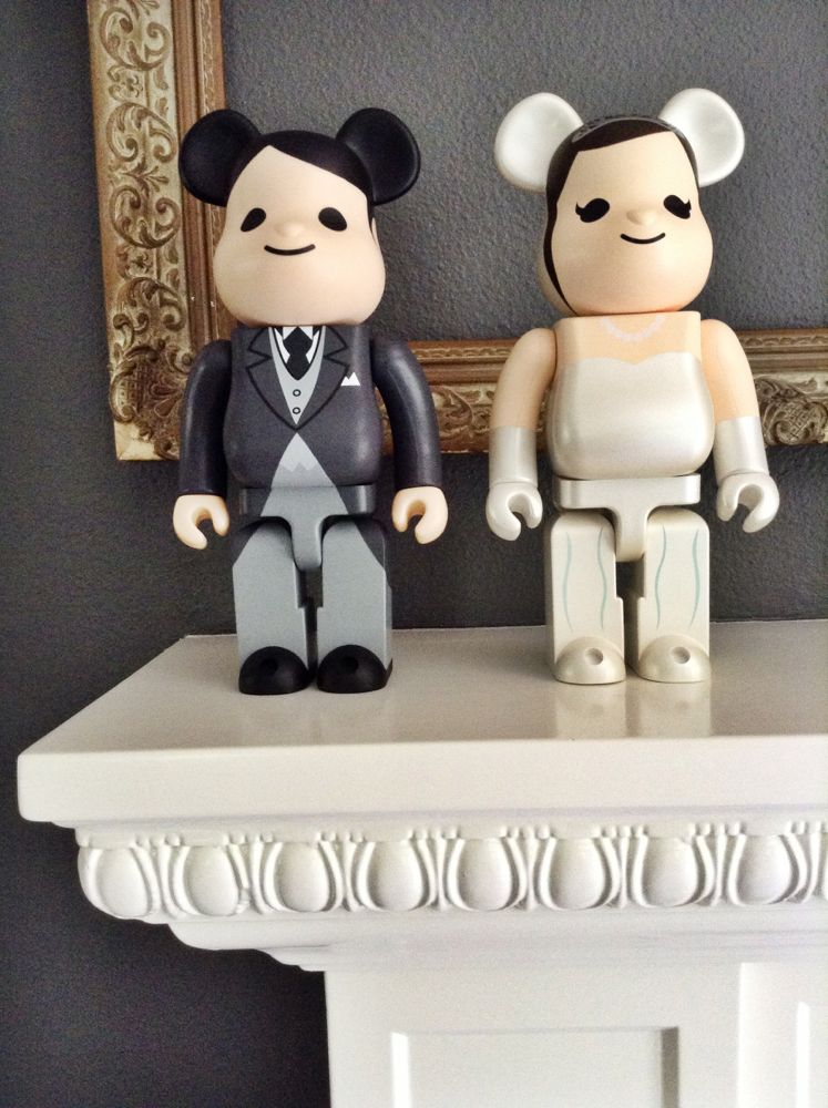
I had Tina and Brian order a married couple from Bear Brick to continue the theme of their collection through out their home.
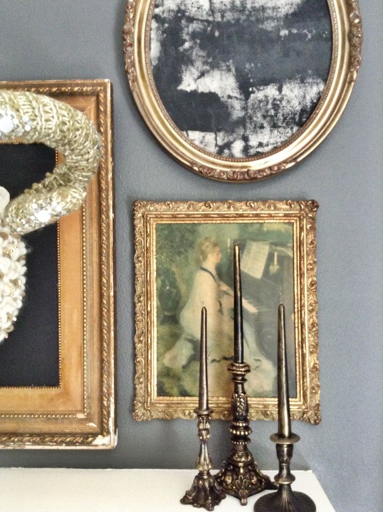
Details!
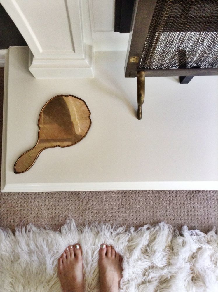
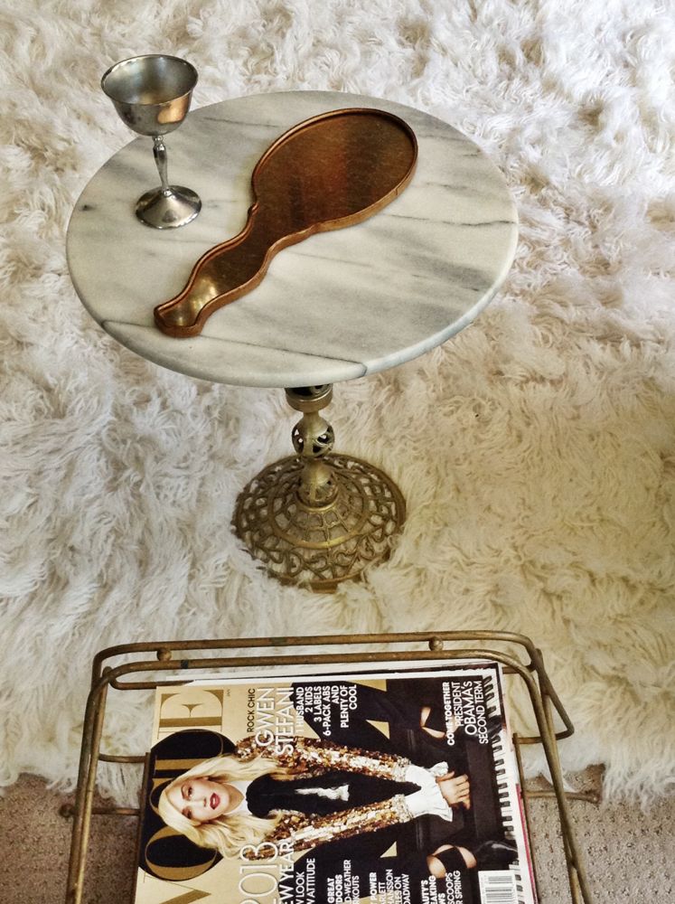
Hand held bronze mirror.
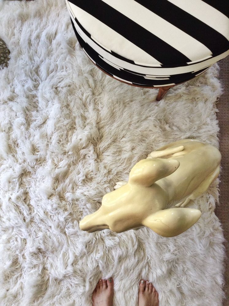
Texture! And a little not so furry friend. Also, my feet.
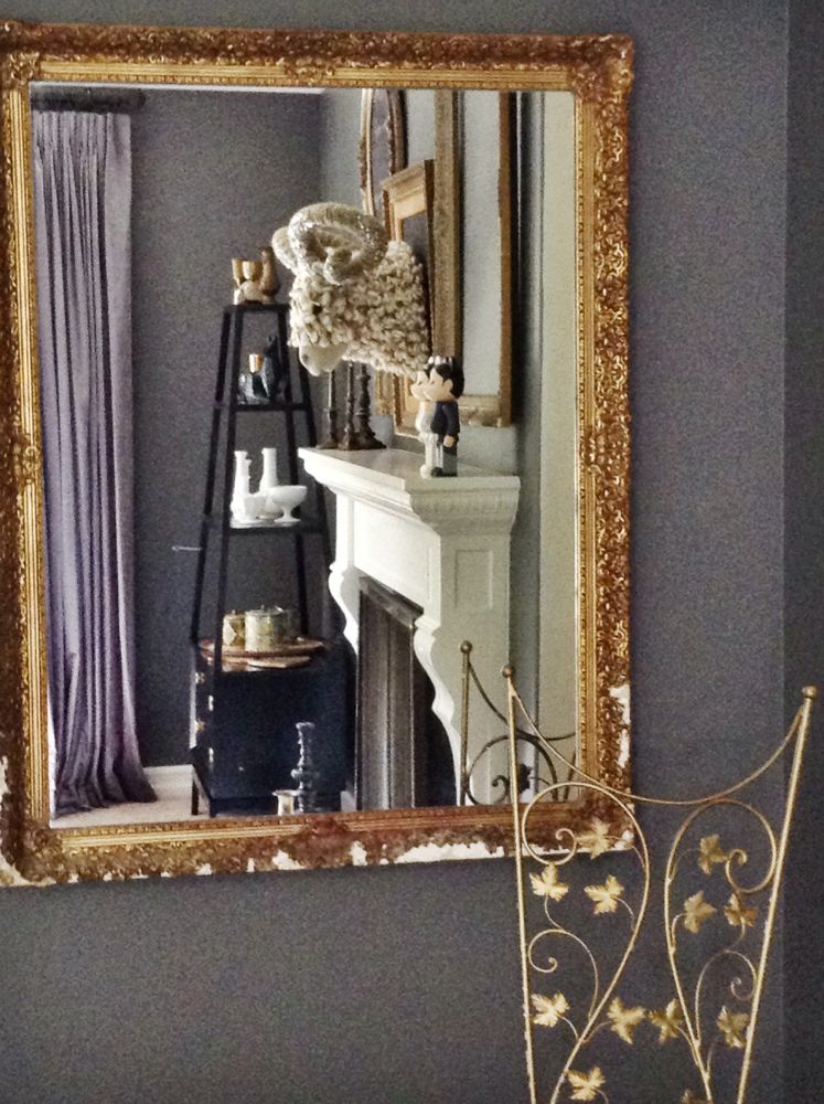
Mirror mirror on the wall, who’s the ram head sitting tall?
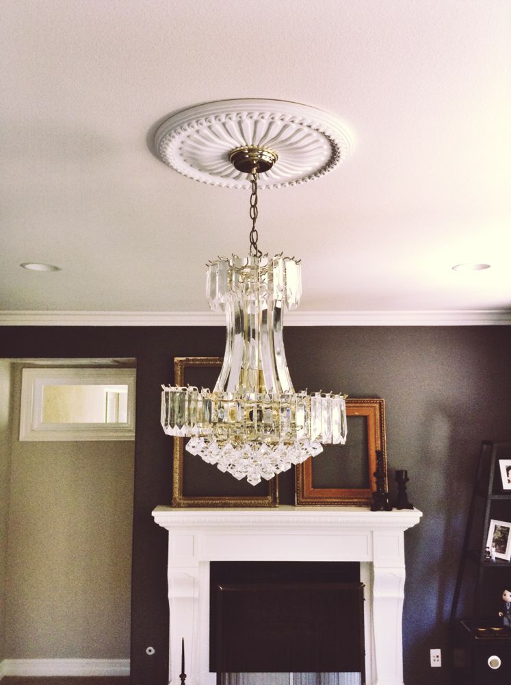
Installed some bling.
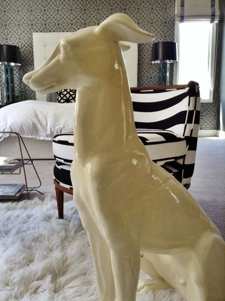
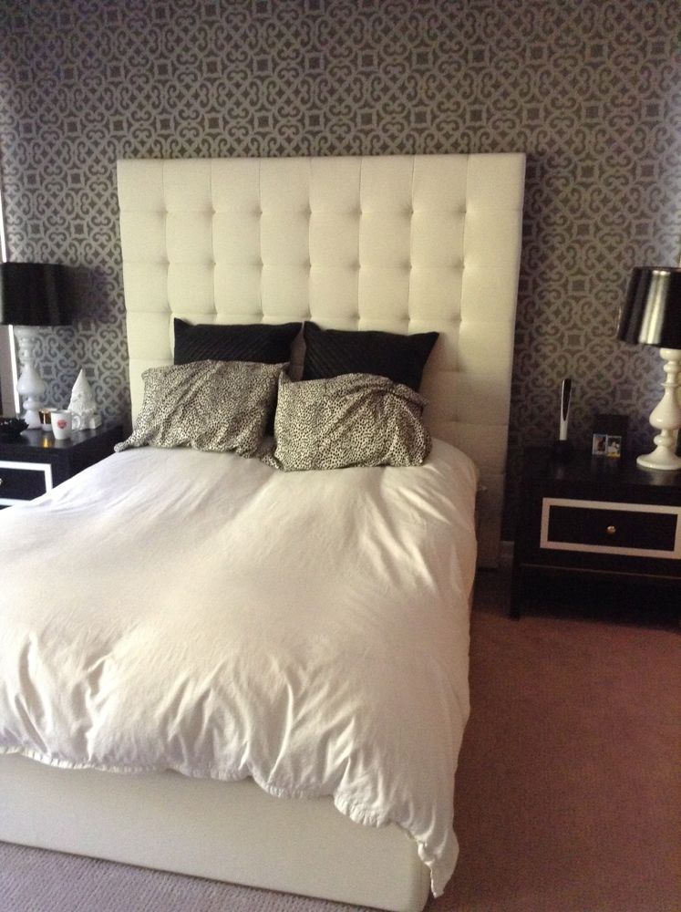
See the mid-century lamps on the side tables? It’s a play on the wallpaper and gives it more life.
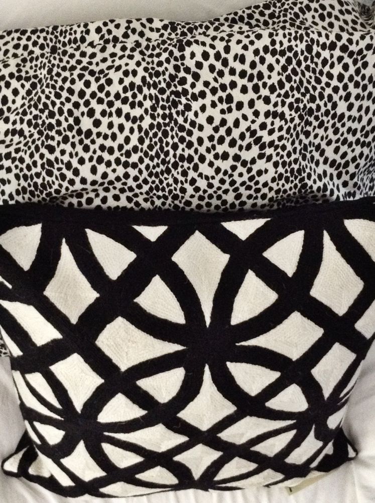
I added those front pillows for some additional texture and to pull the black and white theme through out the room.
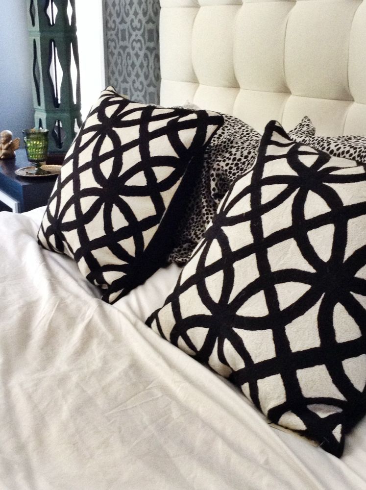
Angel baby to guard them at night. Just kidding. It was just cute. So I had to.
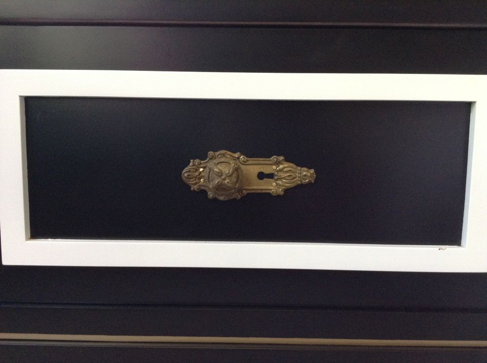
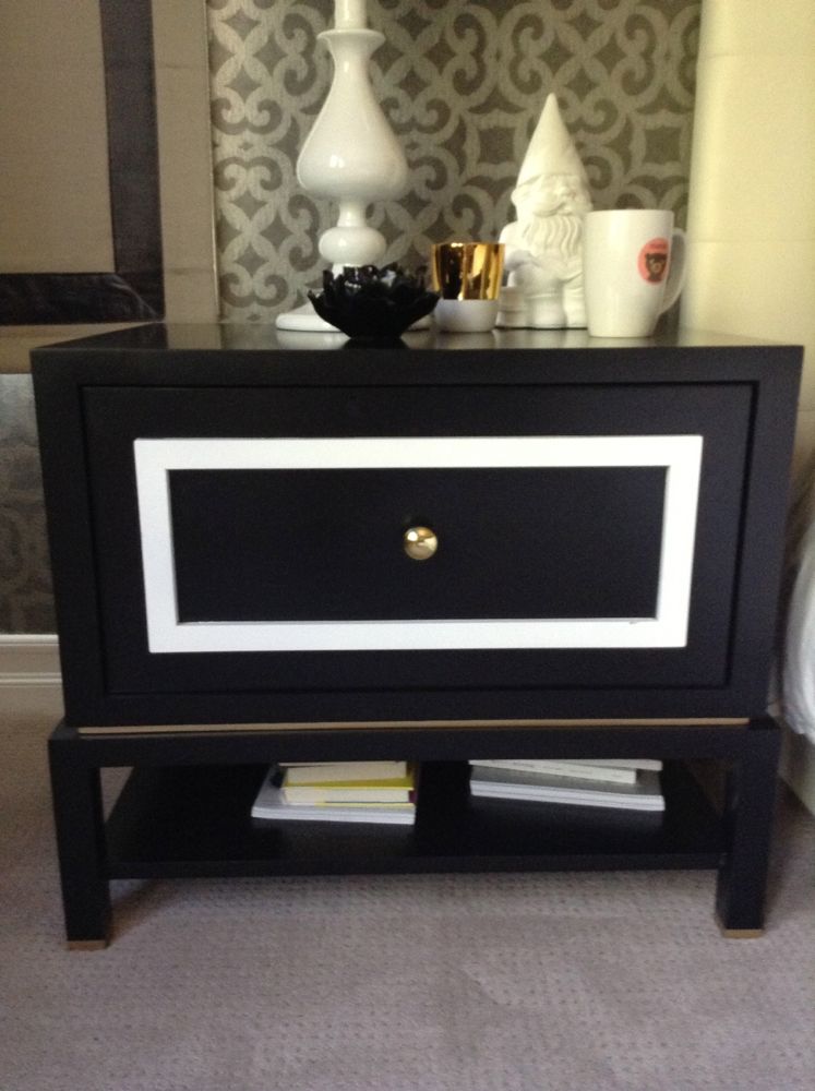
Vintage hardware took this side table to a whole new level.
Here are some before shots for those of you that are curious:
