It’s really hard for me to grasp this concept. I can visualize how a room should be designed, know exactly how I would like a closet to look, how to stage a table or what I want on a wall but what I cannot do is wrap my head around designing a business card. Print design is another world. It is a talent that doesn’t come naturally to all designers or all creative people. How do you express who you are, what your business represents, a taste of your style and get people hooked all with one small card?

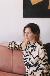
This is why I hired Alexandria Manson to help me with this very intimidating task.  Alex is a young aspiring artist who has launched her business in print design.  She is, right now and probably what should be called, a best kept secret.   Once the word gets out, and it will, she will be well-known as the “go to girl” for stylish, sophisticated, print design for any occasion. She is just an all-around cool girl.

Alex and I sat down last weekend to discuss my logo and business cards.  The first time we met, she spent time getting to know me, learning about what I felt would best describe SMID, understanding why I was starting my own business, and getting a feel for what I am passionate about, etc.  As an action item from our first meeting, I was tasked with pinning business cards that I like onto my Pinterest board so that she would be able to get a feel for what I liked.  This time, Alex presented a PP presentation.  I was very pleased that she was so professional. I was also a bit giddy about it. I have been a professional business woman in business development for 15 years. Now I am working to start my own business and I had someone presenting to me and working to help me with my passion. It is surreal in a way. I was soaking that part in…just a little.

She presented different fonts, color pallets and asked me to talk about the business card samples I pinned and what I liked about each one.  The process was intriguing. Who knew how many options were out there.  The process was also very eye opening for me. I had no idea! Alex has a very calm and soothing demeanor about her, I think if it were anyone else, I might have started to pull my hair out trying to figure out what I want to do.

I want this card to say a lot about me without overwhelming my receiver or crowding the card. I want to get people excited or hooked by handing them a business card after speaking with them about SMID even if they have not seen any of my work. I want for people to leave this card out on their desk for a few days because they love looking at it, because it’s more like a design accessory than a business card. Is that too much to ask? It might be a bit ambitious but I just don’t want this card to be an after-thought or live the rest of its life in a pile of trash. Dramatic? Ok, yes, maybe a little but it should speak to me and speak to you. My good friend, Pam, also stressed to me the other day that in an electronic world, I should really push to be more creative/innovative in this process. She is right! There is just heaps to think about.
image

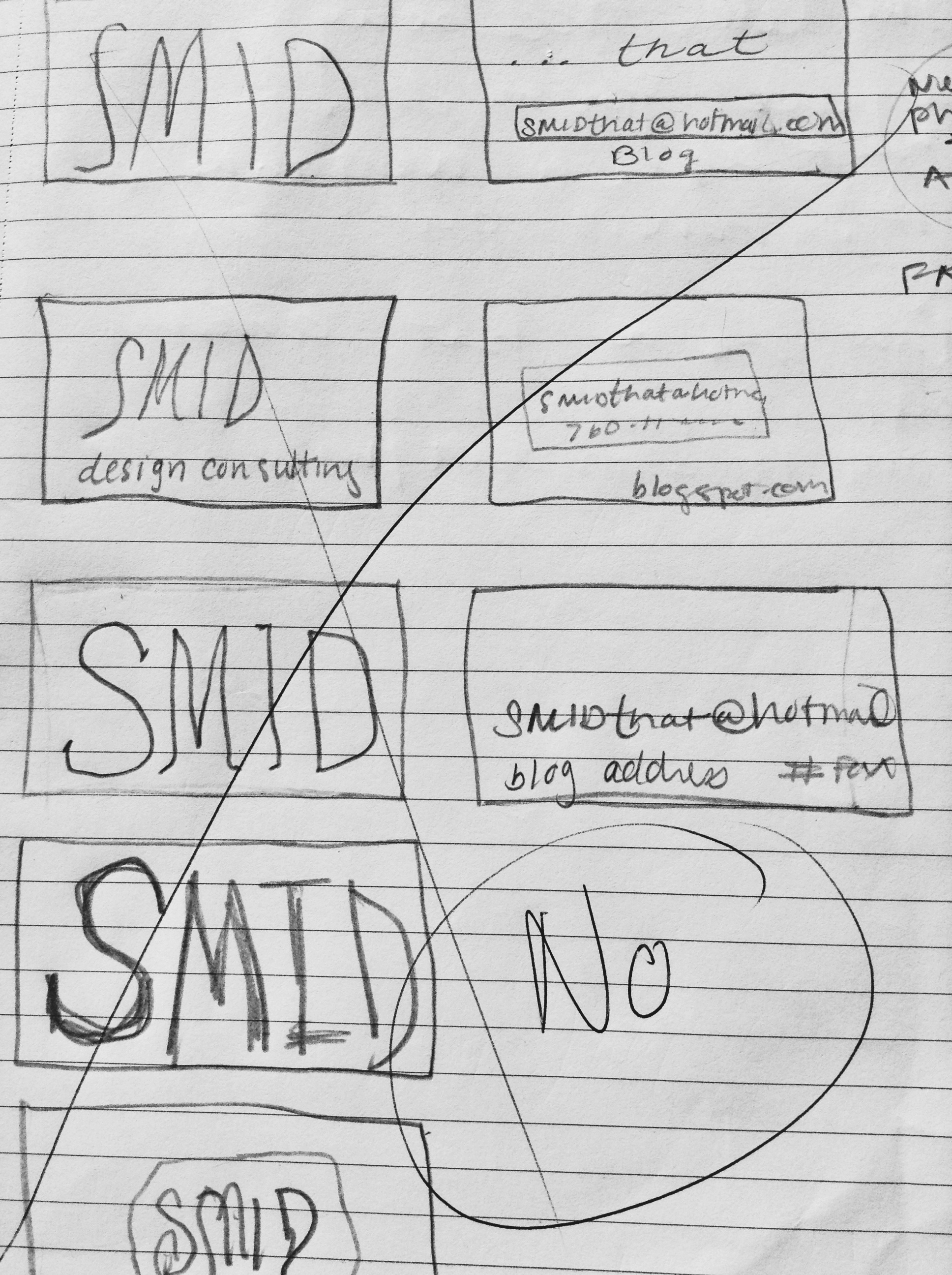
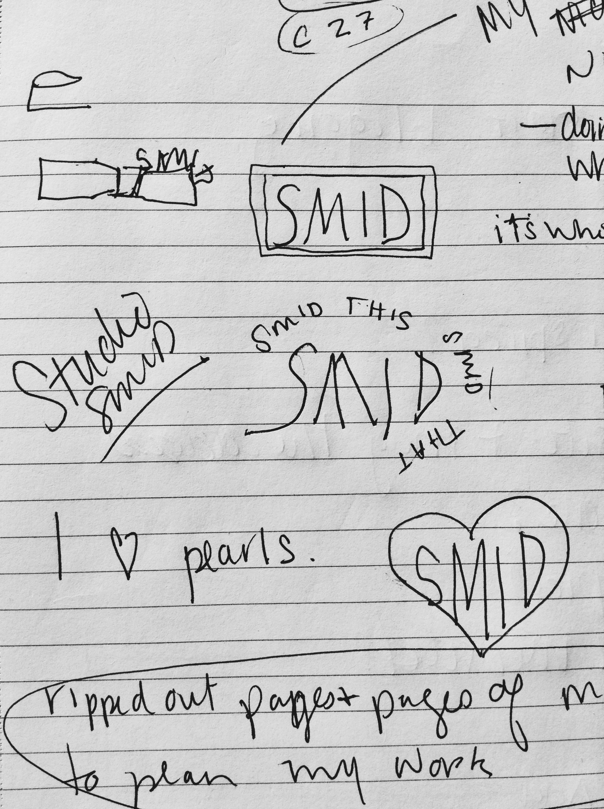
My doodling…hoping to get somewhere.

I wanted to crumble this up and throw it out. I'm just not able to process this.

I wanted to crumble this up and throw it out. I’m just not able to process this.

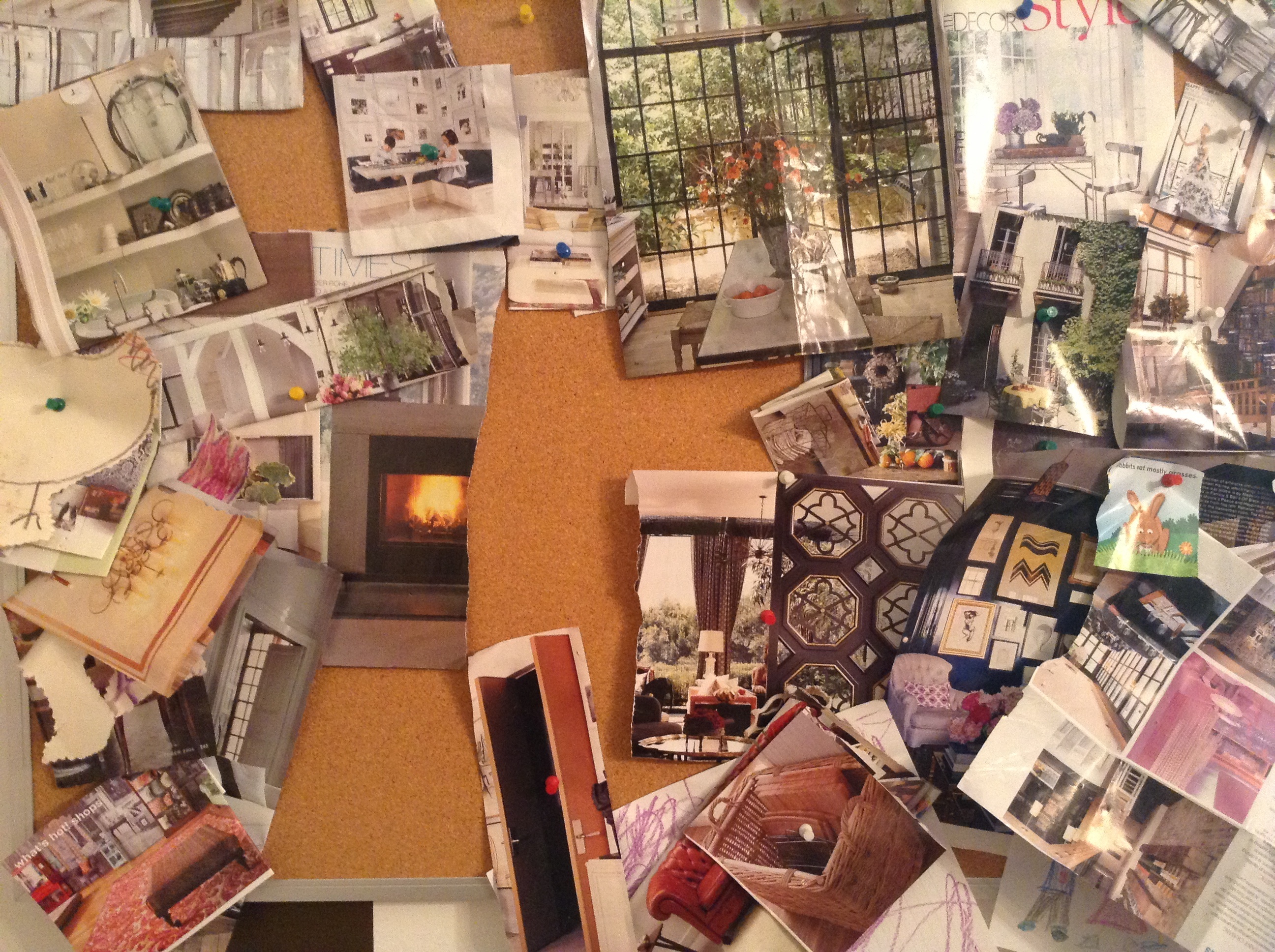
We brainstormed a bit. What do I have in every room besides a little black that I love?  Coasters, trays…I am really obsessed with both but this wasn’t helping me. I love peonies, hydrangeas, chandeliers but really? Alex felt she had enough to take the next step but I felt I was not contributing to the process as much as I should be. I know I am hiring her to do the job but, as a creative person, I am struggling with not providing more. The more I thought about this, the more I thought that I should turn to a process that really helps me wrap my head around a vision for a room or a piece. I decided, if I can story board for those situations, why not story board for my logo and business card? I did it and I feel a bit more at peace with this next step.
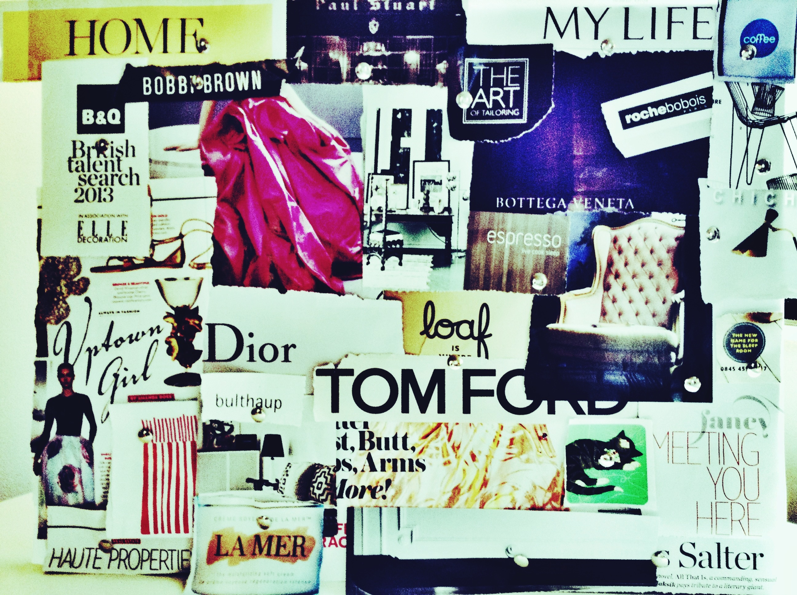
I focused on fonts, colors, textures and contrasts I like. This is not translate literally into what my card should look like but it will help keep me focused on what I like.

I focused on fonts, colors, textures and contrasts I like. This is not to translate literally into what my card should look like but it will help keep me focused on what I like.

I emailed the board to Alex, not knowing whether this would support her efforts or be completely useless to her but, I have now zeroed in on my vision for this card and my logo, which is a very satisfying feeling. At least now, when Alex presents the first round of logos and designs, I will know what I am after and can support her in this very important process. I am sharing this board now hoping that you will get excited about some of the items but I think the most interesting part will be when we can compare the board with the actual card and logo at the end of June. Can’t wait! Here is our planned schedule:

June 1: Round 1 Logo Review
June 8: Round 2 Logo Review
June 15: Round 1 Business Card Review
June 22: Round 2 Business Card Review
June 25: Business Cards To Printer! So stay Tuned!

Hi there. My nickname is SMID. I am starting this blog because I am officially obsessed with interior design. I have finally realized my obsession is a natural talent and an untamed love of mine that others want me to share.

I have been obsessed about interior design for a long time. I am always thinking about design, how to arrange a room differently, how a piece could have been designed better, how people stop just short of an amazing home or room. When I watch movies, I focus more on the home or the interior of the location they are shooting the movie in vs. the story line. In Breakfast At Tiffany’s, I obsess over her white lacquered footed tub used as a couch with a hot pink covered cushion and Fred’s apartment upstairs has insane wallpaper and lighting. In American In Paris, I love that his bed is hooked to chains and rises up and down for functionality and more room space. I will rewind over and over to see his small apartment. In Charades, Audrey Hepburn finds her apartment has been cleared out of everything she owns and I immediately start imagining how the room would look if I had designed it with all the right pieces. In the recent James Bond movie, instead of salivating over Daniel Craig, I am drooling over large wooden planked floors and the detail of his parents home out in the country…trying to figure out how I can get a house like that to design….and I’ve lost the plot.

How would I SMID that? I constantly think about this and ask myself this question. At night I either have a hard time getting to sleep or I will wake up sweating and heart racing because I have figured out a room I am designing, thought of the wallpaper that will make a room or I will come up with a great idea for a piece in my space. I have to keep my journal next to me so I can jot the ideas down and hopefully get back to sleep.

I day dream all the time about the next great piece for our place or how I will design a room to make it more exciting. It drives my family nuts because, I will be with them one moment and then in my head about creative design the next. I started doing story boards a long time ago to help foster my creativity and thinking. It was also to cater to what I considered at the time, my hobby. I love pulling out clippings from decor and fashion mags, fabric swatches, pictures of furniture or accessories that I have found while out shopping and these all go on my board to help me wrap my head around what I want to see in a space. This is what I use to guide my planning and my creativity for a room or a piece I am designing.

image

This is an example of one of my story boards which helped inspire our recent downstairs renovation. I will share this renovation with you over the next few months as it is part of the launch of SMID LLC.

My husband, Stewart, and I have a running joke. We have designed rooms or come up with creative ideas about how to stage a room, choose a color or a wallpaper that is very different or make a piece more exciting and then we will see a similar idea carried out in the center spread of Vogue Living or in Elle Decor. We always joke about someone having bugged our house or a mole that hangs out with us and leaks the information. It’s our joke and we are totally having fun with it but it is really strange, very exciting and encouraging for me still.

A couple of years ago, we decided to try and sell our house. We were thinking about leaving California. It was a time in our lives where our kids were very young and we were constantly reminded how we longed to be near family to get some additional support. When we had our first open house, our realtor, Neda Nourani called us so excited. We had an offer on all of our furniture!!?? I said, “what about the house?” She said this would come next but that everyone loved the house and was freaking out over the design of it. Three months into the listing, every couple that viewed the house asked if I was an interior designer and wanted to see more of my work. Stewart and I had renovated the upstairs of our house at that time but we had not even touched the downstairs yet other than our furniture. I was ecstatic about the feedback. Neda, whom we loved working with and deeply respect, also encouraged me. It really got me thinking about taking a risk in my life and doing something that I am passionate about.

Long story short, we took our house off the market. We decided to stay and explore this opportunity. I have gone through what I guess is normal since then; scared phases, being excited, ready to drop everything to do this and the doubt phase. I am very fortunate to have had some very special people enter my life and ones that have always been supportive of me and have pushed me to believe in this next step of my life. I am also inspired by many of the amazing and talented designers and design bloggers that are out there who have taken this risk.

So I am going for it. I am excited to be joining this talented group of people. I am so excited to share my vision for design with all of you. SMID Inc. will be launching August 29th. Through the redesign and final renovations of our house, we are preparing for the launch party. Project SMID is finally kicking off and I am going to share this crazy ride with you. It will be a stressful few months but I am excited to have you with me.

-SMID

Take a look at a few pictures of my work and let me know what you think.

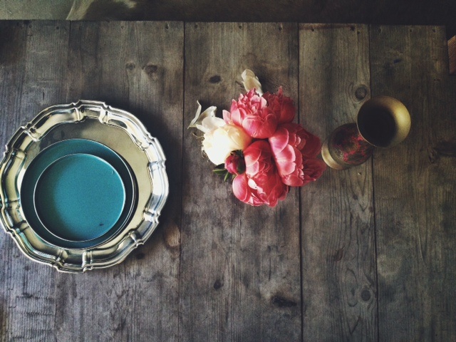
This is our wooden coffee table which was found on the side of the road. It's an old work bench that we left outside under cover for two years. It weathered beautifully. When we renovated the downstairs, we needed a coffee table. We needed something that wouldn't take away from the glam in the room but work with the deep grey walls and original concrete floors to ground the room so it wouldn't feel over the top. We wanted this room to be a work of art, have an edge to it but be inviting.

This is our wooden coffee table which was found on the side of the road. It’s an old work bench that we left outside under cover for two years. It weathered beautifully. When we renovated the downstairs, we needed a coffee table. We needed something that wouldn’t take away from the glam in the room but work with the deep grey walls and original concrete floors to ground the room so it wouldn’t feel over the top. We wanted this room to be a work of art, have an edge to it but be inviting.

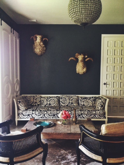
A little snapshot of one of our downstairs rooms. With the grand doors I found and the ridiculously cool sheep heads I scored in a resale shop, the silvery animal skin rug, antique chairs and vintage sofa, I needed the dark grounding walls and the raw coffee table to off set things and keep it unexpected. My favorite thing, juxtapose. It keeps things fun and interesting.

A little snapshot of one of our downstairs rooms. With the grand doors I found and the ridiculously cool sheep heads I scored in a resale shop, the silvery animal skin rug, antique chairs and vintage sofa, I needed the dark grounding walls and the raw coffee table to off set things and keep it unexpected. My favorite thing, juxtapose. It keeps things fun and interesting.

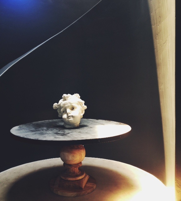
We call this guy, creepy baby head. This is one of my favorite finds. It is a sculpture of a baby cherubs head. It's absolutely gorgeous yet terribly creepy in some ways. My dear friend Jeannie, and an antique dealer, saved it for me. She has the other one and I think there is only one other.  It's sitting in our entrance way and makes such a statement.

We call this guy, creepy baby head. This is one of my favorite finds. It is a sculpture of a baby cherubs head. It’s absolutely gorgeous yet terribly creepy in some ways. My dear friend Jeannie, and an antique dealer, saved it for me. She has the other one and I think there is only one other. It’s sitting in our entrance way and makes such a statement.