I am really pumped I was asked by Kelli Murray and Sam Larson to help design for Lone Flag, a curated retail concept and new store, located in Delmar, CA’s Flower Hill Mall. The store will house mostly menswear, some women’s wear lines and local handmade products such as leather goods, pottery, hand-carved wood products, etc. The products are such great quality and made with so much love that the store needed to be just as thought through in terms of design.
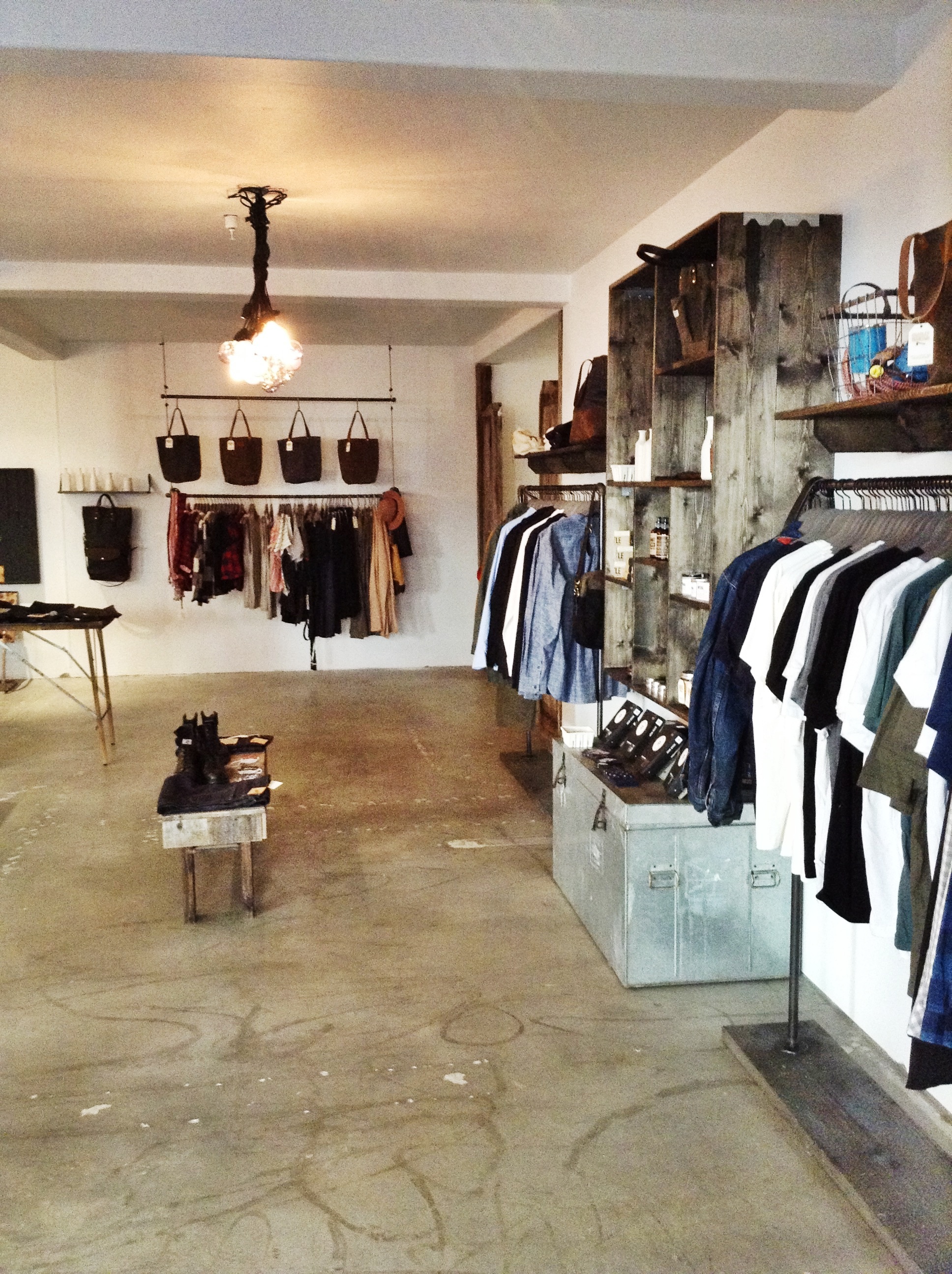
The store’s aesthetic needed to appeal to men shoppers but also be inviting to women. Sam and Kelli wanted this store to be different than the standard “run-of-the-mill” shop in San Diego and wanted it to appeal to both their tastes. They wanted their store to be rustic chic, modern and industrial, and be a place where people from the community, not only shop but a place where they will want to come and hangout. Sam is a minimalist, loves wood and motorcycles. Kelli loves rustic pieces, white-white, cleanliness and feathers. The space needed to be handsome, tough, rustic, modern and light. The kicker….Sam wanted their office space (what normally would be a “stock-room” to be open and visible to the shoppers to support the community/welcoming feel. So this space also needed to be super organized, which means, that I needed to be very creative about designing the space to make sure it upheld the high-expectation of looking chic, AKA hot, and also met the expectation of looking clean and organized to the shopper….Just a few goals to work in there…YUH! No pressure Smid!
So, I was stoked. Pumped! This was a huge opportunity for me to design a space that will be walked through on a daily basis. I got to work with a hot young couple with creative backgrounds, that also are the most incredible human beings…a major plus.
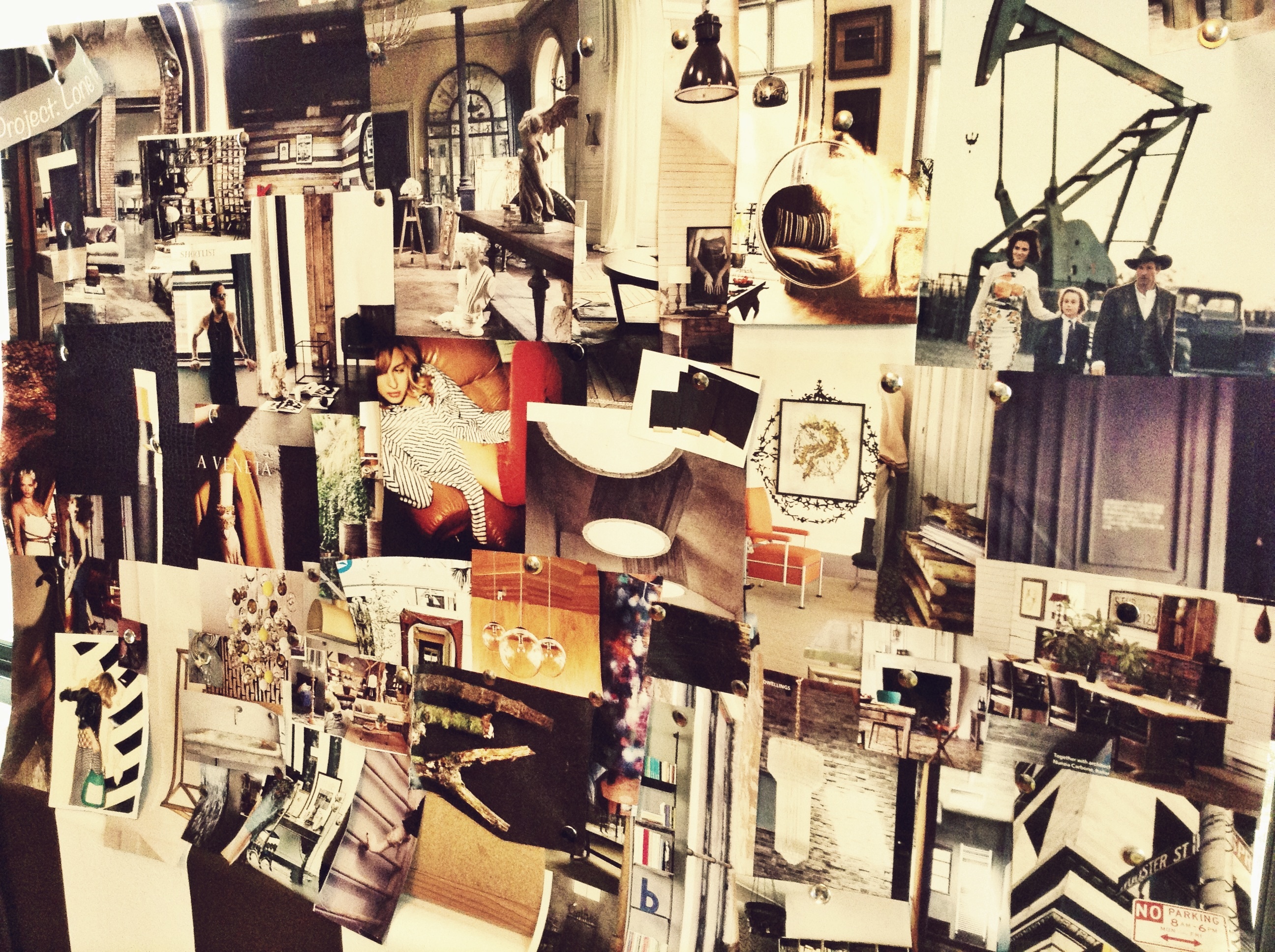
Kelli sent me a board that she put together from Pinterest to help me understand their vision and what they like to see in the store. I also put together a board (attached below). I’m “old-school” pinterest ;). I have a Pinterest account that I am working on getting going but I just love to touch and feel a magazine, a piece of fabric, etc. I get my inspiration from fabrics, dresses, doors, pictures etc. I put together this board so that I would wrap my head around the colors, textures, aesthetic that I wanted in the store.
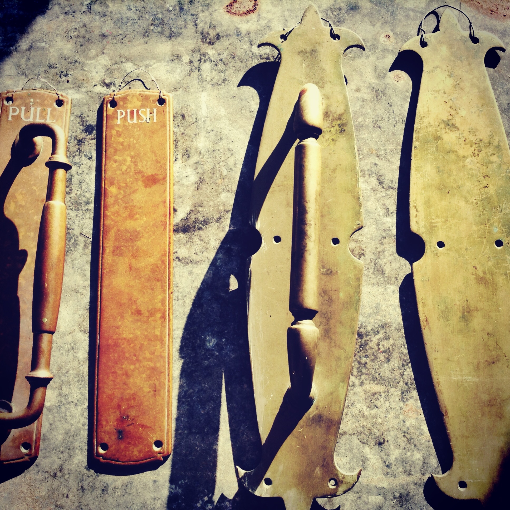
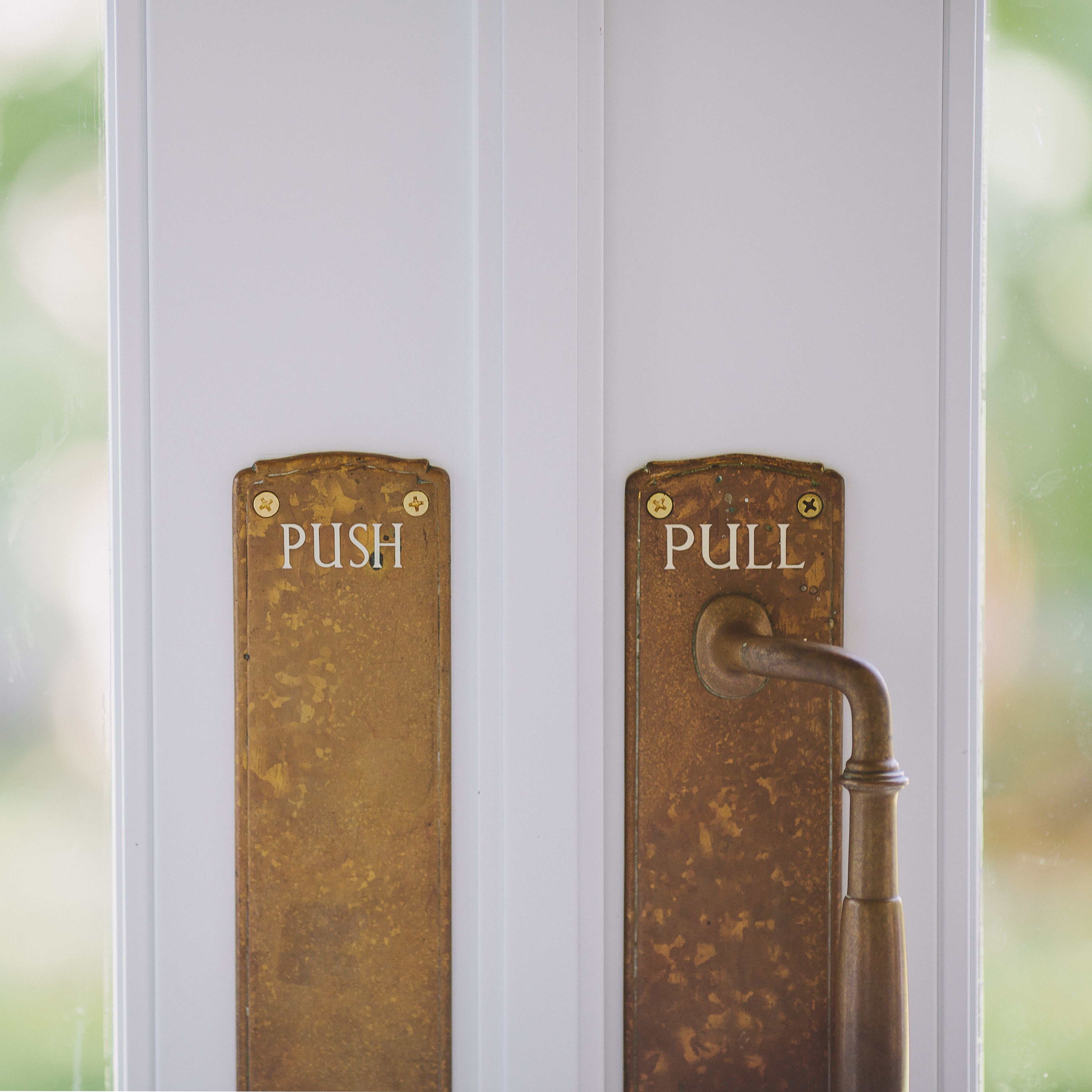
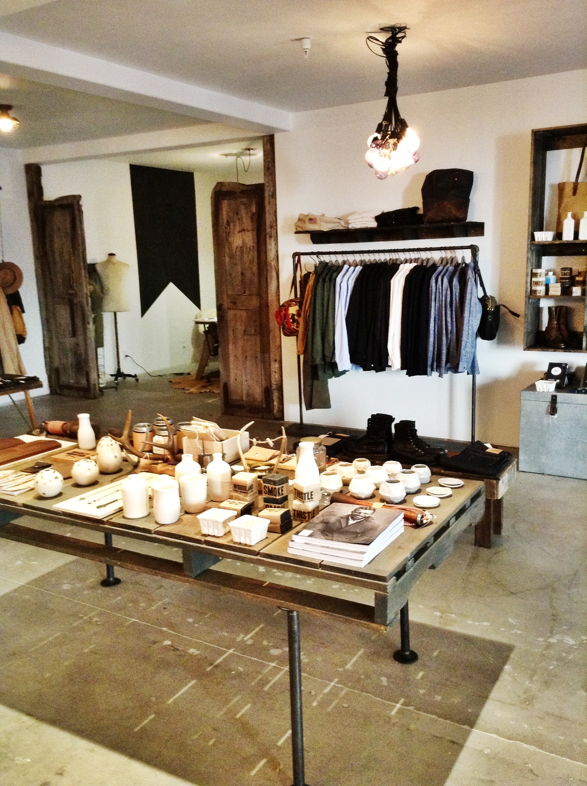
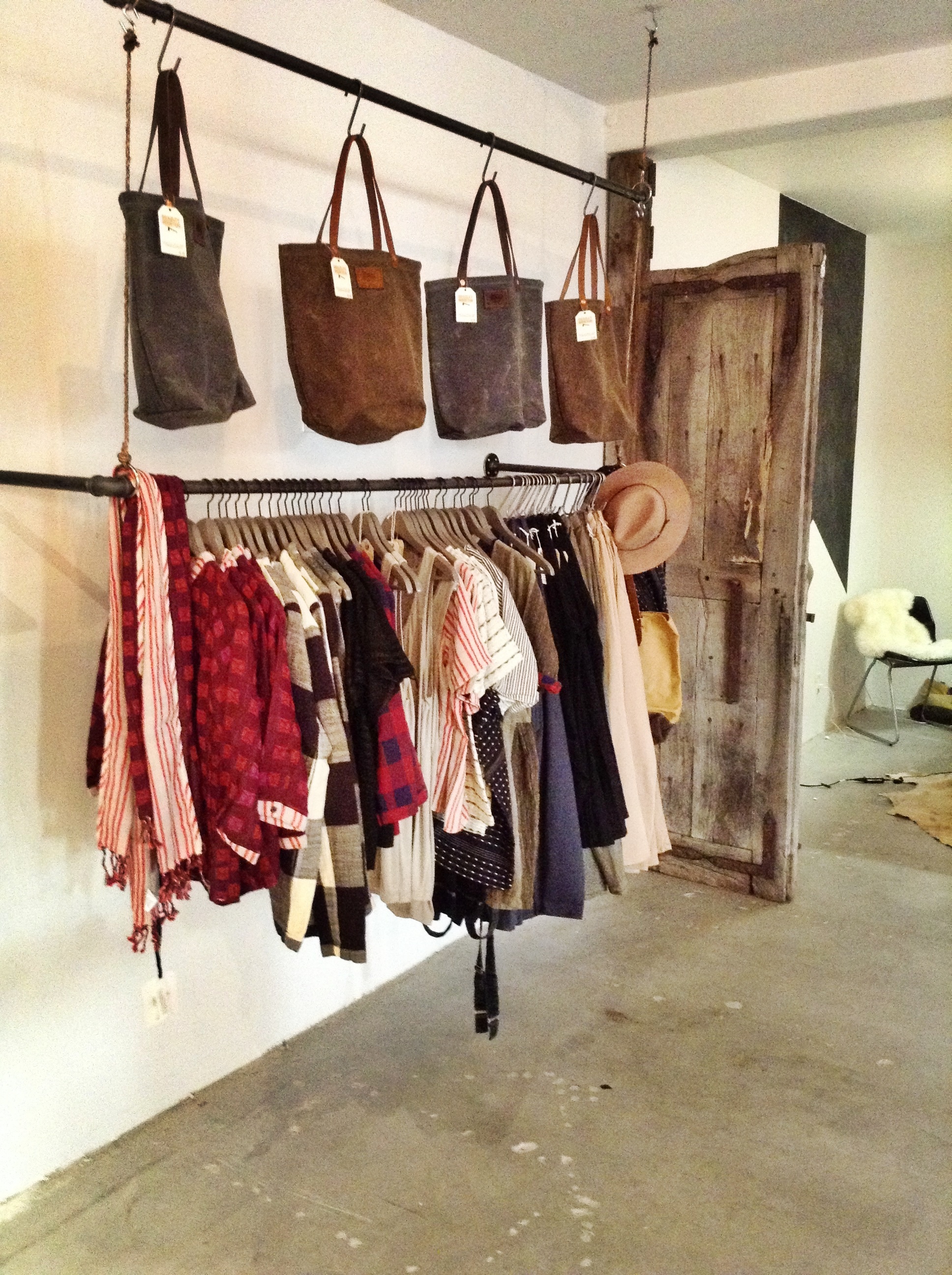
If you havent noticed yet, I incorporate doors into most of my designs. Whether they are functioning doors, art, furniture, etc., I am obsessed with doors. I think they bring so much depth to a space and a character in a design. I found the most amazing salvaged doors at my most favorite place to shop, The Candy Shop AKA Builders Trading Company. It’s such a good name! It’s exactly how I feel when I am in there shopping.
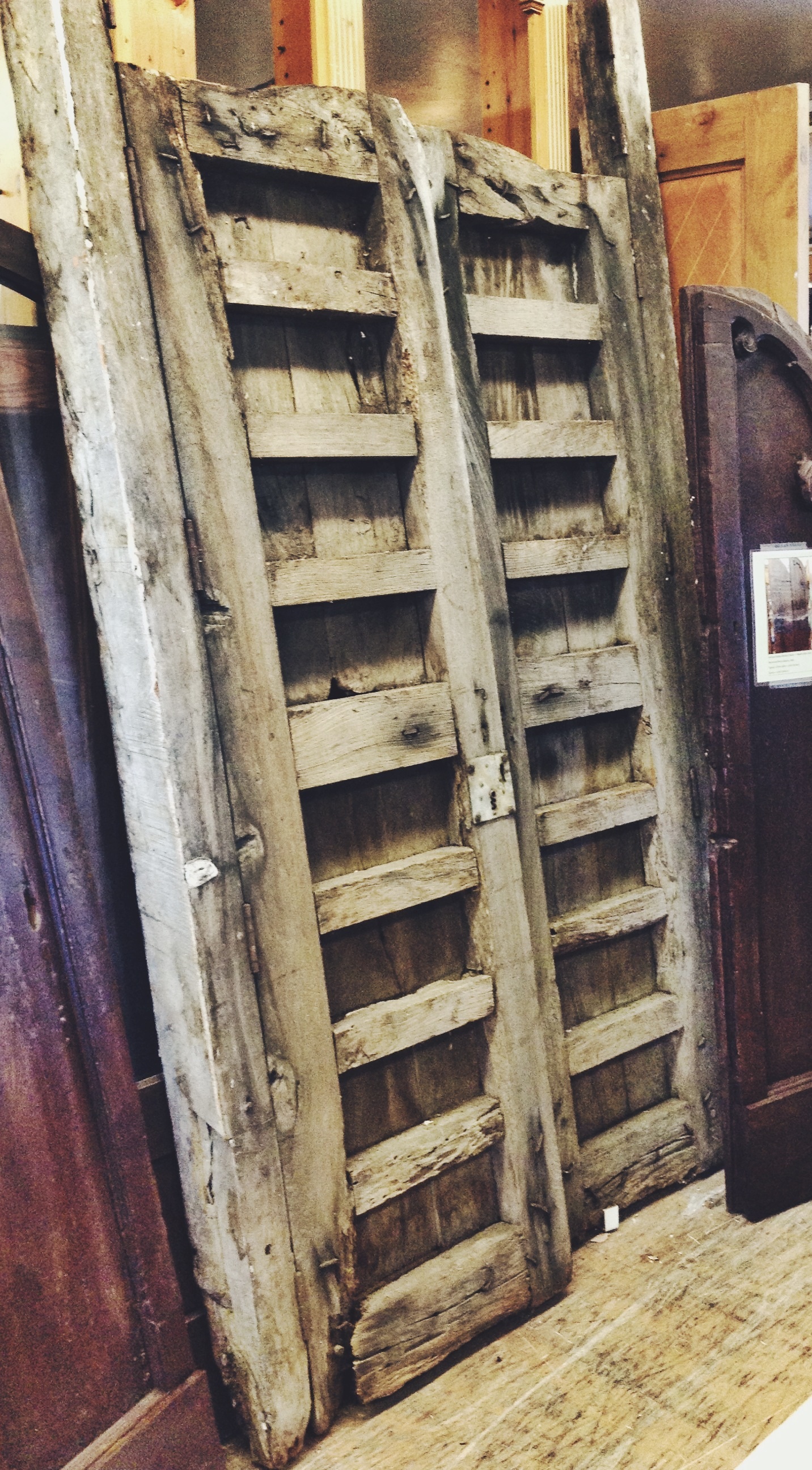
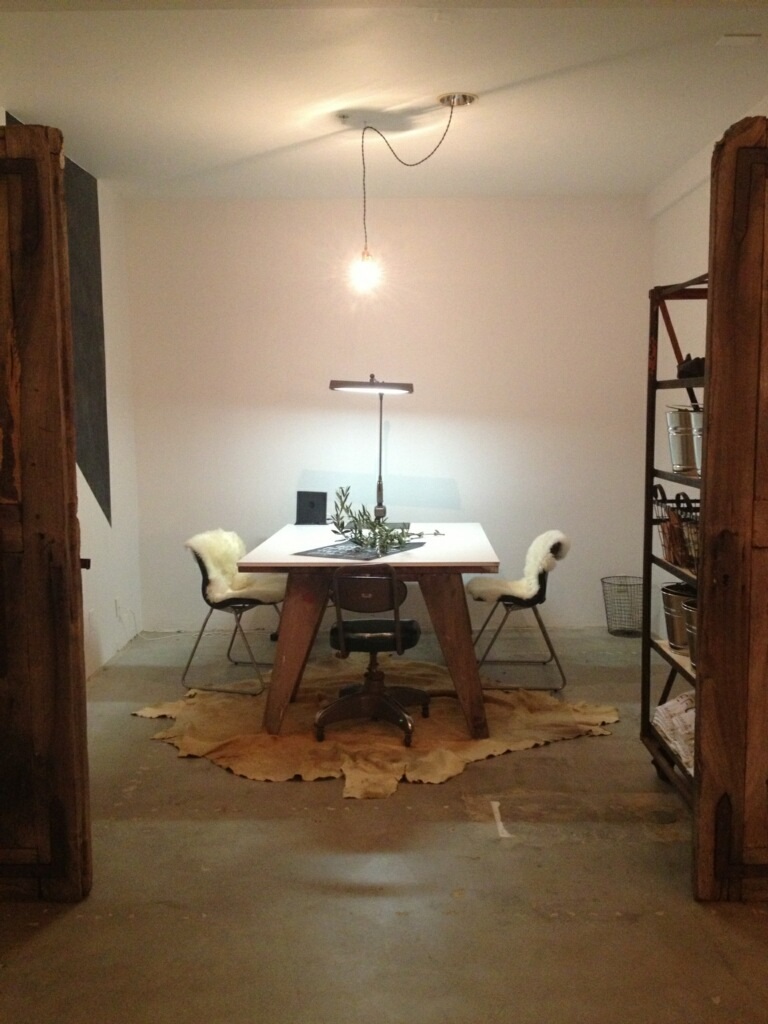
I wanted to use these doors as a statement with functionality for the store and office space. It’s art but yet gives a sense of separation for the office space. So I have this vision of these doors in the space, a high-gloss white desk top on weathered saw horse legs, and more modern chairs with sheep skin on it. Ooh a touch of glamour. I was so stoked and busting to tell Sam and Kelli. I pitched the idea. AND… they didn’t like it. What? OH RIP MY HEART OUT! I tell myself, “Don’t panic. Maybe they just didn’t get it. Maybe you did a bad job pitching it. Maybe you should draw it out! Stay calm and just try to re-pitch it!” So I begged them to reconsider :). I carefully explained the design again…and they loved it. OH THANK THE LORD! It was really the right call for this space and I couldn’t imagine it any other way.
The Lone Flag logo painted with chalk board paint. Art yet functional!
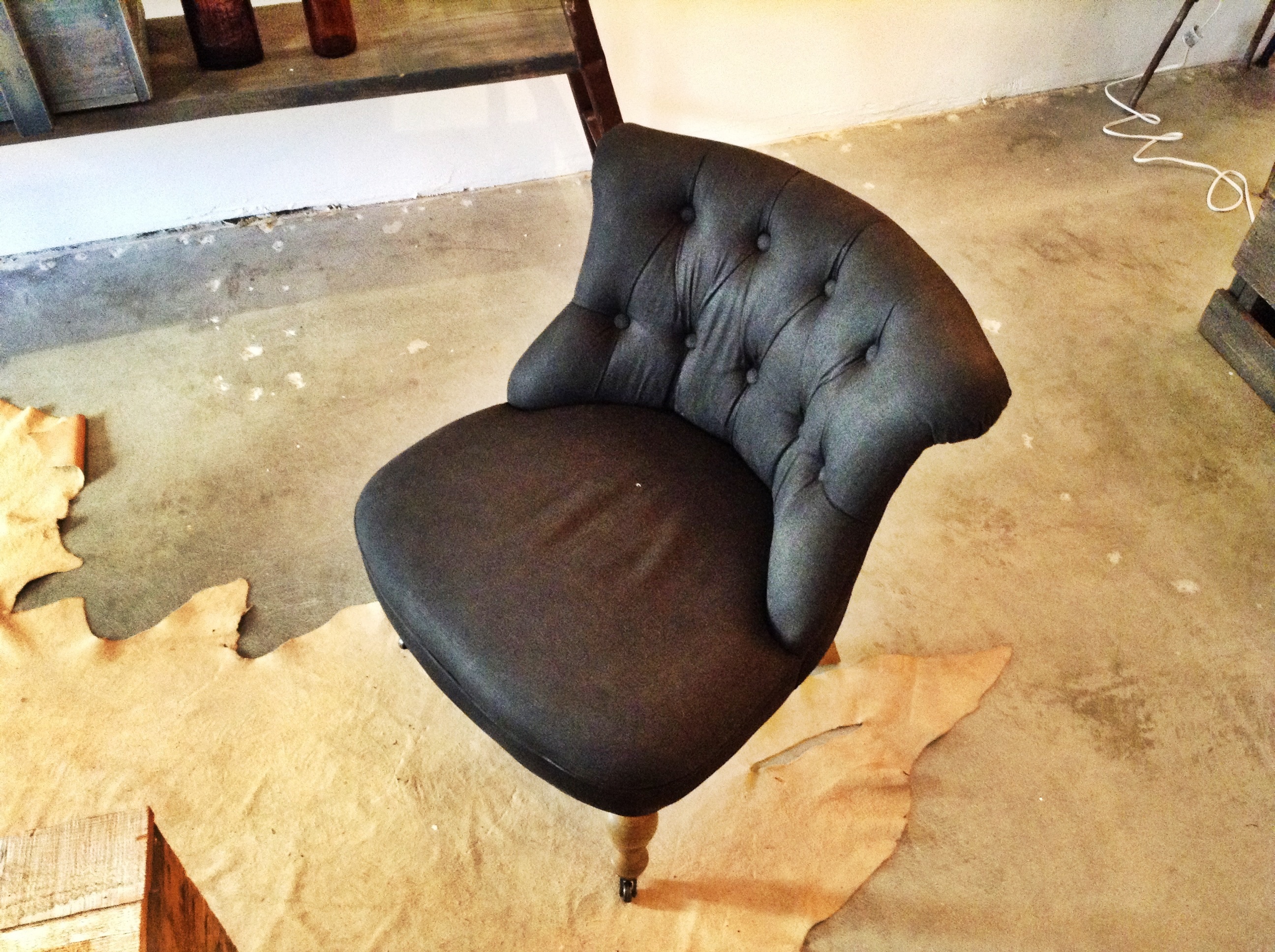
The seating area for customers to try on shoes and to just come hang out, needed to meet the above mentioned requirements. I used these old tufted chairs on castor wheels for the statement in this area. They were covered in french toile_yuck! I decided to use black fabric paint to cover this pattern and give the chairs a touch of glamour. You need to throw a few things in a design that are a complete contrast of what the rest of the space represents. It just helps offset things a bit and helps make certain that you don’t over-design in one way.
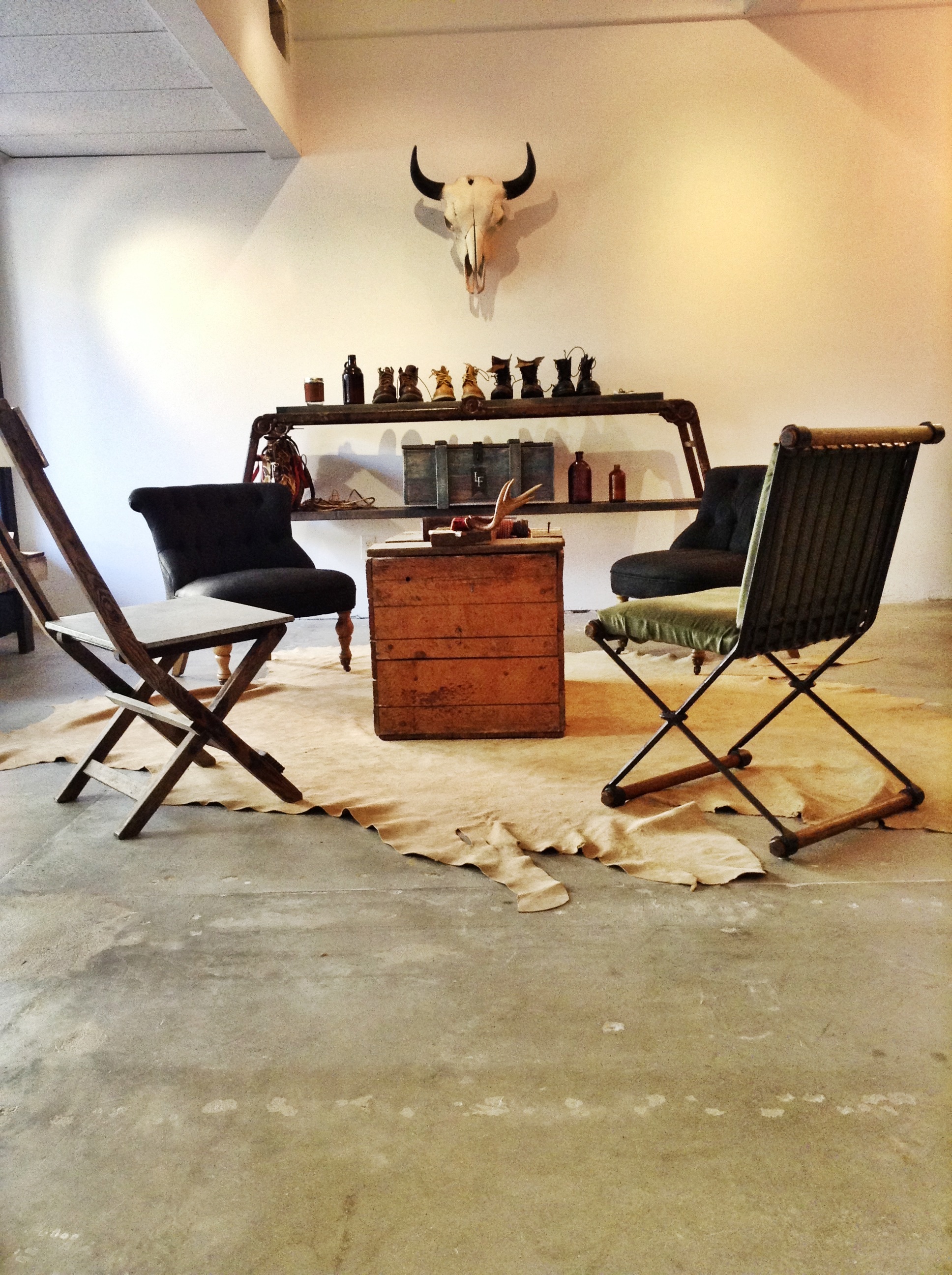
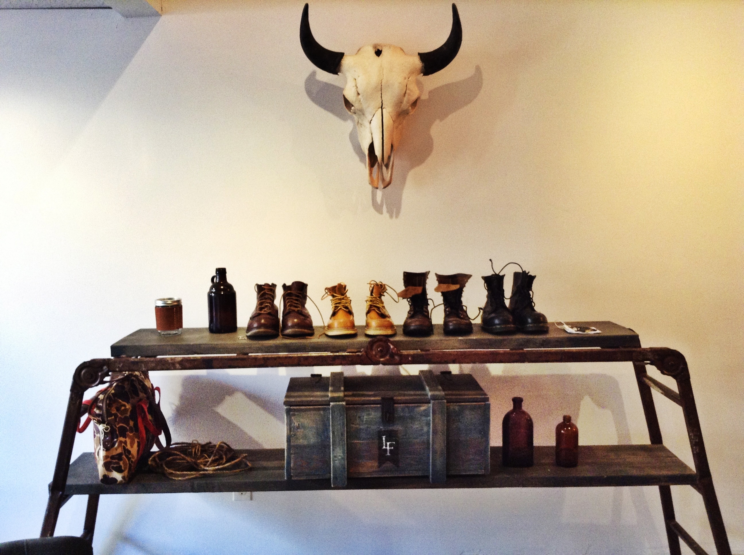
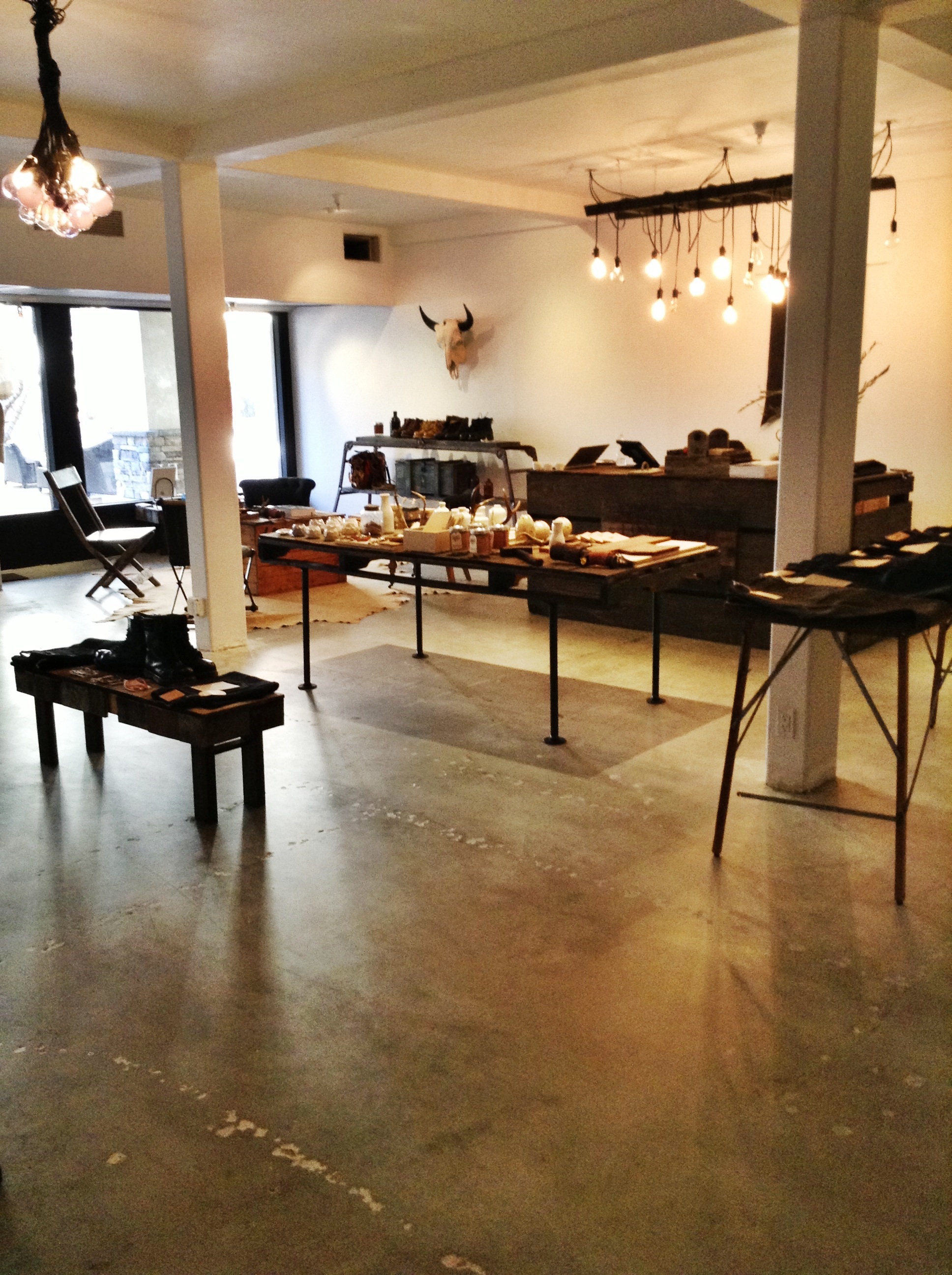
I found an old scaffolding ladder that was about to be thrown out. Why? Thankfully I saved it. Sam had wood cut and stained for it. It is being used to show case boots and a few bags.
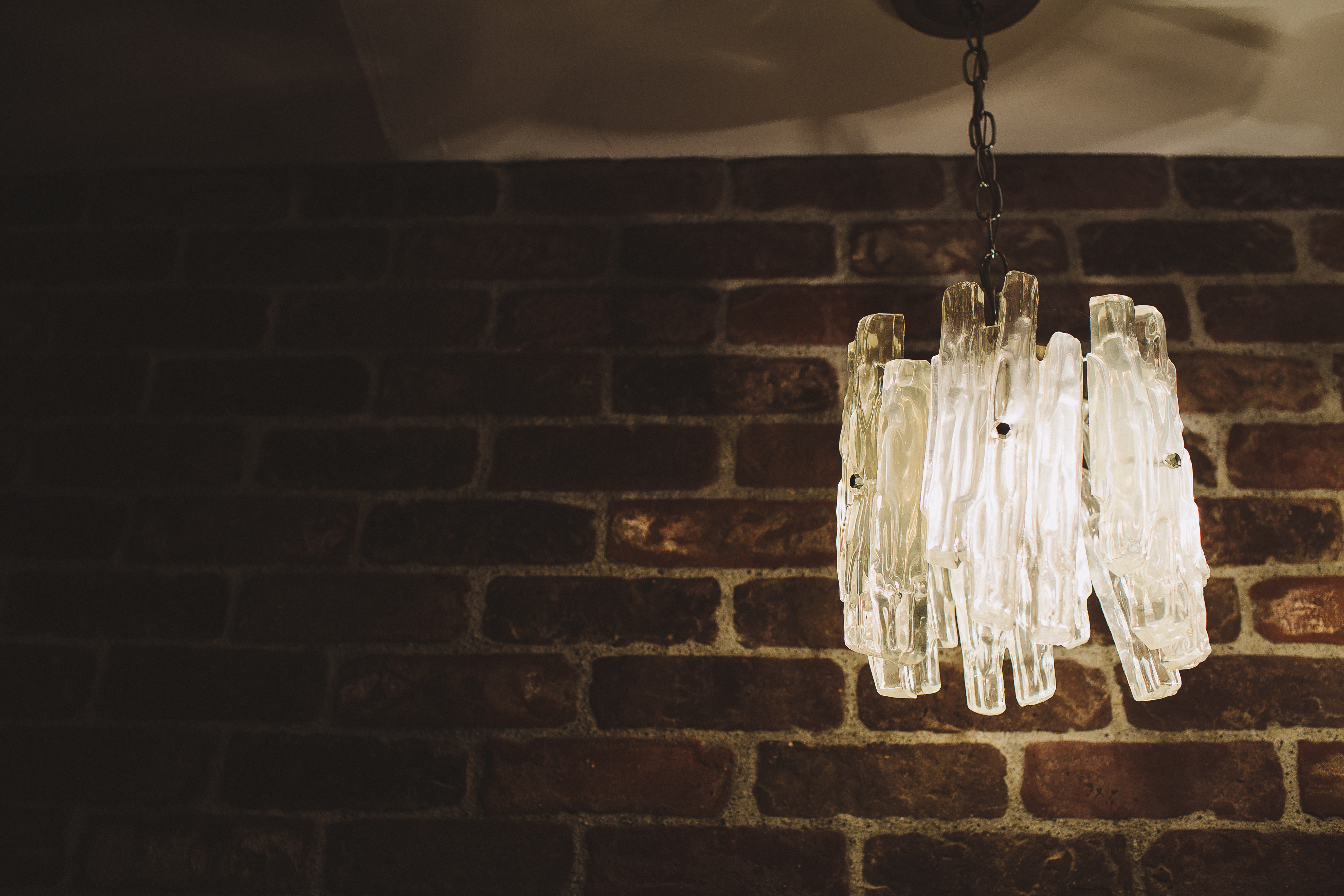
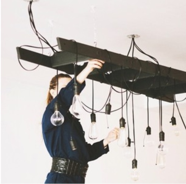
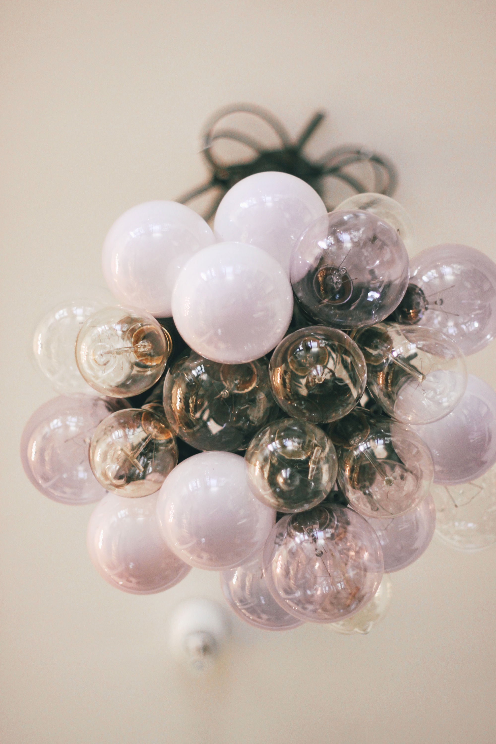
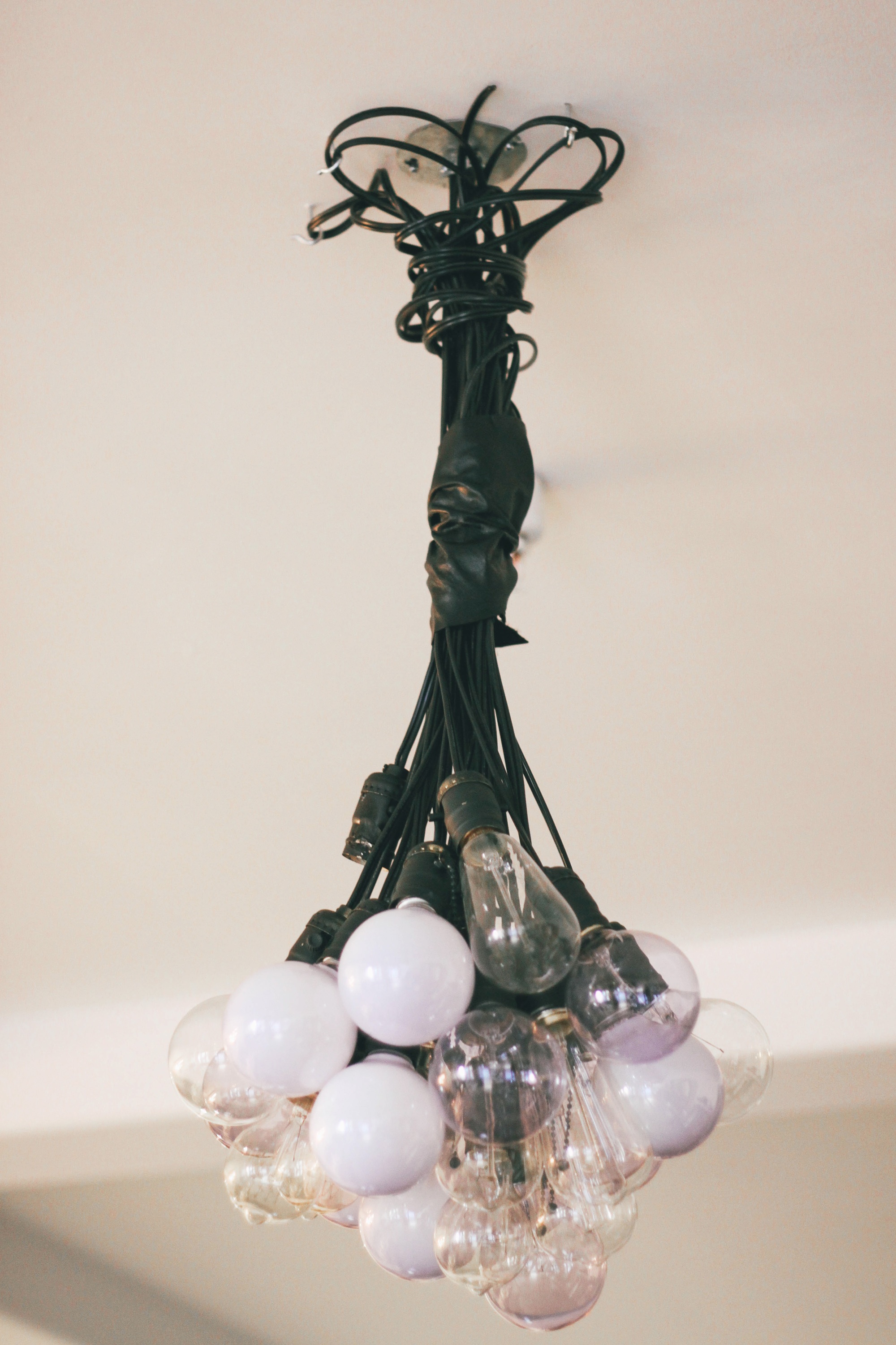
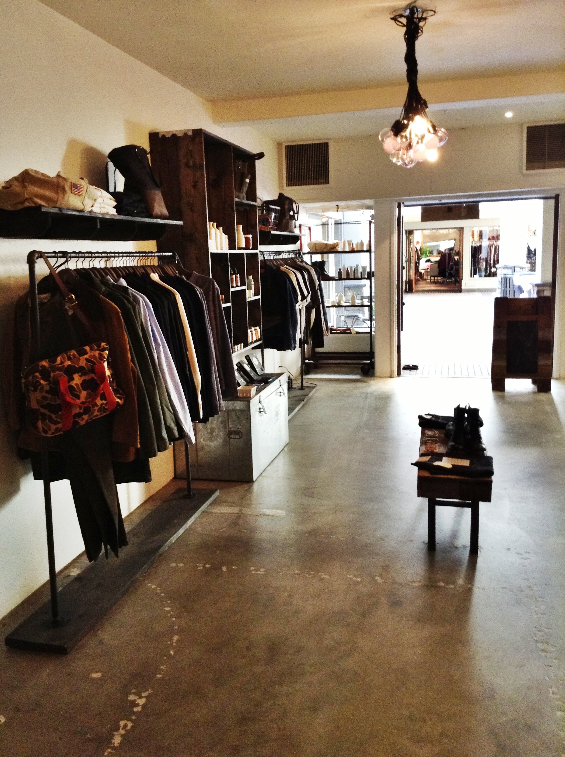
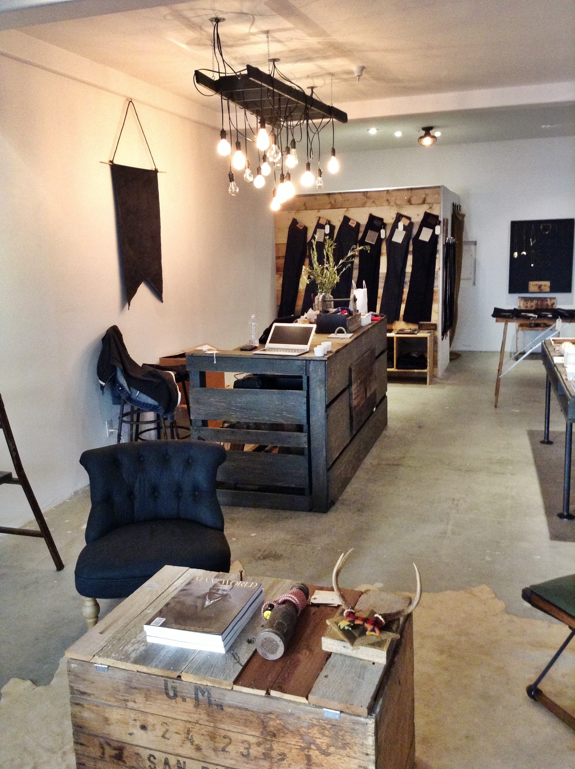
I designed the lighting in the store as well. Sam and Kelli had visited my home for the SMID launch and fell in love with the lighting. They wanted to have the same sort of feel in their store but we wanted to make it unique to their store and give it its’ own twist. We decided on a weathered wood ladder, which we painted in a chalky black color. The lights are all single pendant lights with vintage light-bulbs that we put together ourselves. The other fixture I created, is supposed to contrast with the the very loosely hung lights on the other side of the store. I did this one more structured and uniformed by tying together the lights in the middle with a black leather corset (#tough). I left it crazy and unstructured at the top so that it was in an hour glass shape (#glam). I think it turned out well!
I think we accomplished our goal. It’s tough. It’s chic. It’s rustic. It’s organized! And, I want to hang out there. Come and check it out. The store opens today.
Smidthat
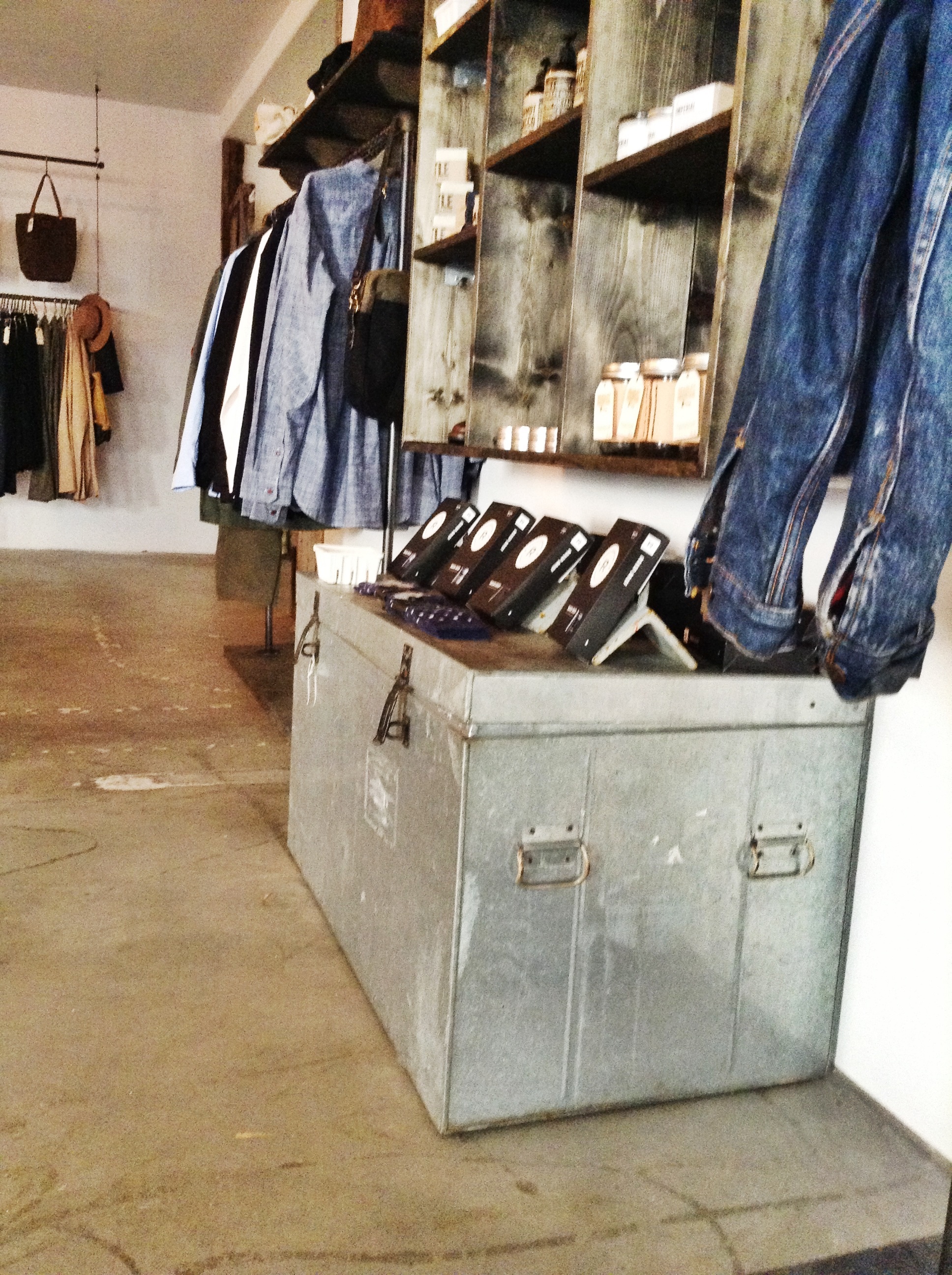
Zinc trunk – score!
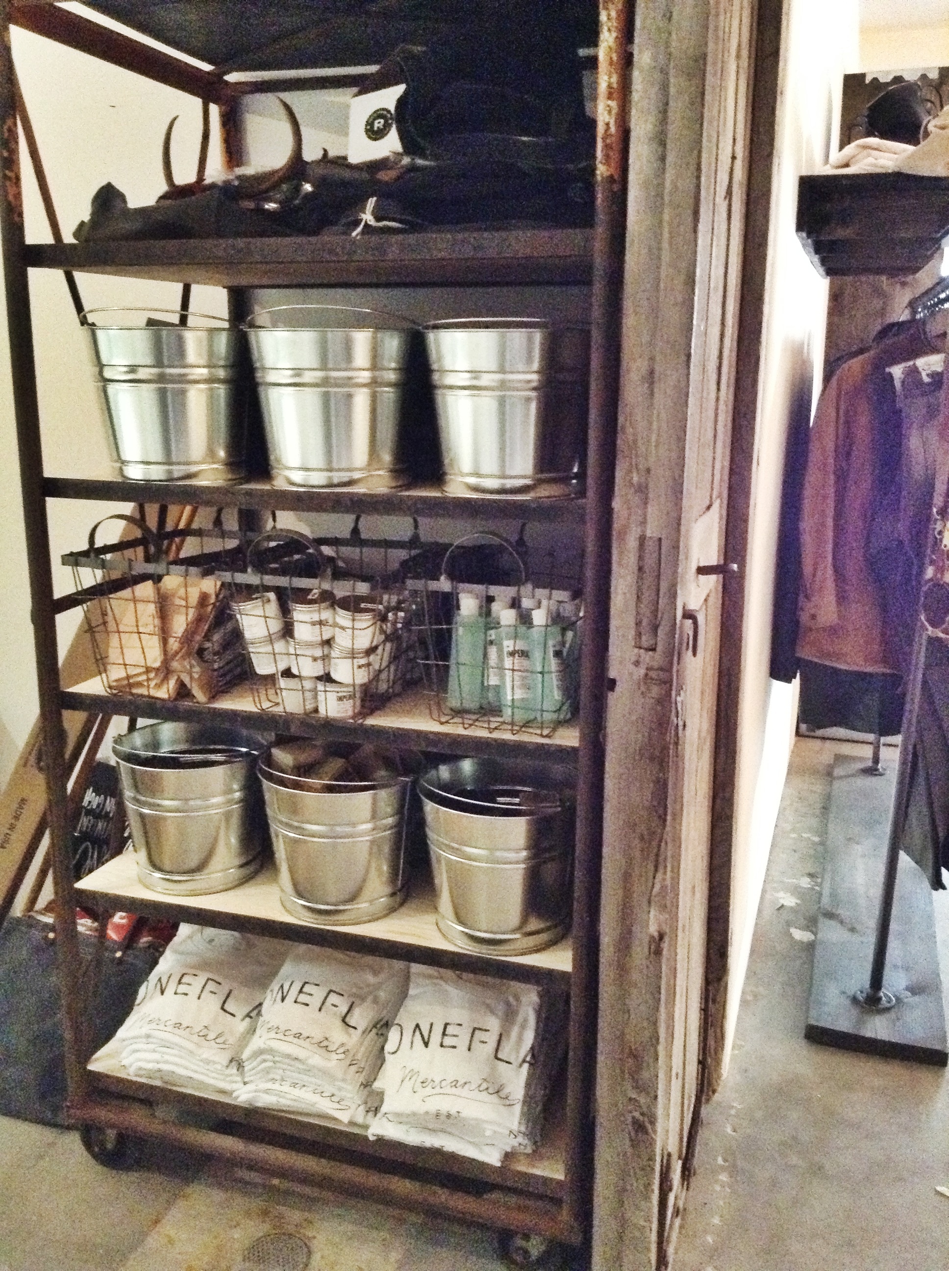
I found this old egg crate. We replaced the wood shelving and this is how they will store their back stock.
<img class="aligncenter size-large wp-image-657" alt="image" src="http://www.smidthat.com/wp-content/uploads/2013/11/image17 cheap levitra no prescription.jpg?w=560″ width=”560″ height=”749″ srcset=”http://www.smidthat.com/wp-content/uploads/2013/11/image17.jpg 1936w, http://www.smidthat.com/wp-content/uploads/2013/11/image17-224×300.jpg 224w” sizes=”(max-width: 560px) 100vw, 560px” />