Since moving into the design space, I’ve noticed that I get so wrapped up in designing other people’s homes/projects, that it literally consumes my mind. I’ll be mid-sentence and have a design idea pop into my head and I run away with it.  I obsess over the last additions or final details that go into a room.  The details  are what make a space after all.

Fortunately for me, this obsession and kidnapping of my mind, is quite enjoyable.  The challenge I’ve faced however, is when it comes to my own home, decorating for the holidays or preparing for these traditional dinner parties, has been left to the very last minute. I have failed to meet my own expectation.  I found myself saying, “I’m sorry the linens don’t match.” Or, “Just grab whatever plates and put them on the table please.”  Really? Yes, I know. I am appalled with myself too.

If designing is my obsession and one of the things that makes me insanely happy, why should I look at my own dining room in disgust? I put hours and hours into researching a project to pull all the details together.  Colors and textures should work to compliment each other. I must accomplish the perfect pairing of juxtaposition. Clearly a well designed room is important to me. This is also what I do for a living.  I decided.  I really have no excuse.  This could and should be considered part of my work.

I was sharing all of these feelings recently with my friend, Farra Miron of Hostess Haven. Farra shared the same frustration! I am sure many of you do too. We decided we could partner up to accomplish our goal of staying ahead of the holidays and preparing ourselves better. It’s important to us that we enjoy the holiday, enter it calmly and are at peace with our own homes. It started as venting between the two of us and then evolved as a business concept.  We wanted to be able to share this with our viewers in hope that you would get excited about the concept and also gain ideas for your holiday parties. With Farra’s incredible taste in vintage glassware and killer table scaping, and my eye for designing the overall space,  it could only be magical, or Smid Haven….Right?  Do you love the name?

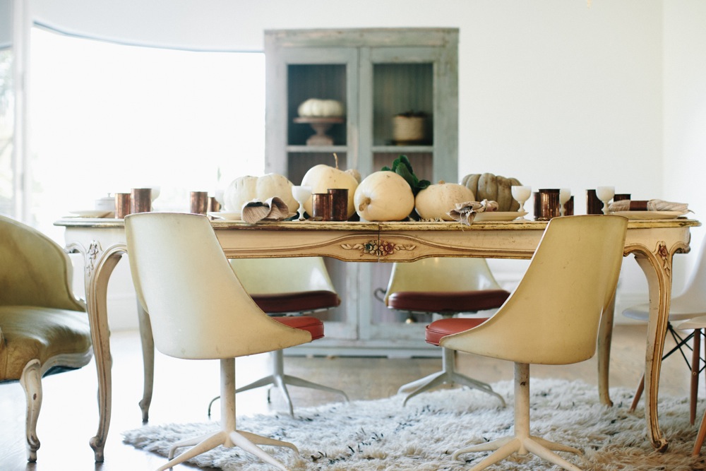
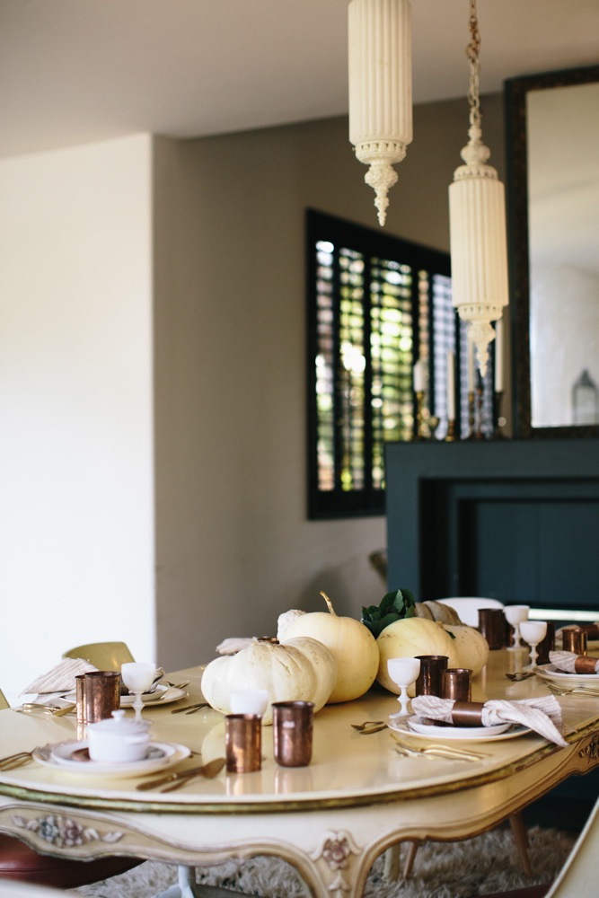
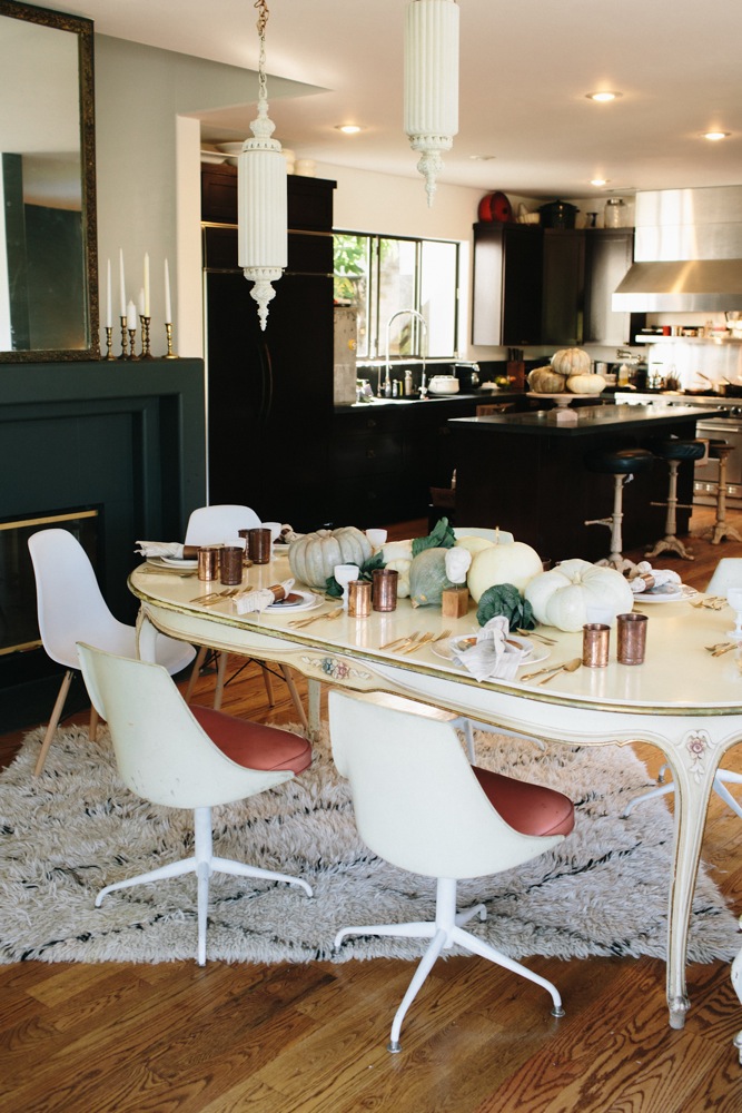
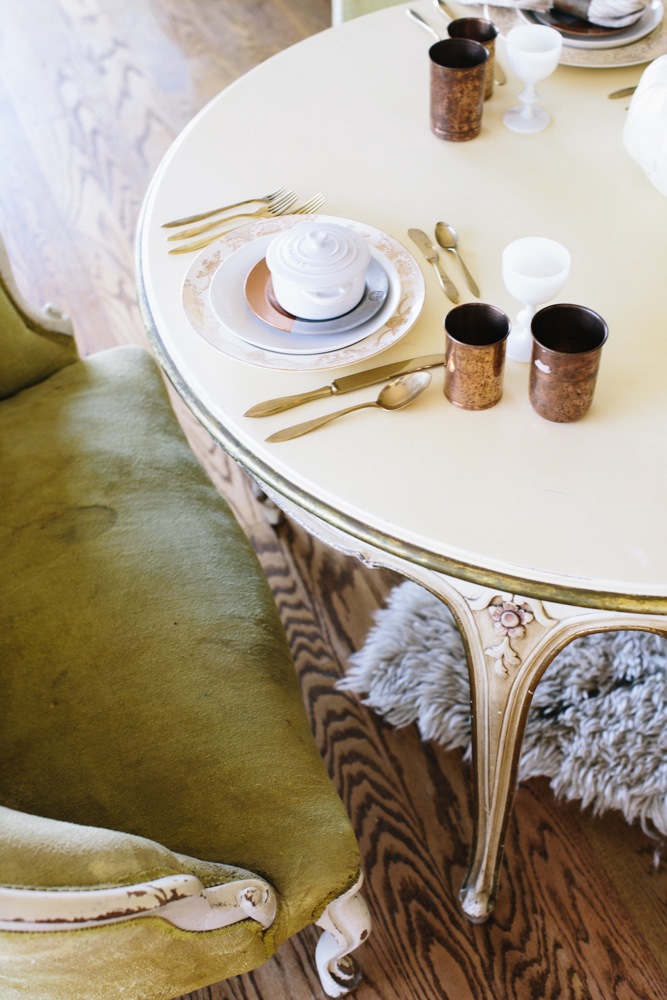
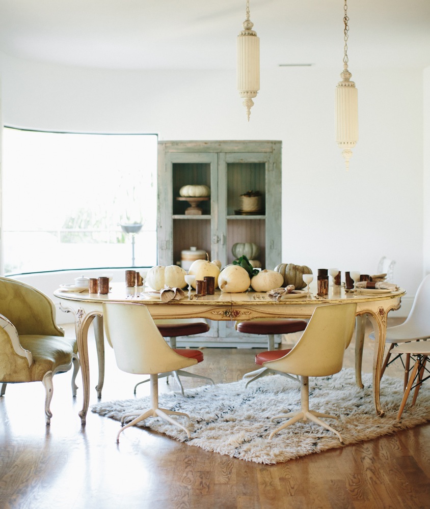
For the first of this series, we designed a room for Thanksgiving.  I had been acknowledging that whenever my home had been featured for design, the dining room had never been selected. I too have not posted any pictures. The reason being, my dining room was not quite complete. My taste has evolved and I was growing tired of it.  I have a beautiful antique cream colored dining room table and all matching chairs with blush and green upholstery.  It is a beautiful table. But I like to design with a bit of an edge and with some juxtaposition in play.  We decided to use my space for this first photo shoot to provide myself an opportunity to revitalize my own dining space and get excited about my table again.

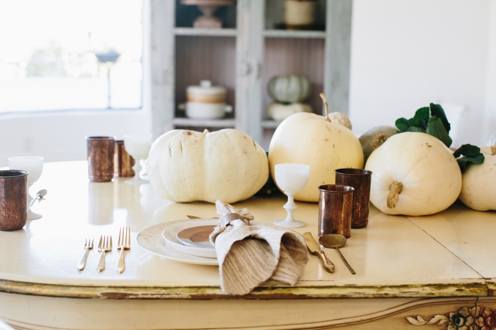
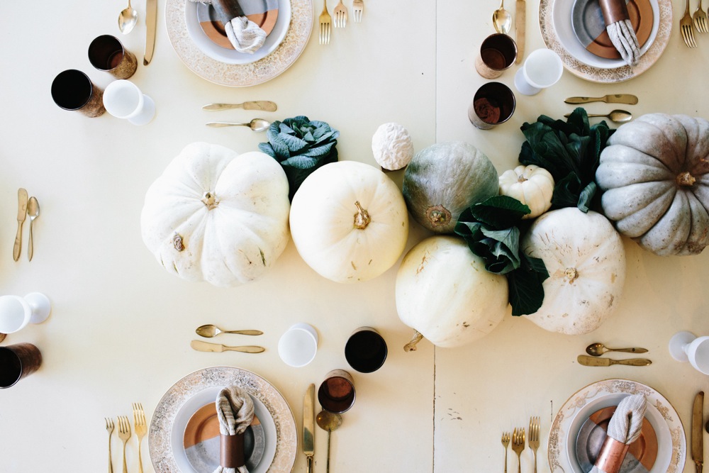
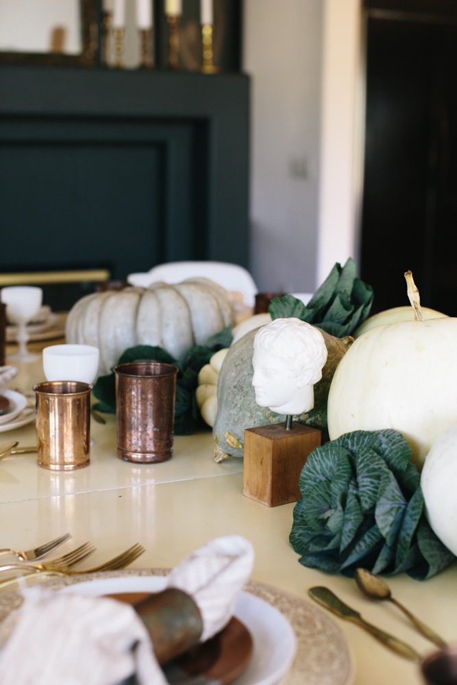
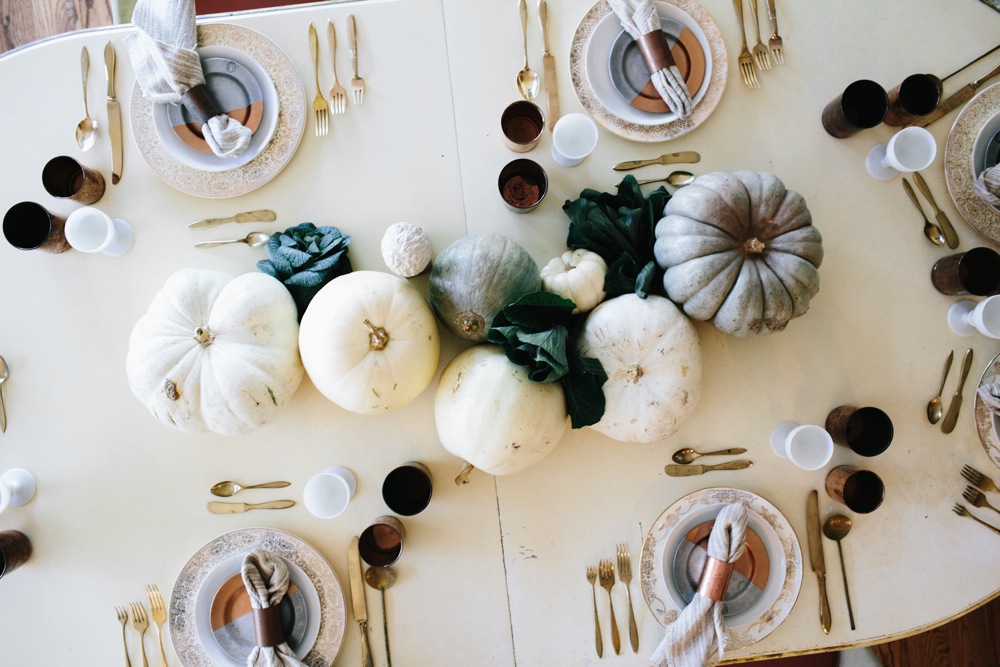
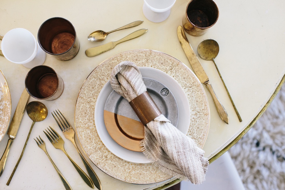
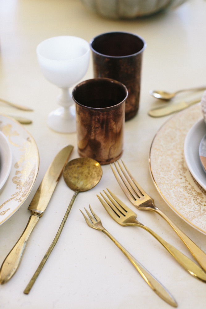
Farra and I wanted to do something different for this shoot. Or, we wanted to stay away from the typical browns, burnt oranges and greens, at least in their traditional way of being presented.  We are both obsessed with coppers and well, really any metal at this point. We wanted to show a lighter dining experience with creams, whites and few hints of fall colors.  If you think antiques, traditional vintage, mid-century and some industrial flare can’t be paired together. Think again ;).

See how we styled our dining room for Thanksgiving here. What do you think?

– Smid

Photos by Jamie Street Photography
jamiestreetphotography_hostesshavenandsmidthat_thanksgiving (3 of 47)

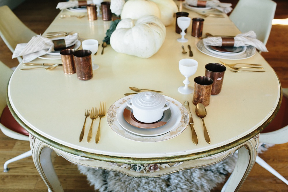
My old table never looked better.

jamiestreetphotography_hostesshavenandsmidthat_thanksgiving (47 of 47)

Creams, coppers, whites, oh my…

jamiestreetphotography_hostesshavenandsmidthat_thanksgiving (7 of 47) <img class="alignnone size-full wp-image-1713" src="http://www .smidthat.com/wp-content/uploads/2014/11/jamiestreetphotography_hostesshavenandsmidthat_thanksgiving-5-of-47.jpg” alt=”jamiestreetphotography_hostesshavenandsmidthat_thanksgiving (5 of 47)” width=”667″ height=”1000″ /> jamiestreetphotography_hostesshavenandsmidthat_thanksgiving (35 of 47)
jamiestreetphotography_hostesshavenandsmidthat_thanksgiving (12 of 47)

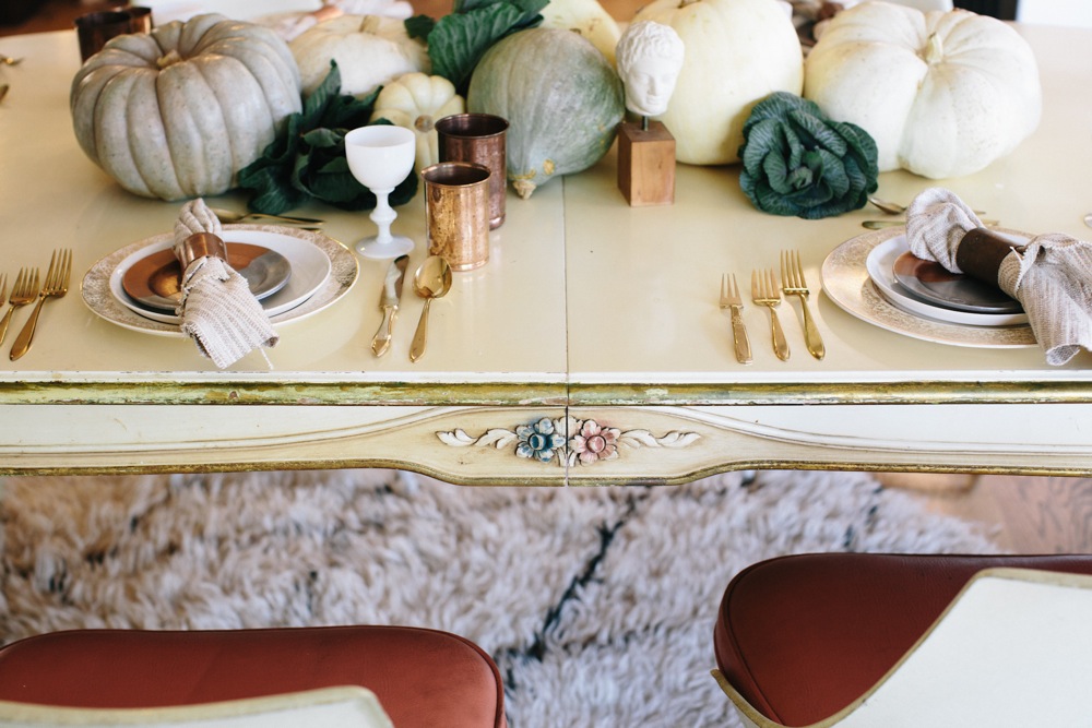
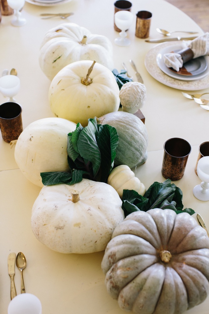
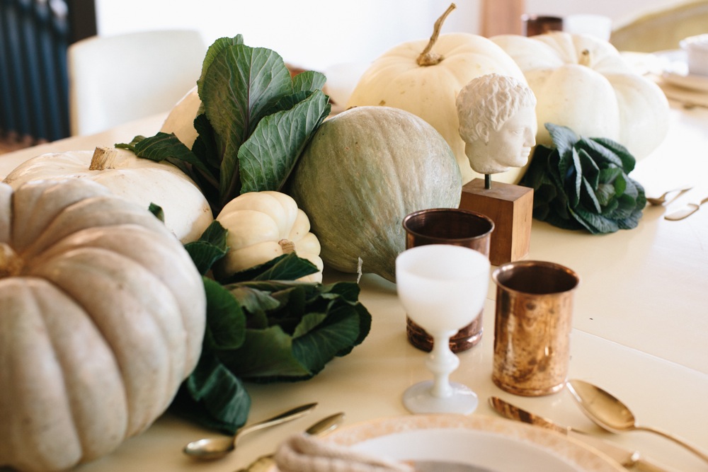
Not your traditional pumpkin. Kale with a hint of purple.
jamiestreetphotography_hostesshavenandsmidthat_thanksgiving (9 of 47)

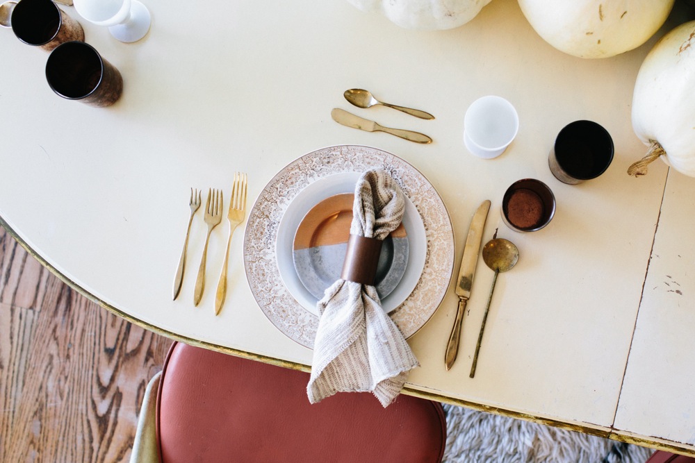
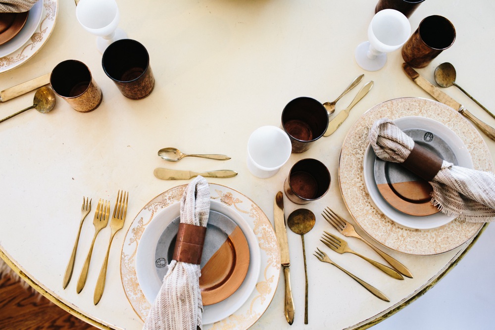
A copper dipped pewter plate. A Hostess Haven signature.
jamiestreetphotography_hostesshavenandsmidthat_thanksgiving (11 of 47)

Copper plumbing pieces from Home Depot for our linens rings.
jamiestreetphotography_hostesshavenandsmidthat_thanksgiving (26 of 47)

You know I love my creepy heads. I had too.
jamiestreetphotography_hostesshavenandsmidthat_thanksgiving (8 of 47) jamiestreetphotography_hostesshavenandsmidthat_thanksgiving (22 of 47) jamiestreetphotography_hostesshavenandsmidthat_thanksgiving (20 of 47) jamiestreetphotography_hostesshavenandsmidthat_thanksgiving (1 of 47) jamiestreetphotography_hostesshavenandsmidthat_thanksgiving (16 of 47) jamiestreetphotography_hostesshavenandsmidthat_thanksgiving (14 of 47) jamiestreetphotography_hostesshavenandsmidthat_thanksgiving (33 of 47) jamiestreetphotography_hostesshavenandsmidthat_thanksgiving (32 of 47) jamiestreetphotography_hostesshavenandsmidthat_thanksgiving (39 of 47)

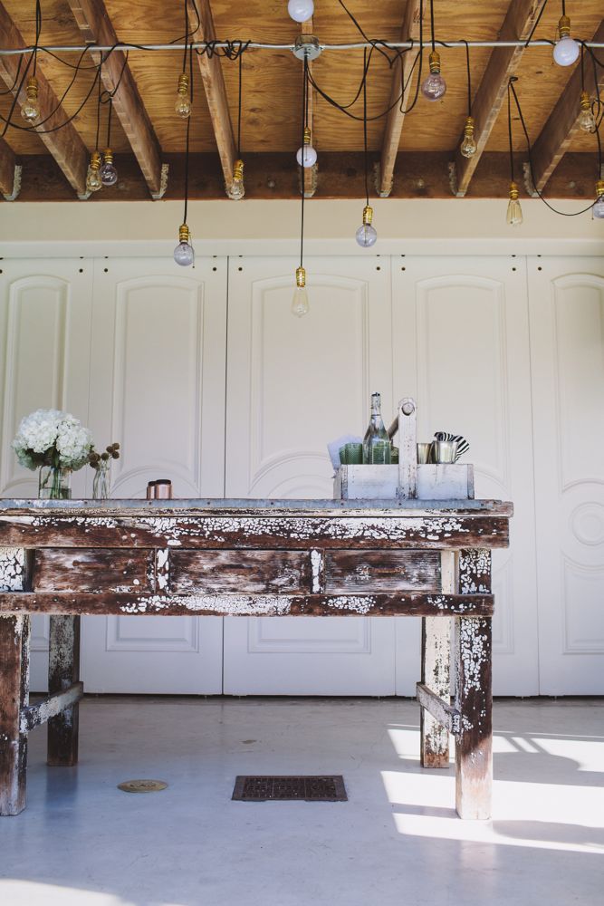
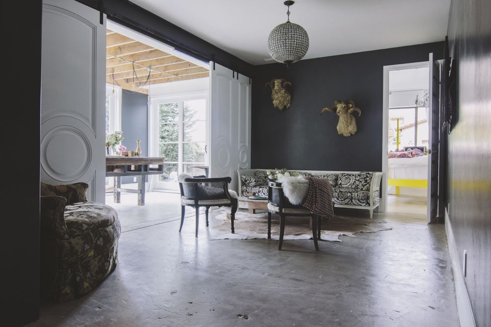
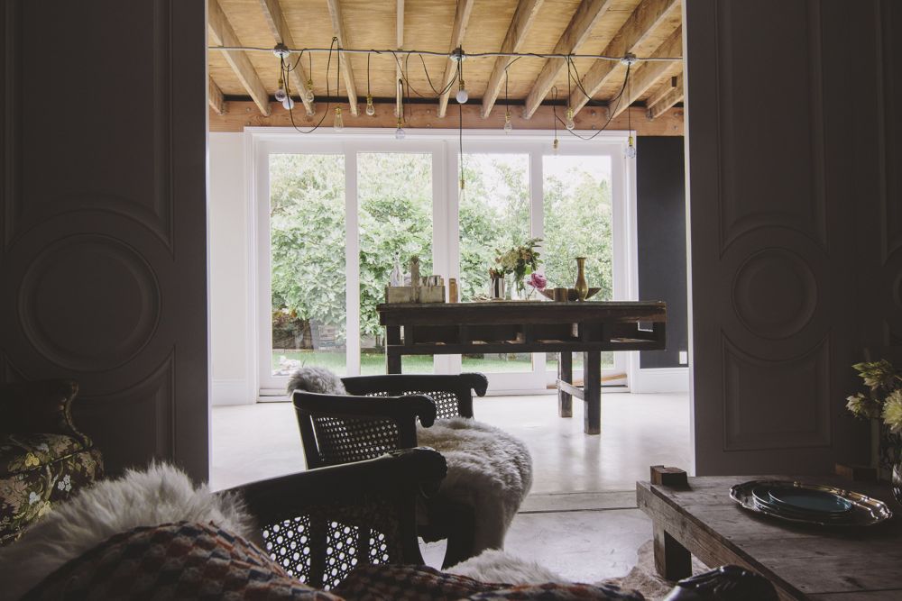
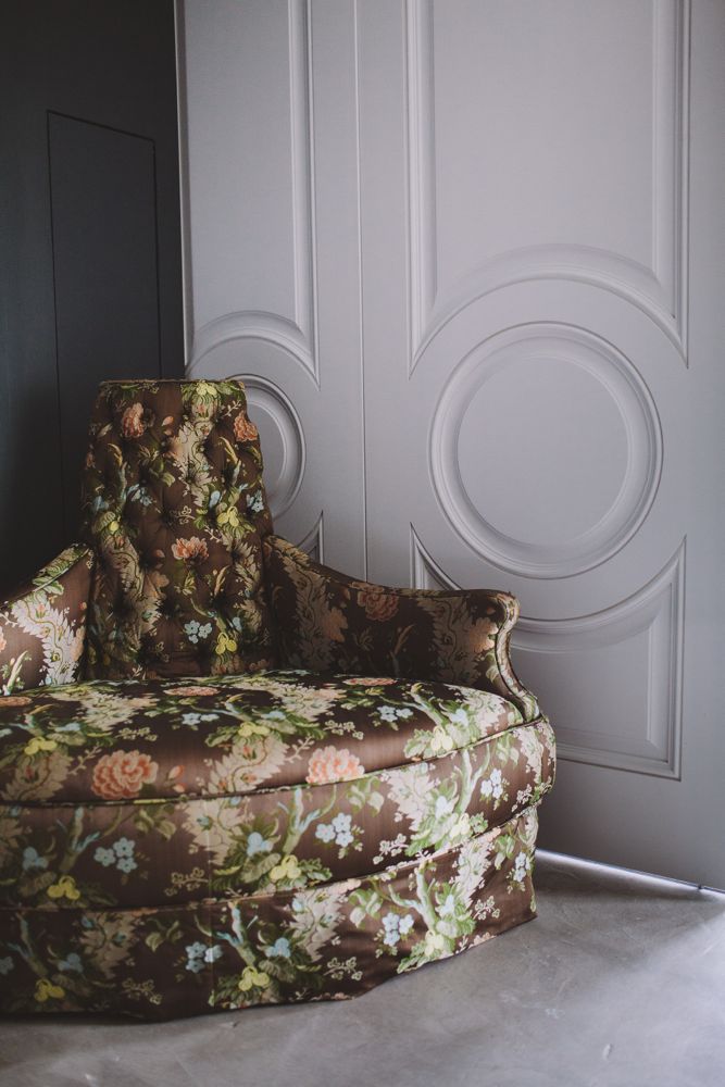
A room is room, you say? If it’s not great to start with, you can only do so much.  Maybe. But, I believe a great room is one that you give the right foundation or the right canvas to start. A door can create a strong foundation for your space. If you don’t have the perfect floors, the best lighting, the best view, great space or even a good wall texture, you can still make a really strong statement.  A door with character, not just any old door, will give the room depth and an amazing framework to begin designing your space visit this website.

See the statement and the frame work these doors provided for my space.

-Smid

IMG_9795-2899083100-O

Instead of leaving this room with a large opening, I found these old doors and used them to frame the room. They also give the room a dramatic back drop when closed.

SMID_004
SMID_023
SMID_019

Tina and Brian are renewing their vows on July 24th. It is their five year anniversary.  And from what I learned, they have a lot to celebrate.

They are probably one of the cutest couples I know.  They are incredibly in tune to what each other is thinking and very respectful of each other’s wishes. I also find them extremely calming and peaceful in how they manage conflict, or at least the design decisions they were presented with while working with me.  I am a very expressive and emotional person as you may have gathered by now. I get very excited and worked up about many things. Ok… most things. So I am completely impressed and was quite taken back with their patience for one another and their warmed hearts toward me as we designed the space together.  I THINK they may actually be this way when they are alone and behind closed doors too. Amazing!
Tina asked me if I would redesign their master bedroom prior to their vow renewal. They have put a ton of work into their home to make it alive and playful but, their bedroom was the one place that felt unfinished in their mind and was not reflecting who they are as a couple and as individuals.  They wanted the entire house to look spectacular for the event.  Most importantly, they  wanted to use their bedroom.  They wanted it to feel comfortable, inviting, exciting, romantic and be happy with the way it looks. They struggled with what the room needed in order to make it all of those things. They were tired of trying to get it there and being unsuccessful.

I knew exactly what it needed when I walked in the room. I understood why they were so frustrated with it. It was too stale and a little uptight for them. It was a beautiful room for most but not enough for them. It just felt like it was cut short and not given as much love as the rest of the house. It didn’t feel or look lived in.  Nor was it inviting. The rest of their home is incredibly playful. It is full of these fun Bear Brick collections and unique pieces that they have purchased together over time that represent who they are and carry significant sentimental value. Their bedroom didn’t have any of these things.

Tina shared that they had their master bedroom designed before. However, the designer had not captured their personality in the space.   They have spent very little time in there because of it.  I hated to hear that they had been avoiding this room, other than to sleep , and have also shut the door to their bedroom when having visitors. They were not proud of it. Tina and Brian have a very large bedroom, with a fire place and lots of light. There are walk in closets AND Tina even has a powder room!!! Are you kidding me? It is a great space. We had to get them using it! And what a great time to do this.

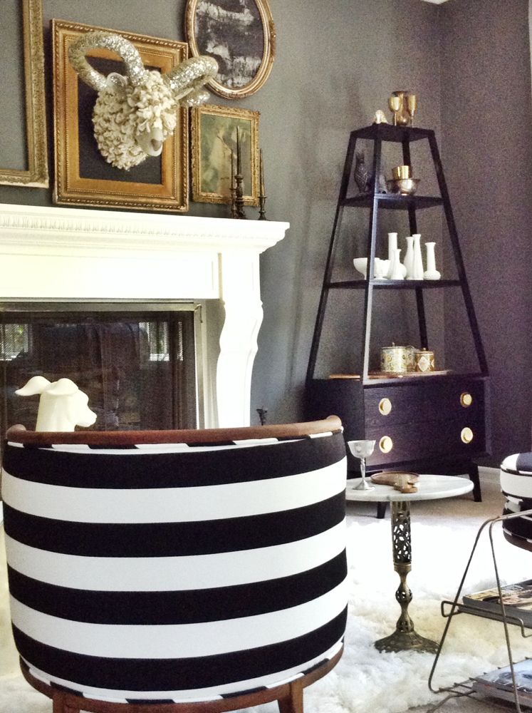
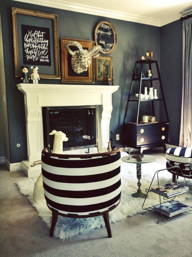
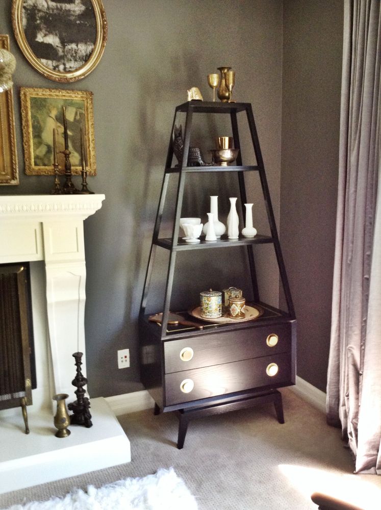
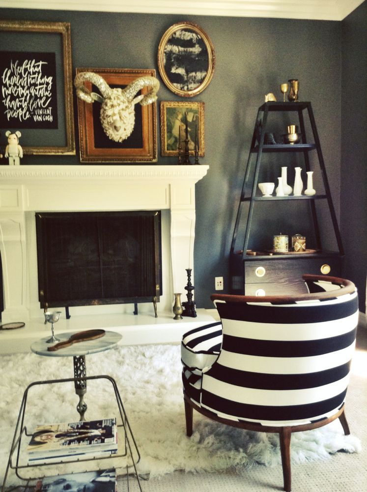
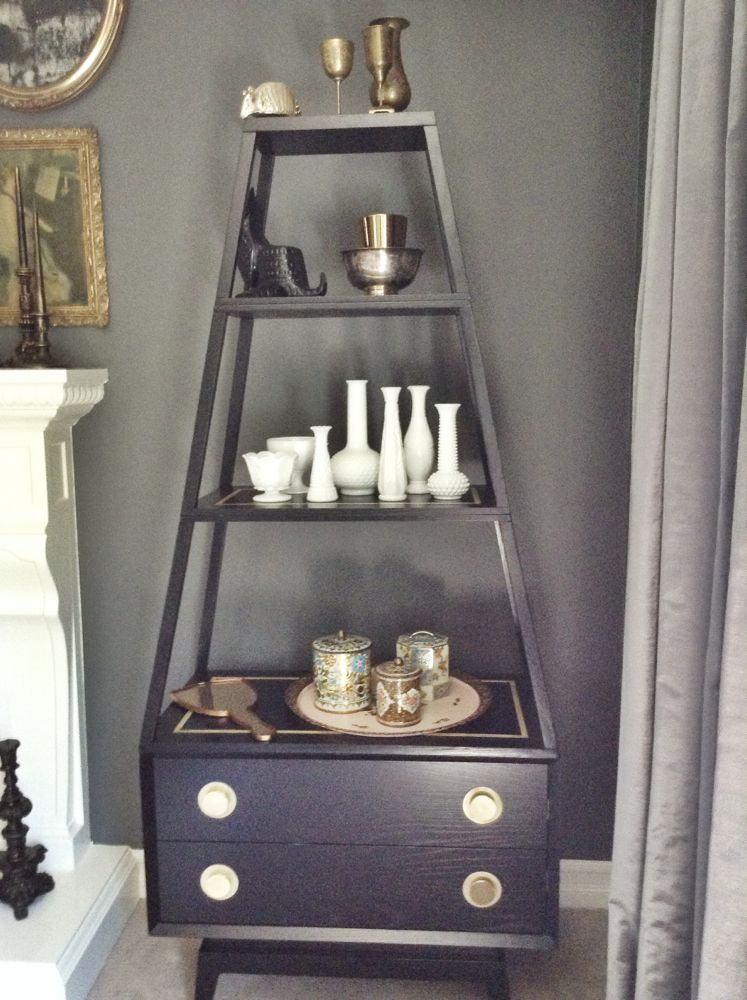
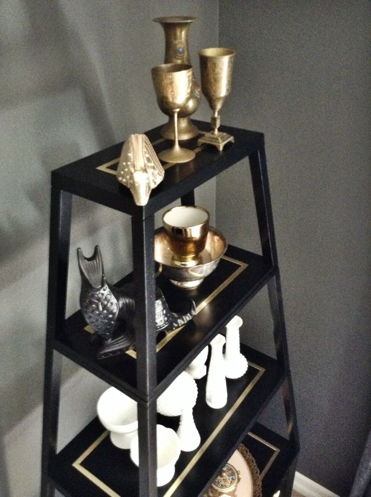
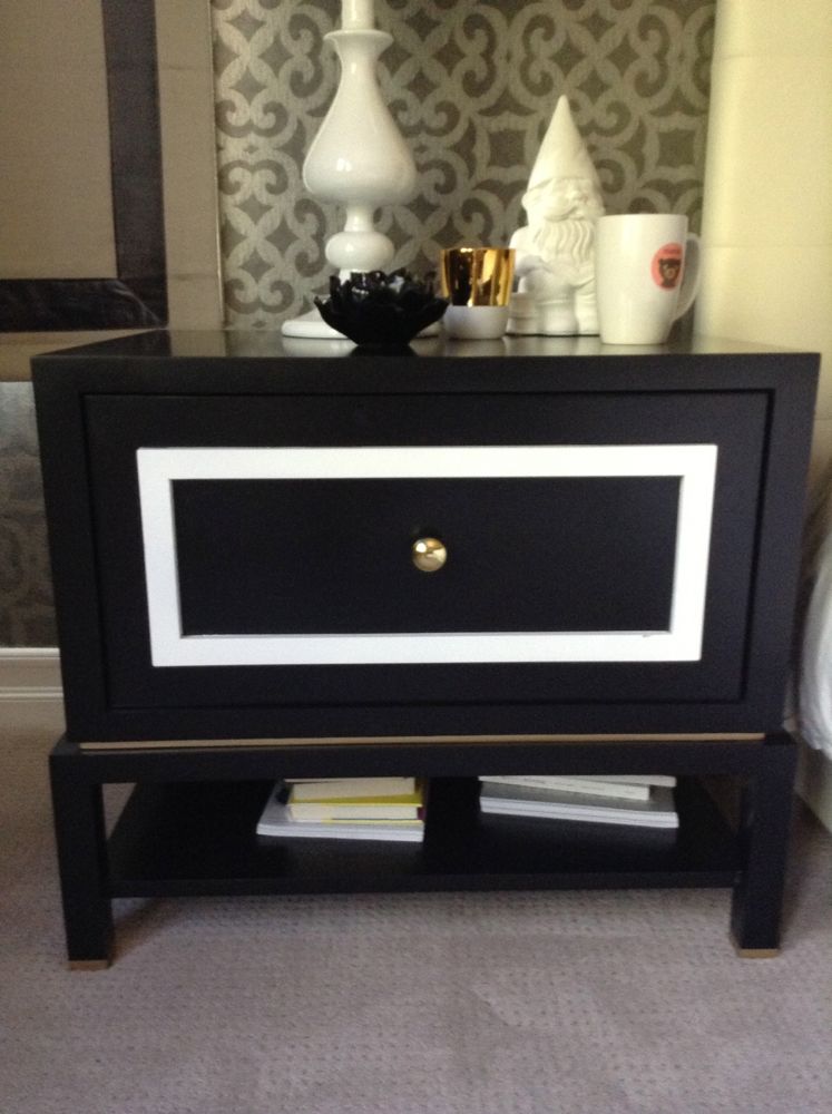
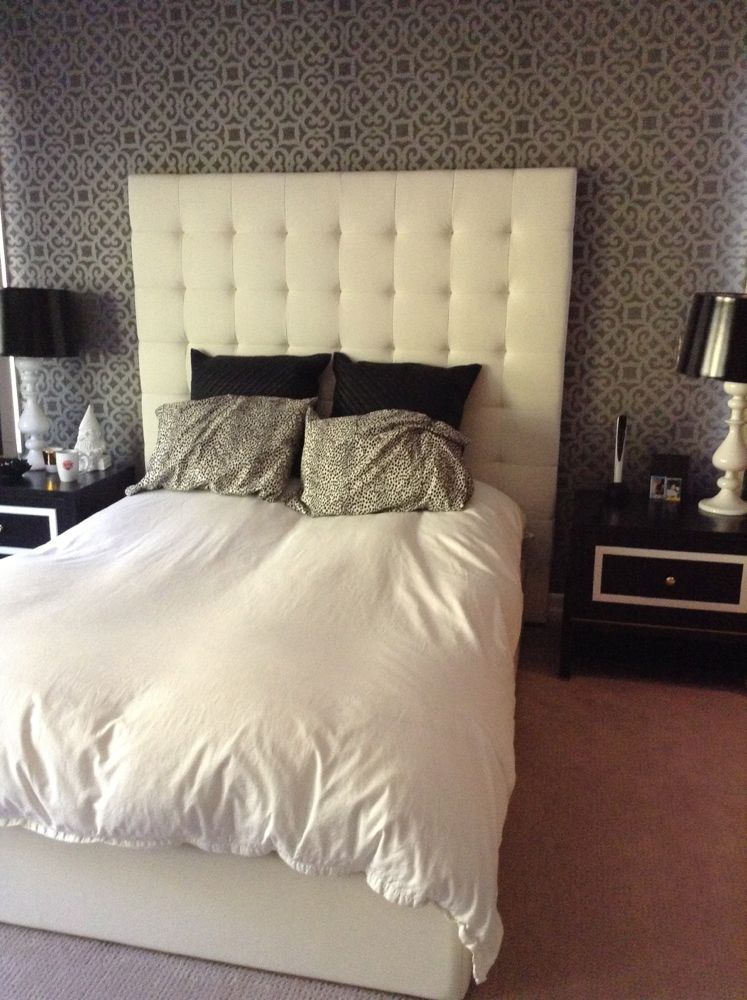
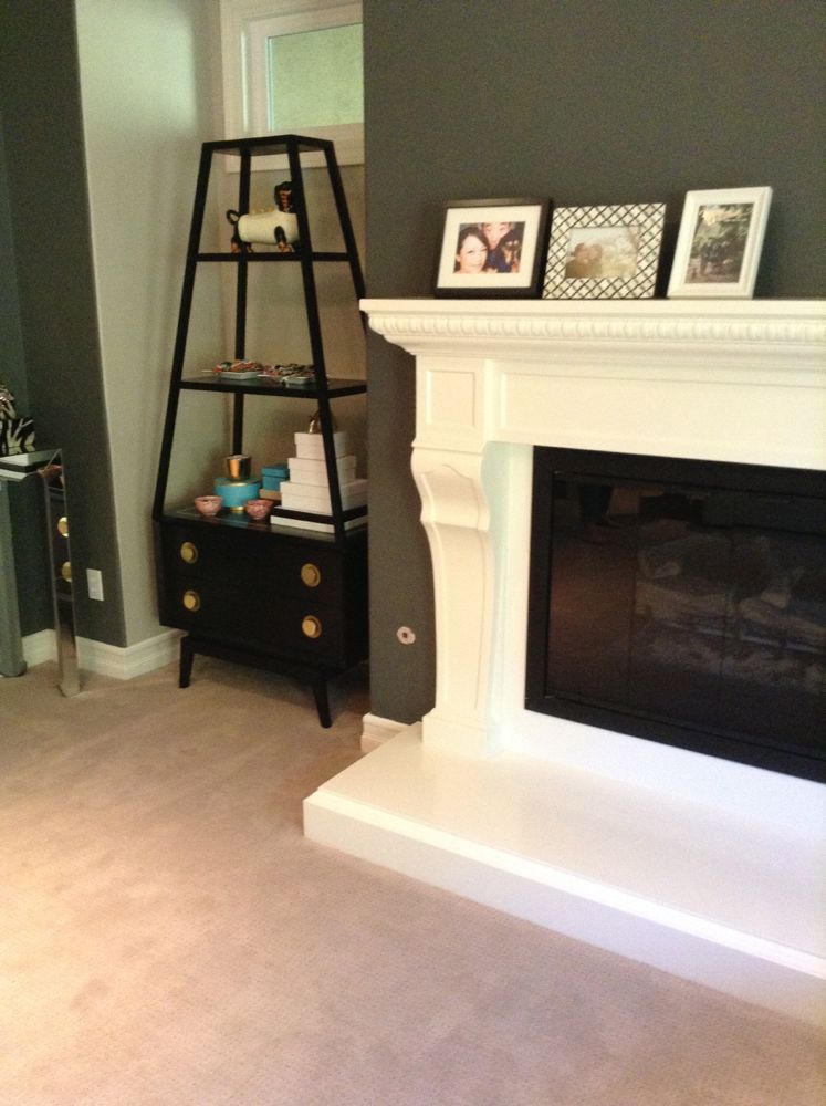
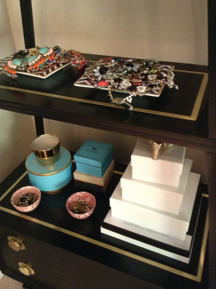
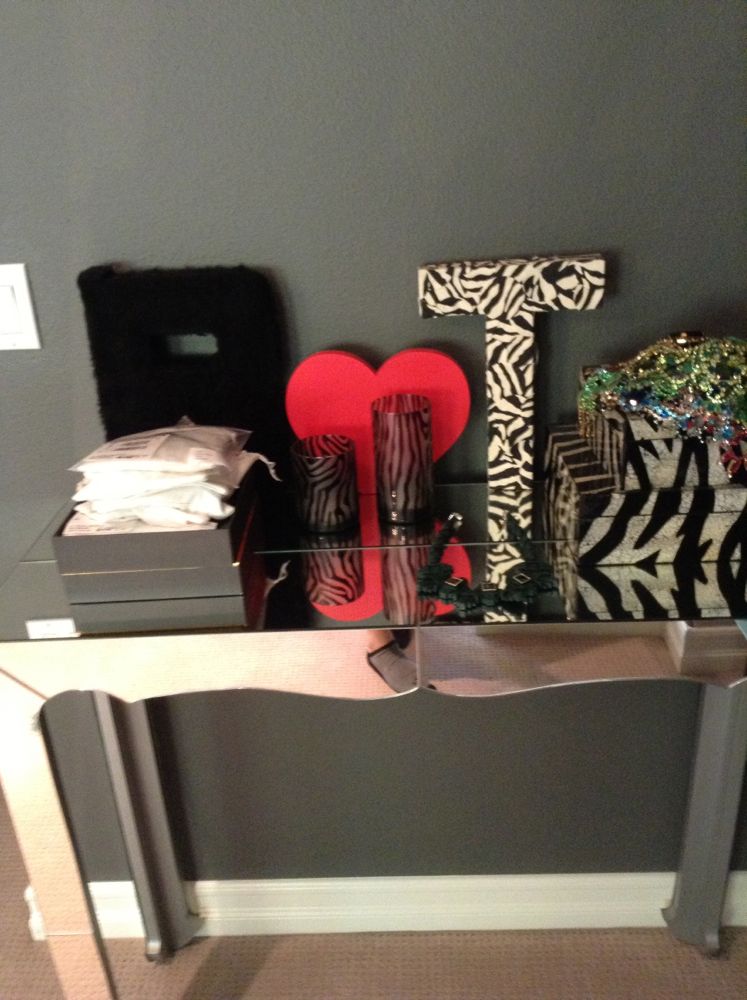
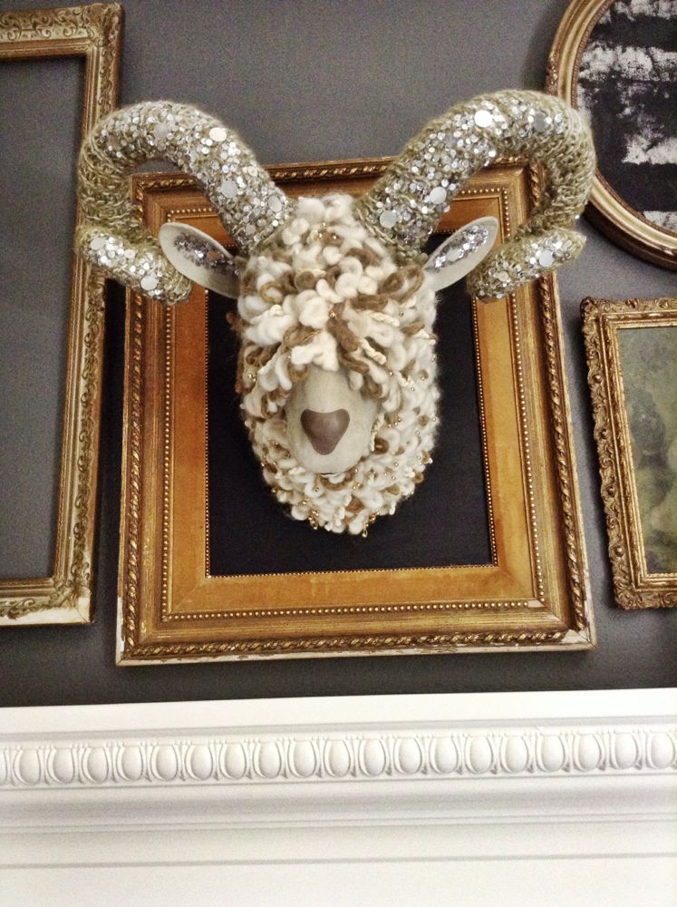
The challenge I faced with this re-design, they had already poured quite a bit of money into their bedroom. We had to be reasonable with what we  invested in the space. We also needed to make things work in the room (that were already there) which were substantial investments or had sentimental value. Here were the things we agreed/needed to leave; the wall color, the wallpaper (which Tina was disappointed in since it was installed), the curtains, the custom made side tables, and the head board. They also had a very cool Jonathan Adler etagere which got lost in their room before. It was tucked in a little nook and the styling on the table was too flat to make it noticeable. Then there was this Ram’s head made of cashmere, suede, yarn and sequins. It was a piece the couple had purchased a while ago and it had been sitting in their closet for years. They really wanted to get it into the room somehow.

My goal was to bring life to the wallpaper, compliment the curtains and make the side tables look more sophisticated. The room needed more glam and yet needed to look tougher. I wanted it be fun and livable. It was important to compliment the theme in the rest of the home. And did I mention this?  Tina loves glamorous, edgy designs.  Brian loves mid-century. Right! We had to ‘master’ that bedroom.

Here is a look at what we did. I hope you enjoy it. Smidthat!

-Smid


IMG_6498

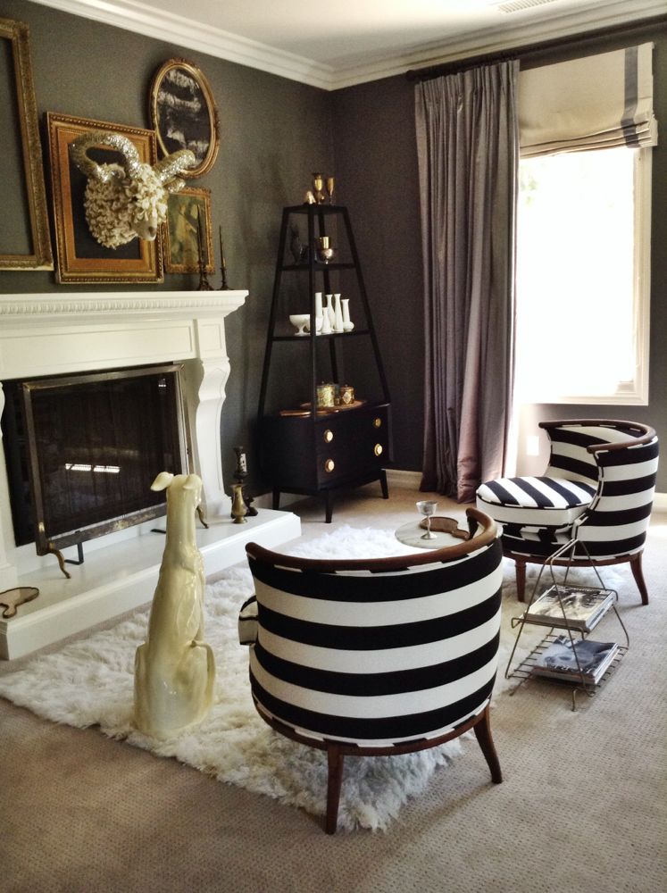
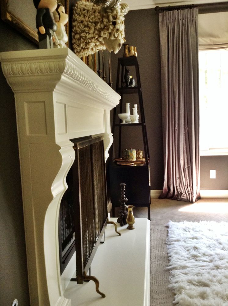
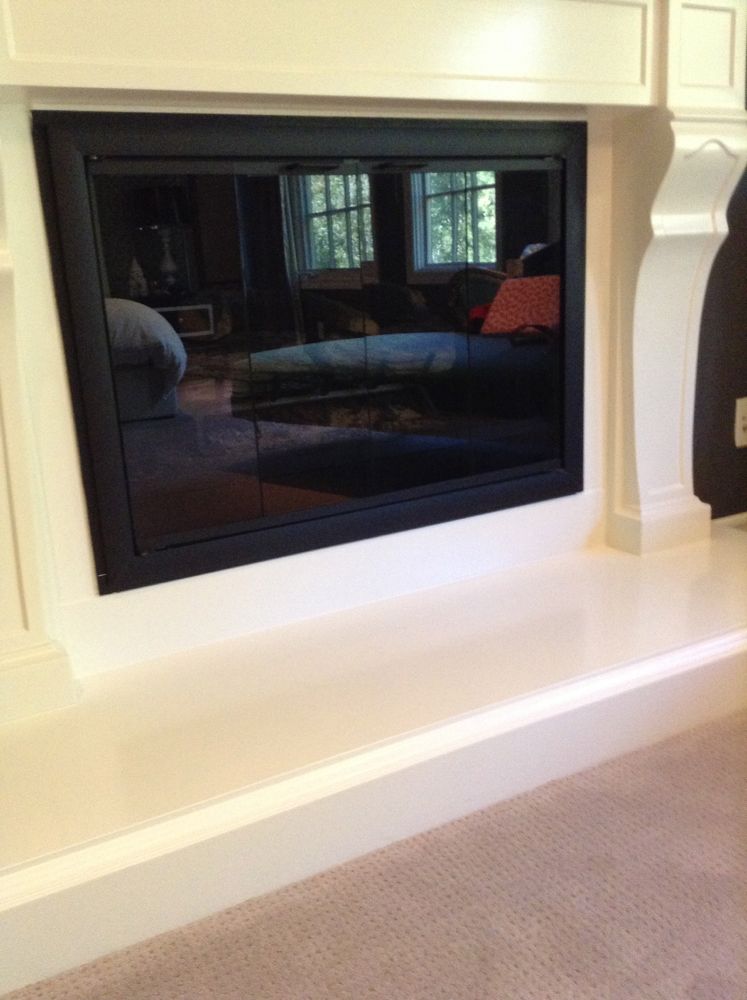
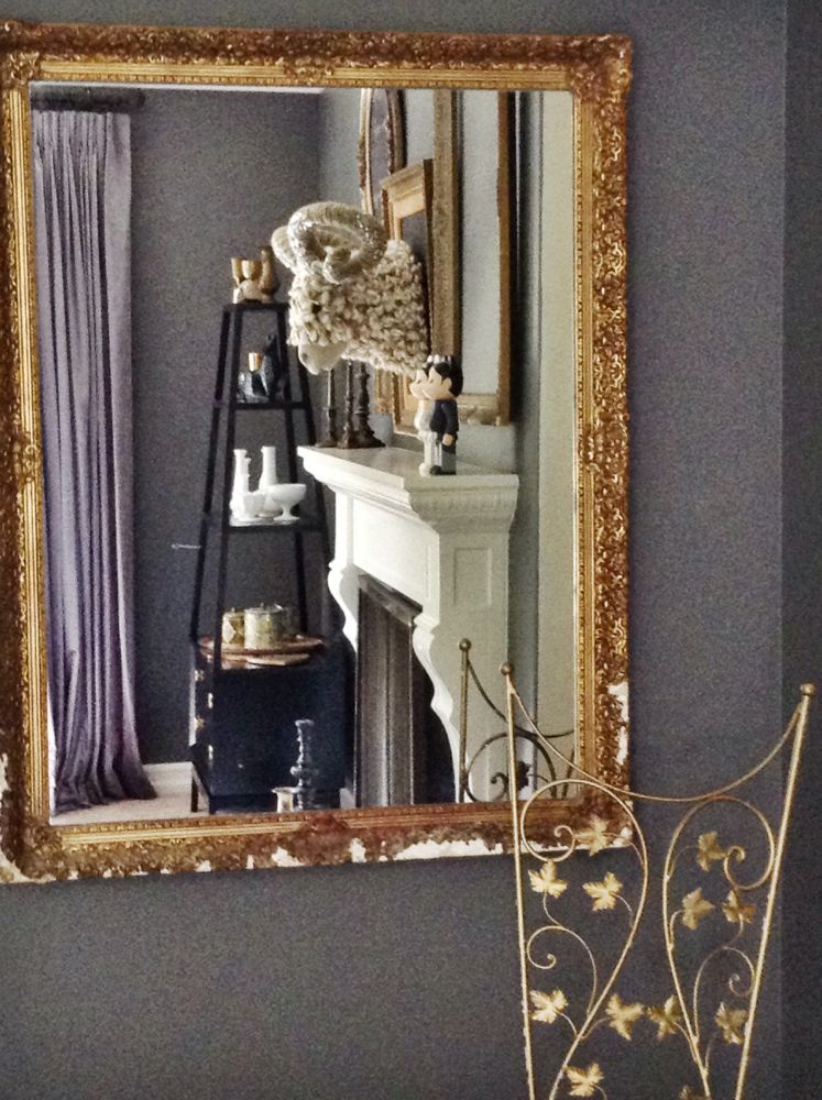
Etagere now NOT tucked away. Ram head now sitting tall and in it’s new home. I added a fireplace cover to soften the fireplace. The curtains now appear to be full of life and more glamorous.

IMG_6499

I styled the etagere by using more height and a bit of the color blocking technique.

IMG_6477

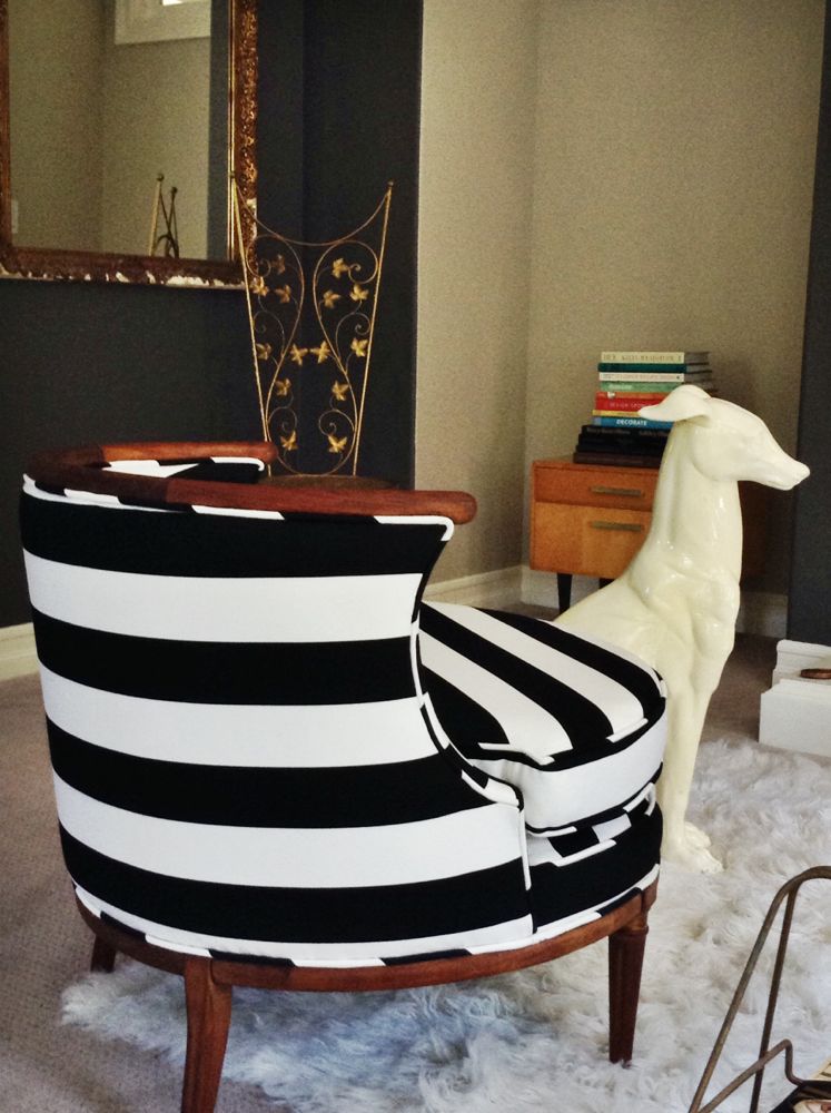
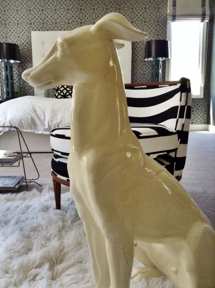
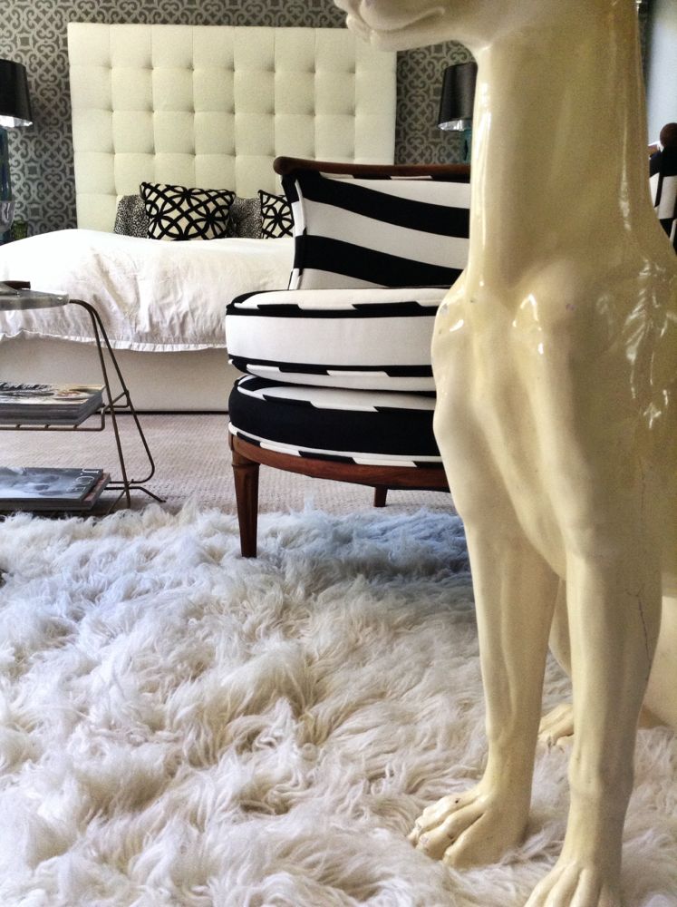
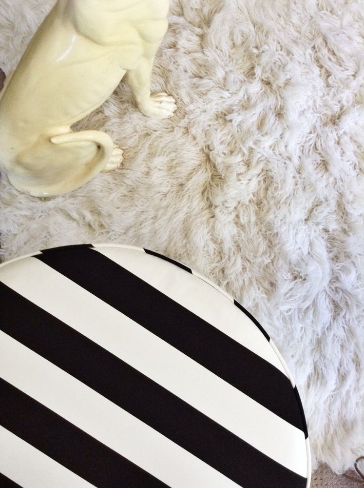
The chairs are very mid-century. We ‘glammed’ them up with a classic bold black and white stripe.

IMG_6484 IMG_6485 IMG_6480

IMG_6489

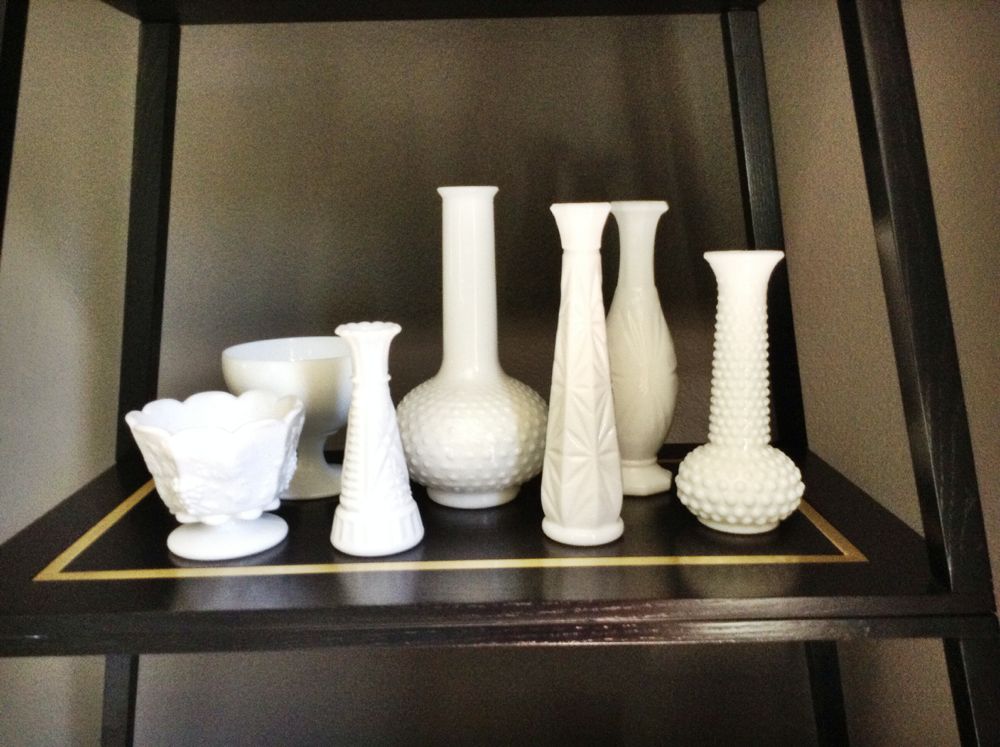
This is Tina’s milk glass collection that we finally got dusted off and out in their room.

IMG_6488

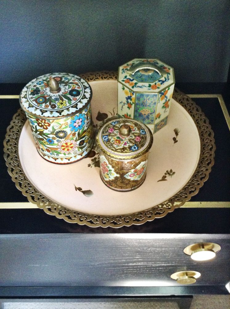
I found this floral trey at the flea market and it compliments these old flower tins from their first wedding.

IMG_6490 IMG_6491

IMG_6475

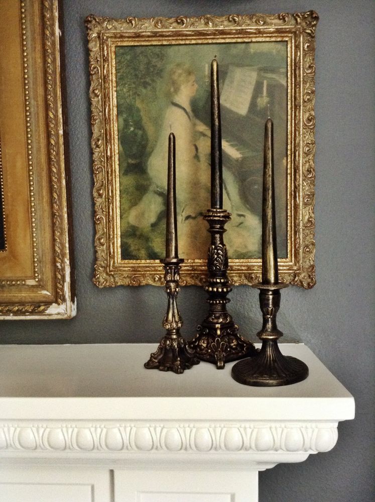
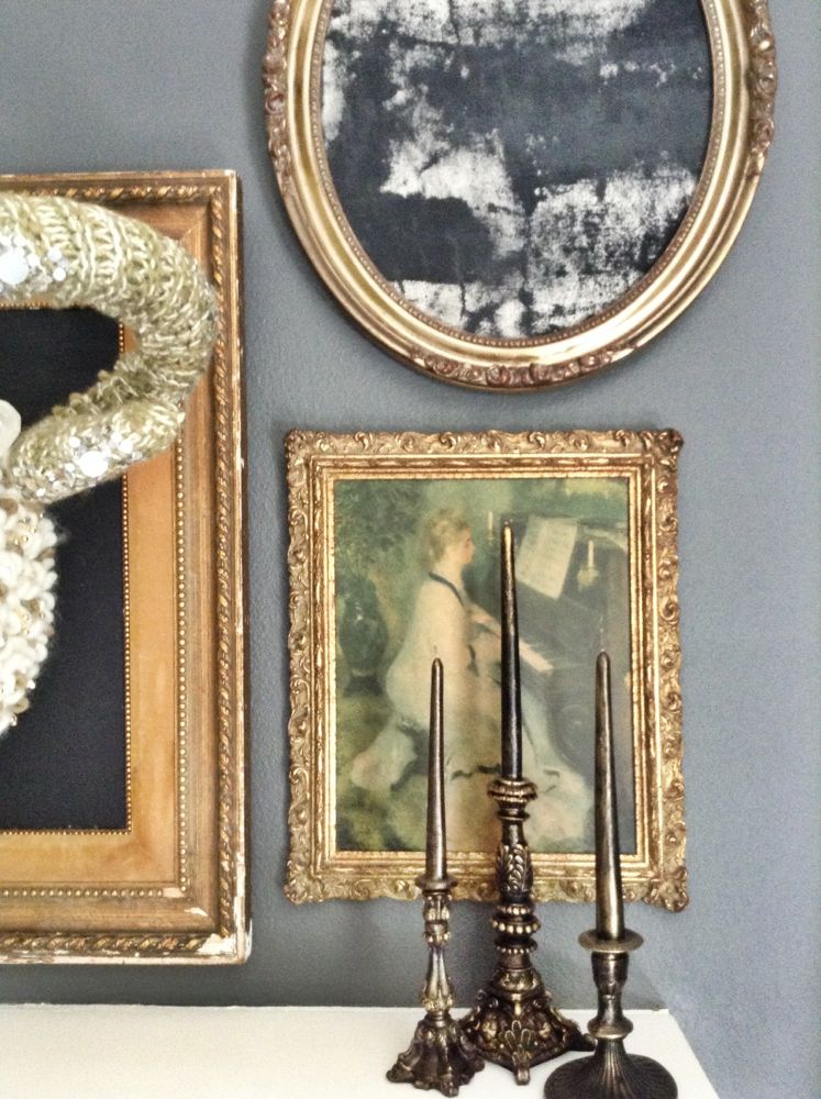
Tina had these beautiful full wax candles that complimented the frames on the new art wall. I love the detail in this space.

IMG_6486

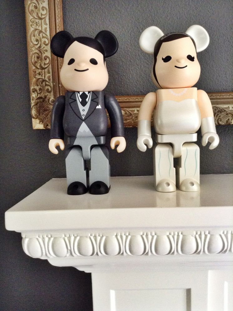
I had Tina and Brian order a married couple from Bear Brick to continue the theme of their collection through out their home.

IMG_6492

Details!

IMG_6493

IMG_6487

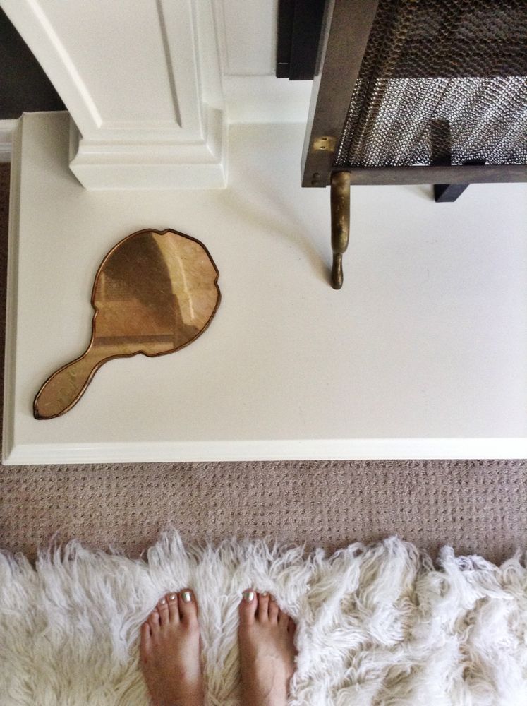
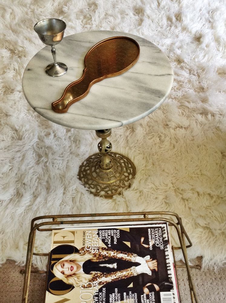
Hand held bronze mirror.

IMG_6497

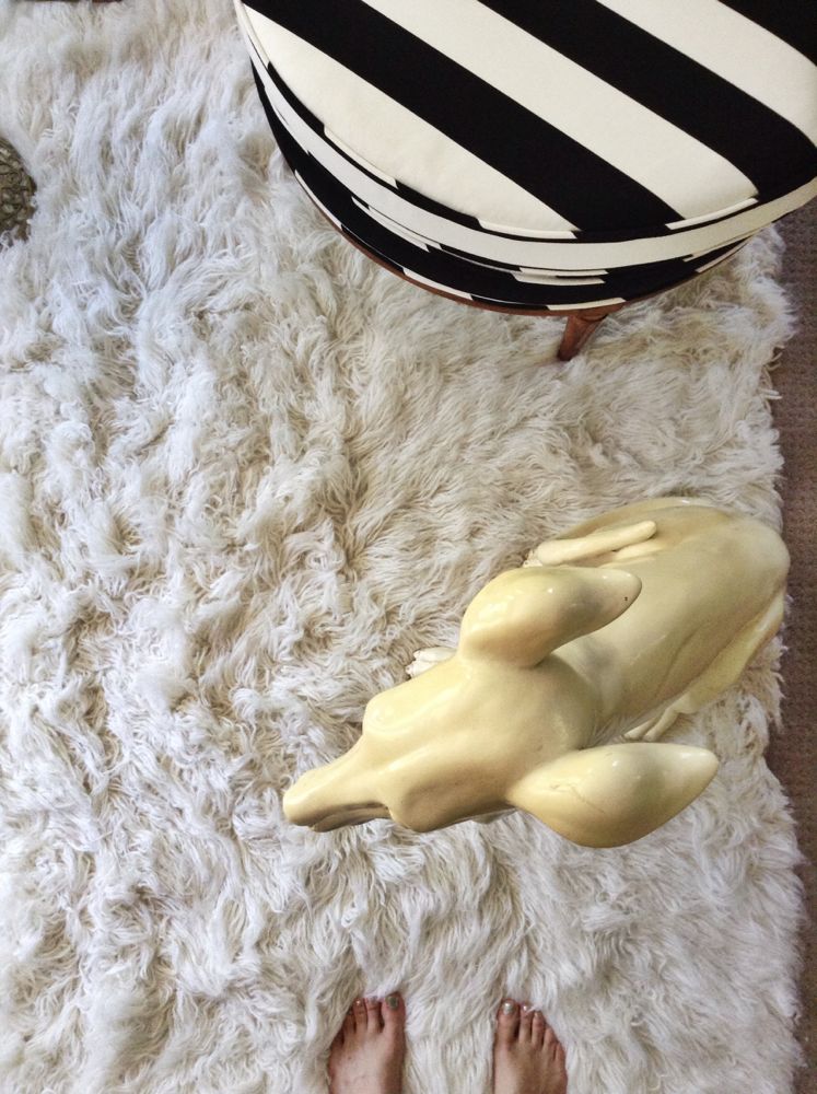
Texture! And a little not so furry friend. Also, my feet.

IMG_6508

Mirror mirror on the wall, who’s the ram head sitting tall?

IMG_6506 IMG_6504 IMG_6503

IMG_6019

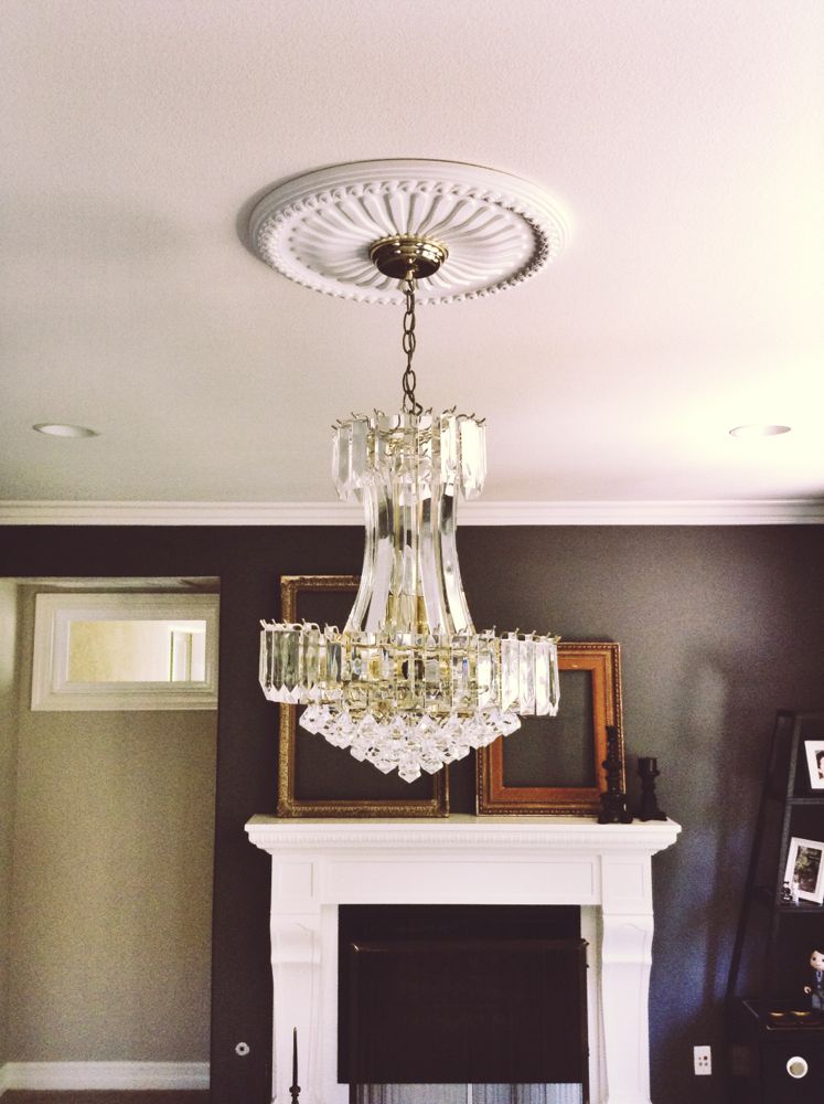
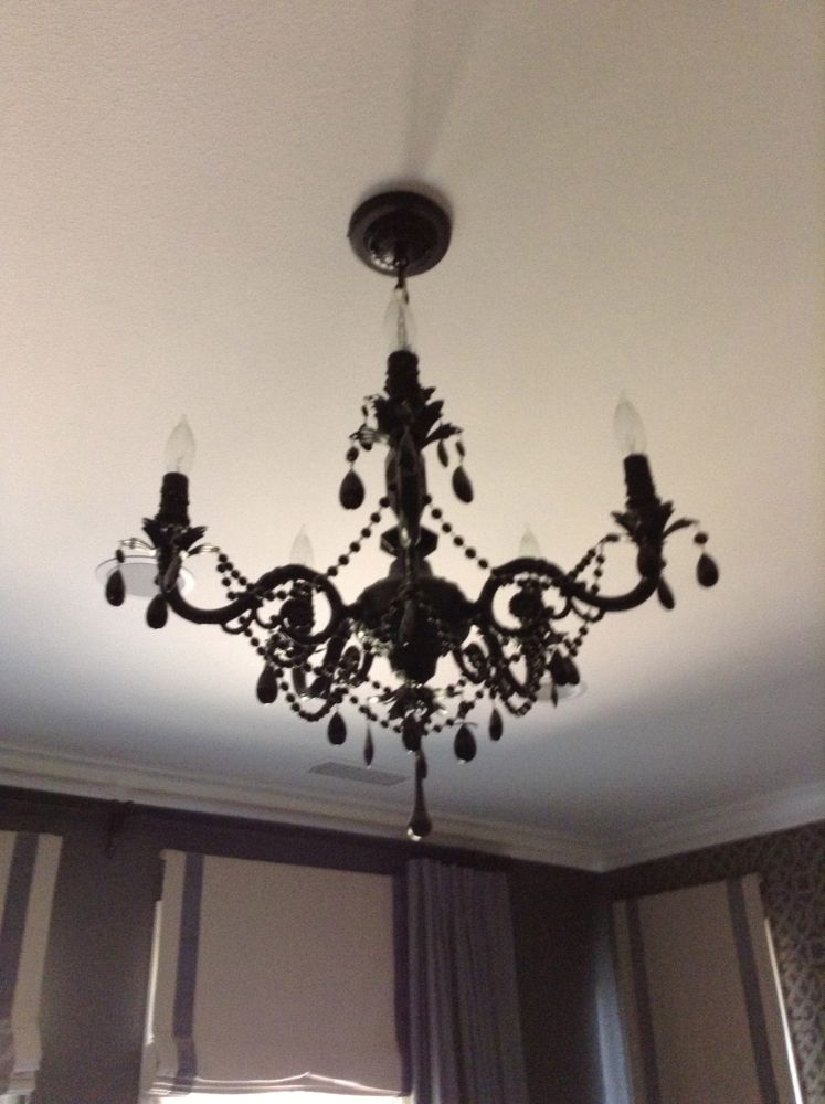
Installed some bling.

IMG_6494

See the mid-century lamps on the side tables? It’s a play on the wallpaper and gives it more life.

IMG_6495

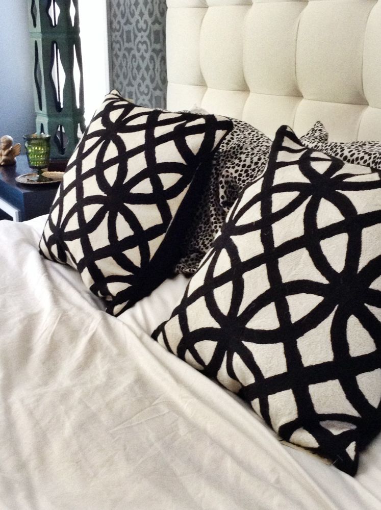
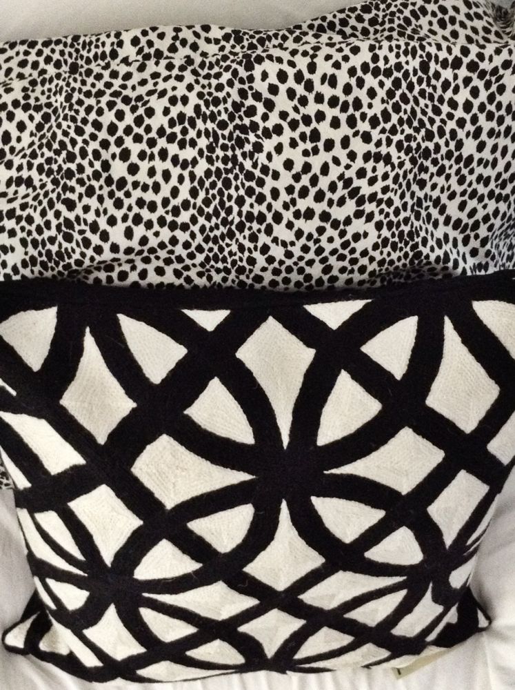
I added those front pillows for some additional texture and to pull the black and white theme through out the room.

IMG_6502

Angel baby to guard them at night. Just kidding. It was just cute. So I had to.
IMG_6501

IMG_5996

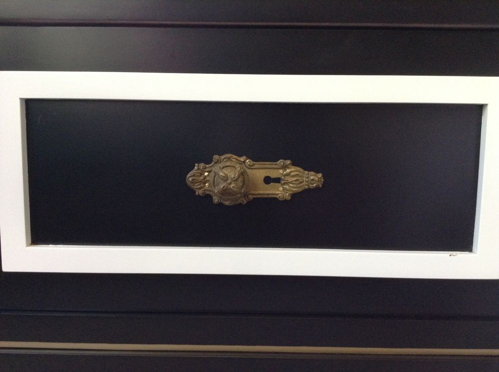
Vintage hardware took this side table to a whole new level.
 

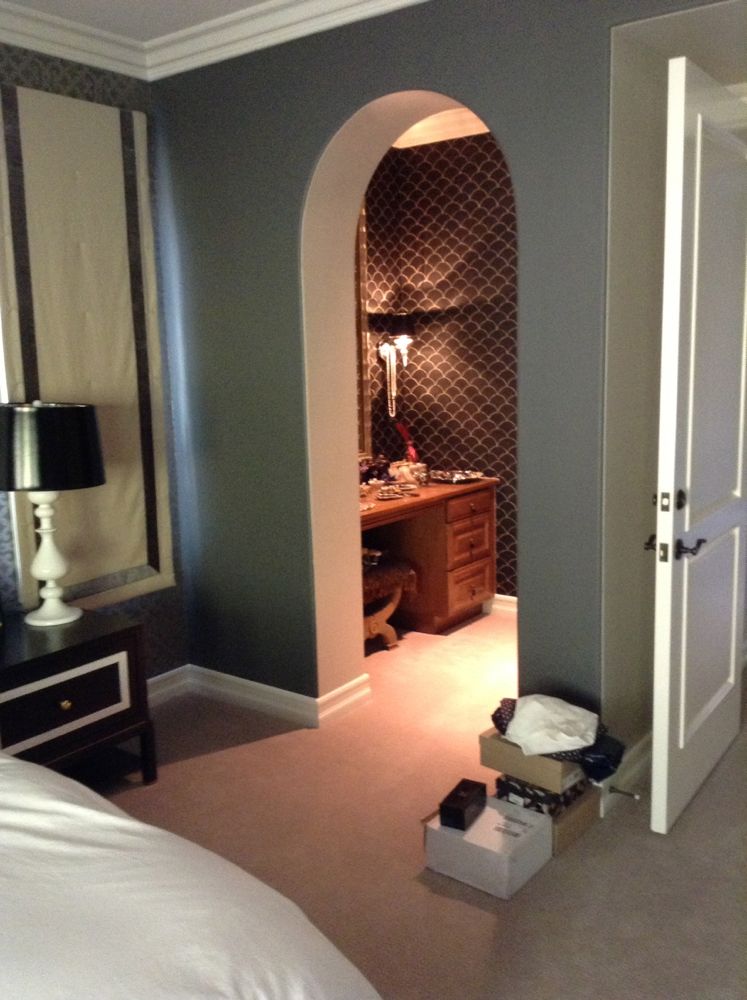
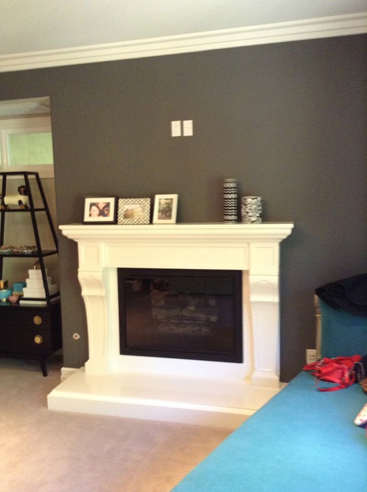
Here are some before shots for those of you that are curious:

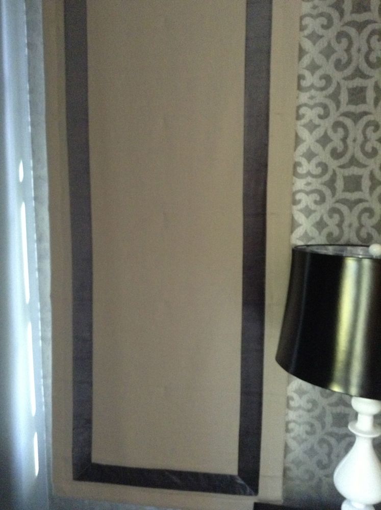
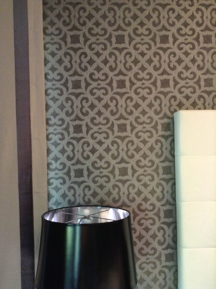
IMG_4203 IMG_4214 IMG_4202 IMG_4199 IMG_4210

IMG_4198 IMG_4195 IMG_4194 IMG_4196 IMG_4197 IMG_4204